OVERVIEW
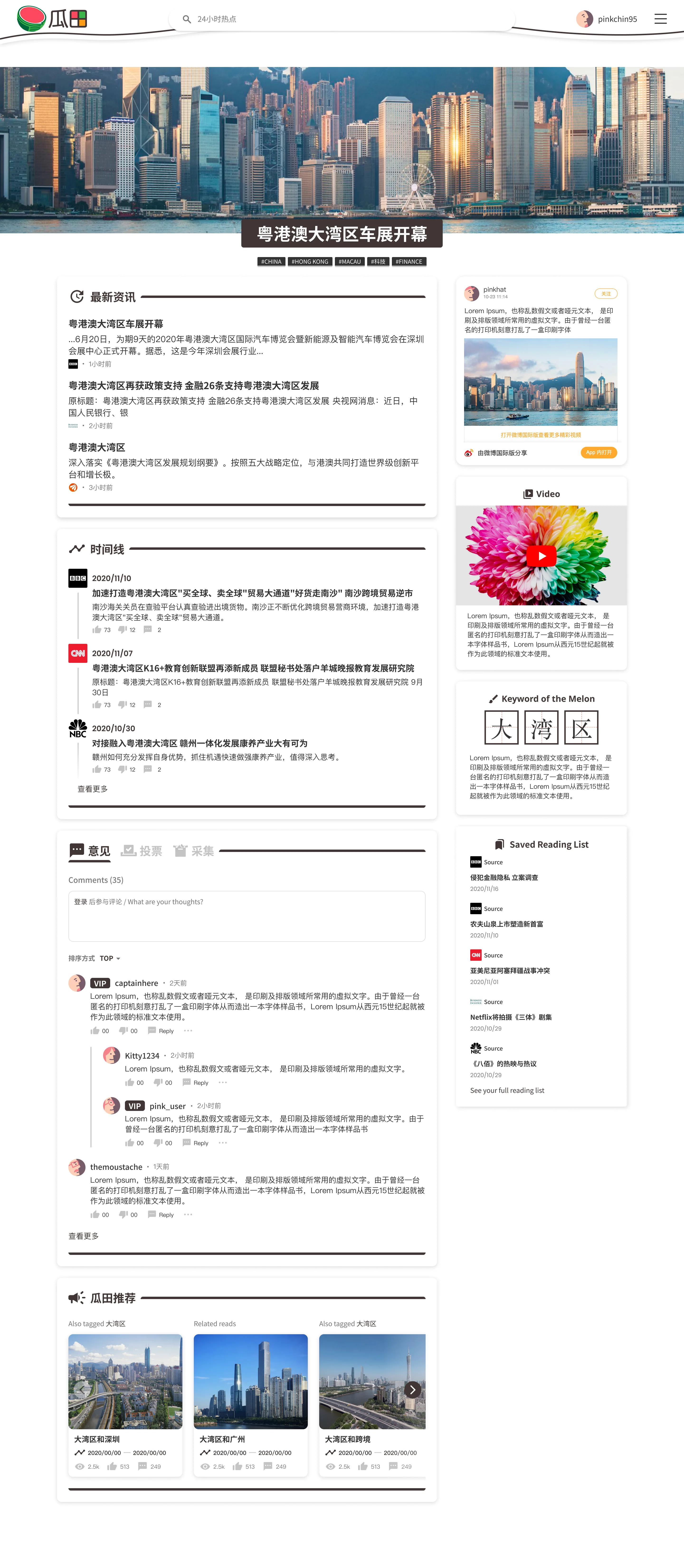
To design a logo and website for one the Datago Technology's projects Melon. Similar to DatagoTech but explores other topics not only finance but as well as entertainment, sports, etc. Melon is an online publishing, social news aggregation and discussion website. (Project is still in a prototype stage and is currently on halt, I think it's safe to say it is a concept project)
TIMELINE
October 2020 - December 2020
MY ROLE
UI/UX Designer, Logo Designer
THE TEAM
Solo designer, 1 developer and 2 data scientists
TOOLS USED
Figma, Illustrator
The Goal
Understanding the user
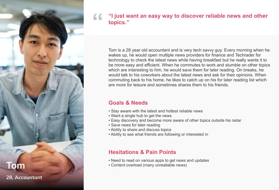
Since talking with the team, they were hoping the "MILLENNIALS" and "GENERATION Z" would like the app, but especially the mainlanders. Before I even started sketching, I spent time understanding the popular apps, which are surprisingly different from the western apps.
Persona
Comparing Western and Chinese apps
An example that one caught me off guard were the many floating text on videos (live stream and offline) sliding in & out all over in the app "BiliBili'' which are actually comments where in western apps such as "Instagram - Live" where comments are displayed on the bottom or in streaming apps like "Twitch" & "Youtube", comments are displayed on the right side. This is definitely a whole new demographic for me to design.
Logo Design
The Name
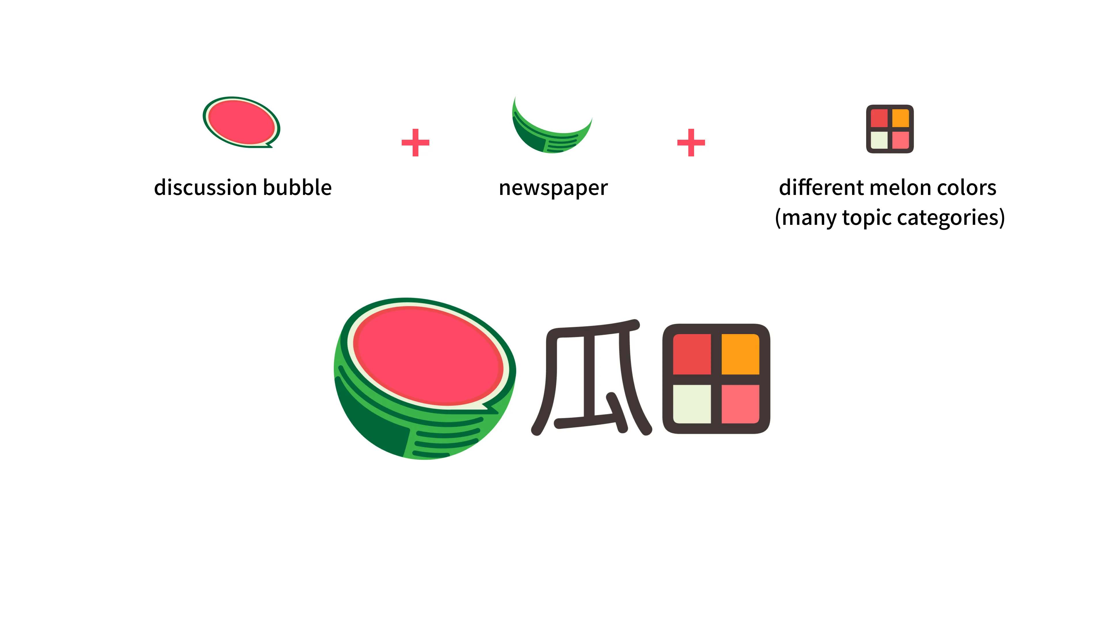
The app's name
"瓜田"
which directly translates to "Melon Field" but the intended translation should be "Melon Eater" which comes from a Chinese slang term often used humorously, onlooker to be exact. Now you may wonder why not just use the Chinese characters for "Melon Eater", well "Melon Field" refers to an area of melon, but in this case, an area of many categories, so different melons represent different topics. In short, we provide the field (the app) to melon eaters (the user). Name aside, I think it could go either way.
Logo Directions
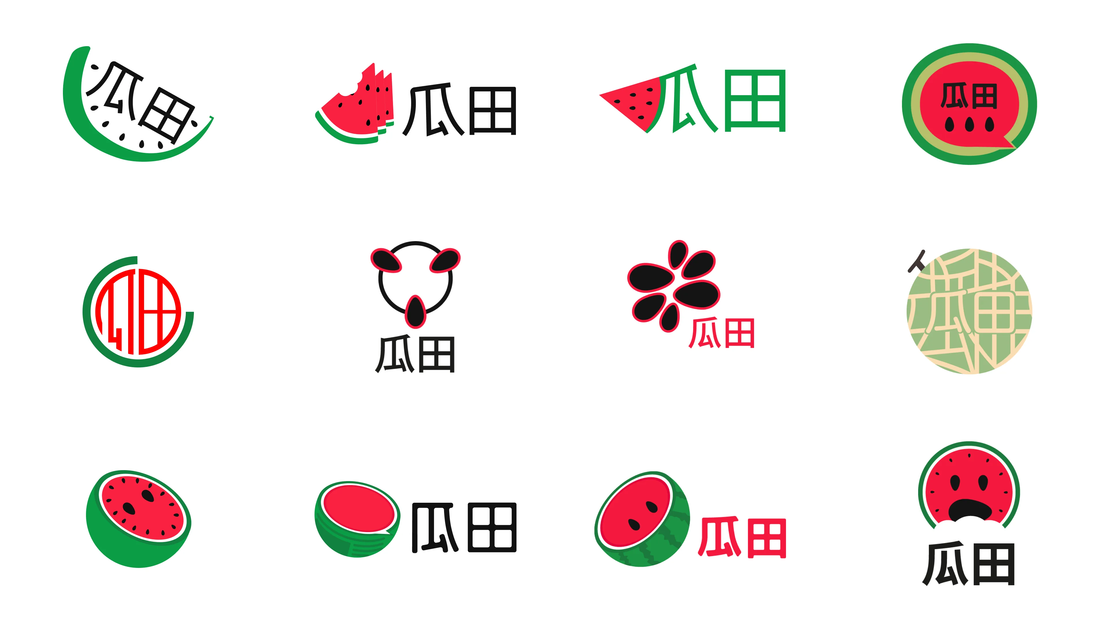
With a clear understanding of the title, I thought maybe adding some personality and fun elements to the logo might help, like having a mascot and being the face of the app. (Fun fact: The mascot has a bitten part, referring to the melon eater idea.)
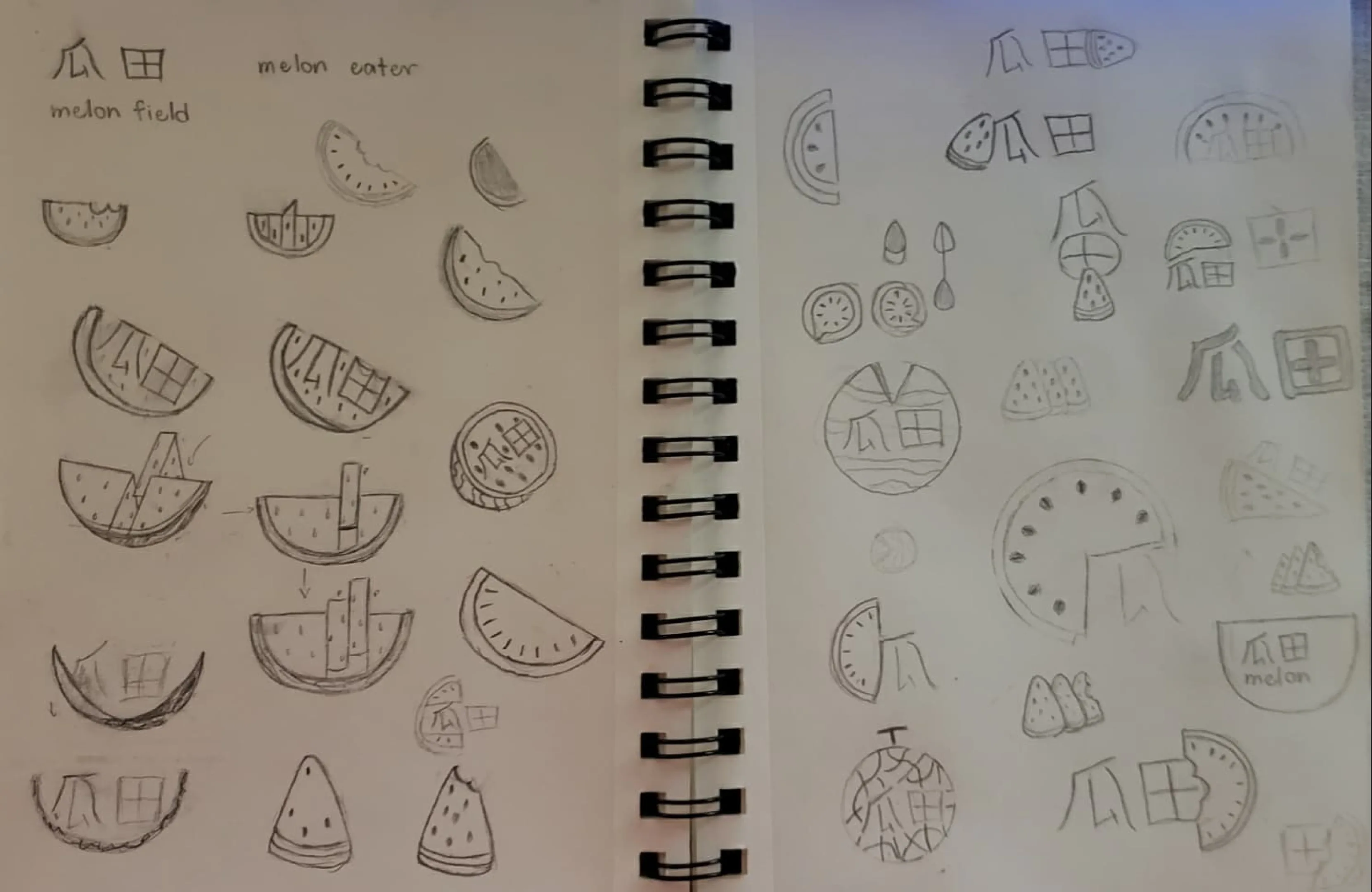
Paper Exploration
Digital Exploration
The Selection
Topics and Discussions are the core content of the app so I incorporated those and concluded with this. Also having some emojis for users to use in discussions. Even the team agreed with my choice.
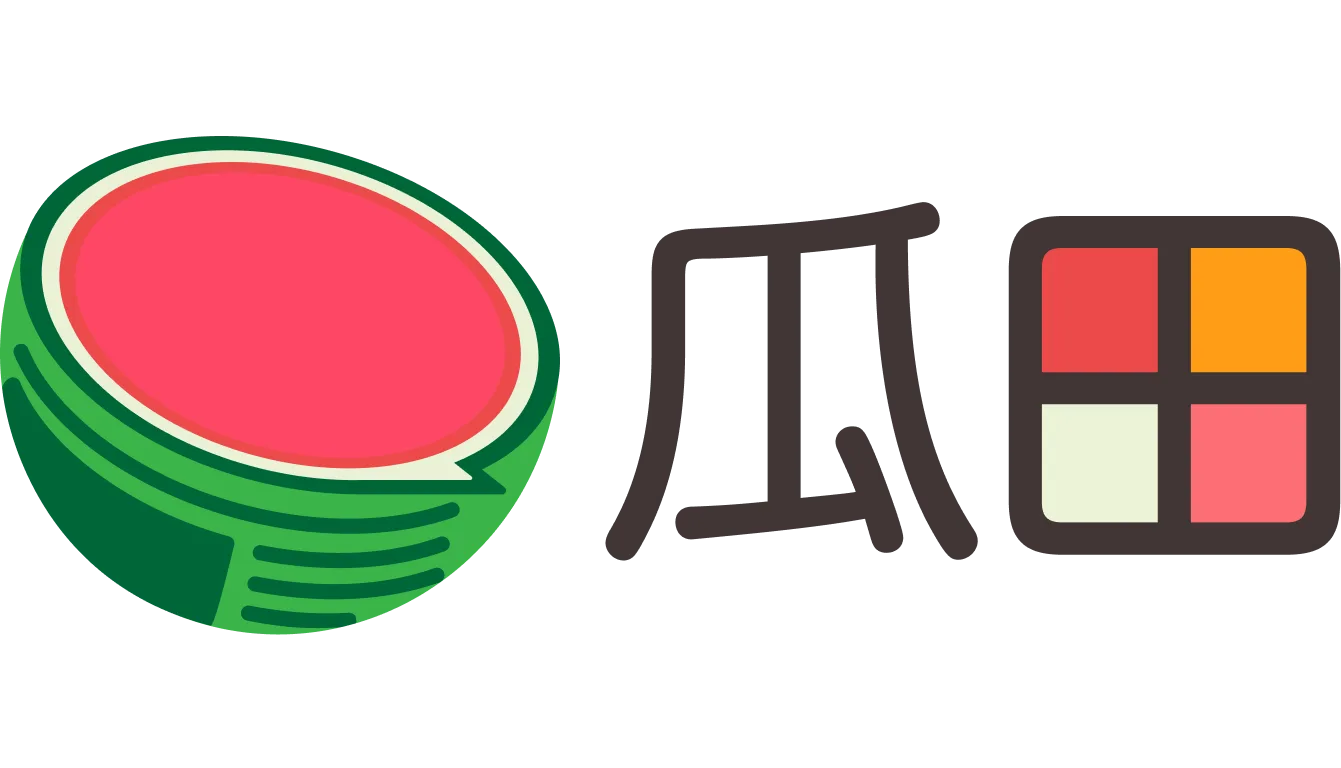
Melon Logo Breakdown
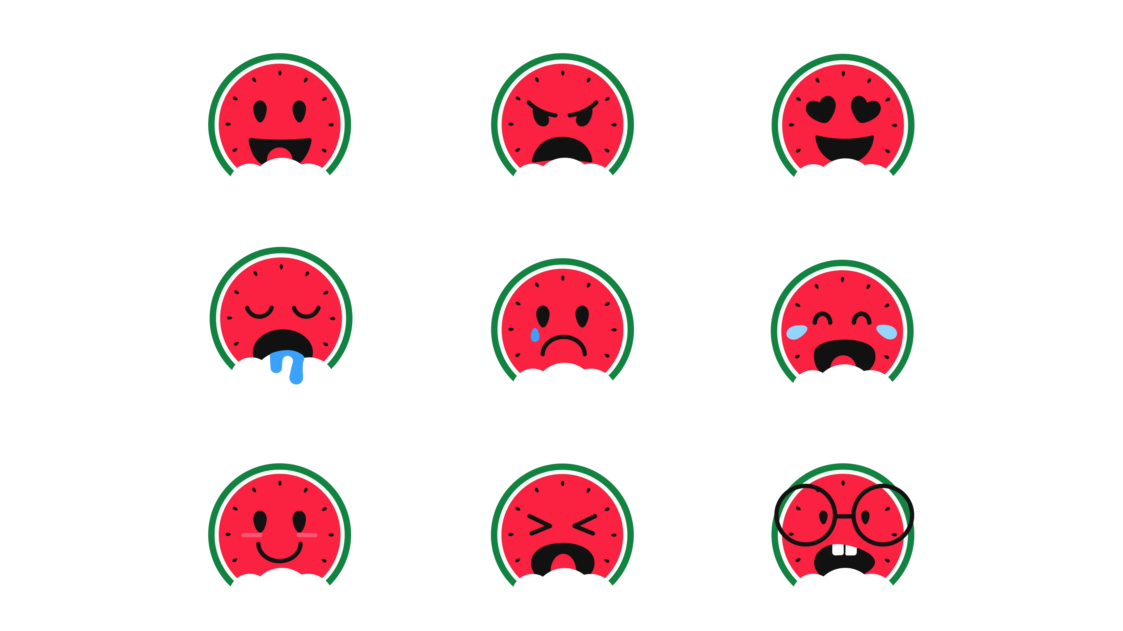
Emoji Alternative
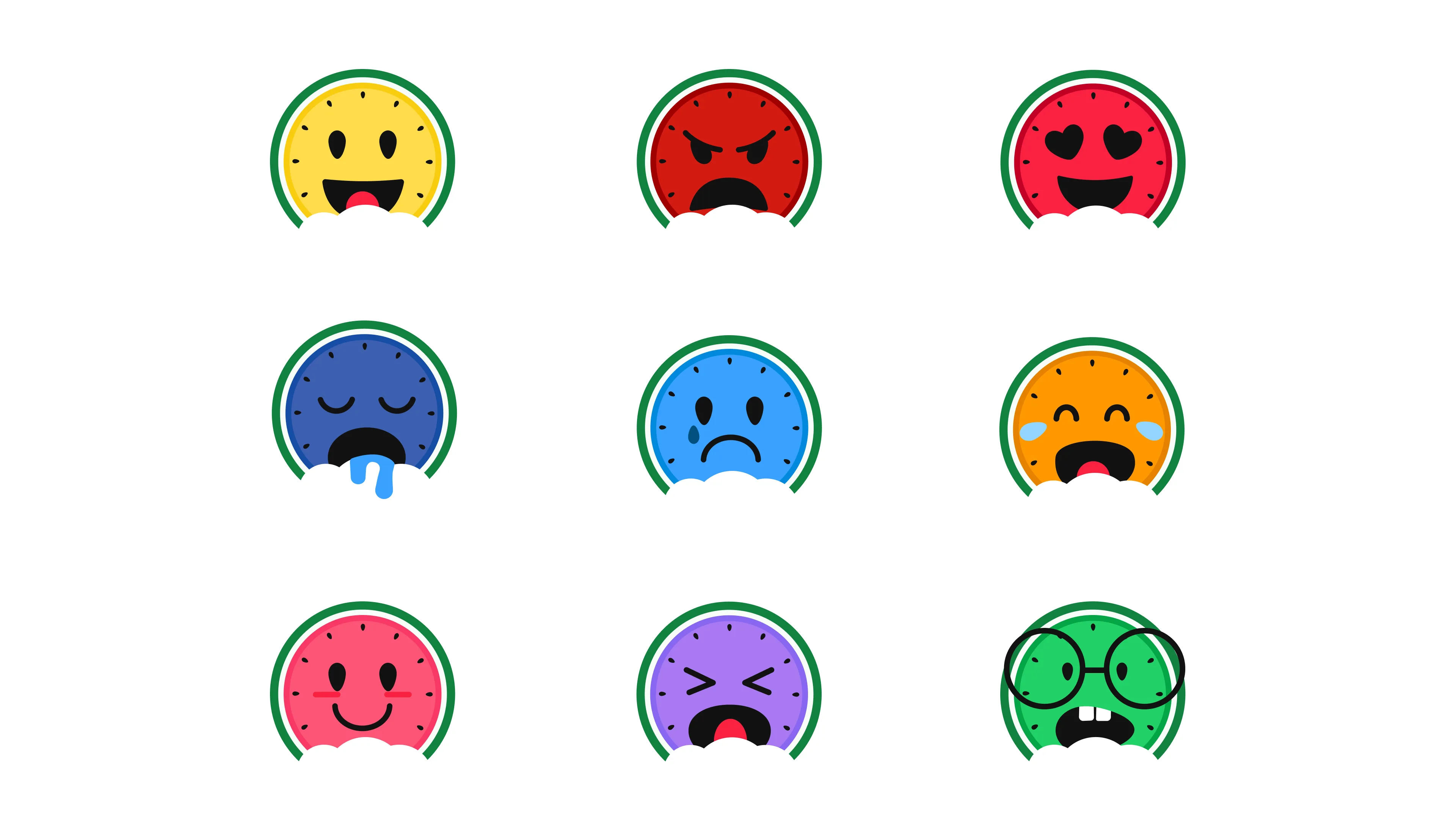
Melon Emojis Colorful Alternative
Style Guide
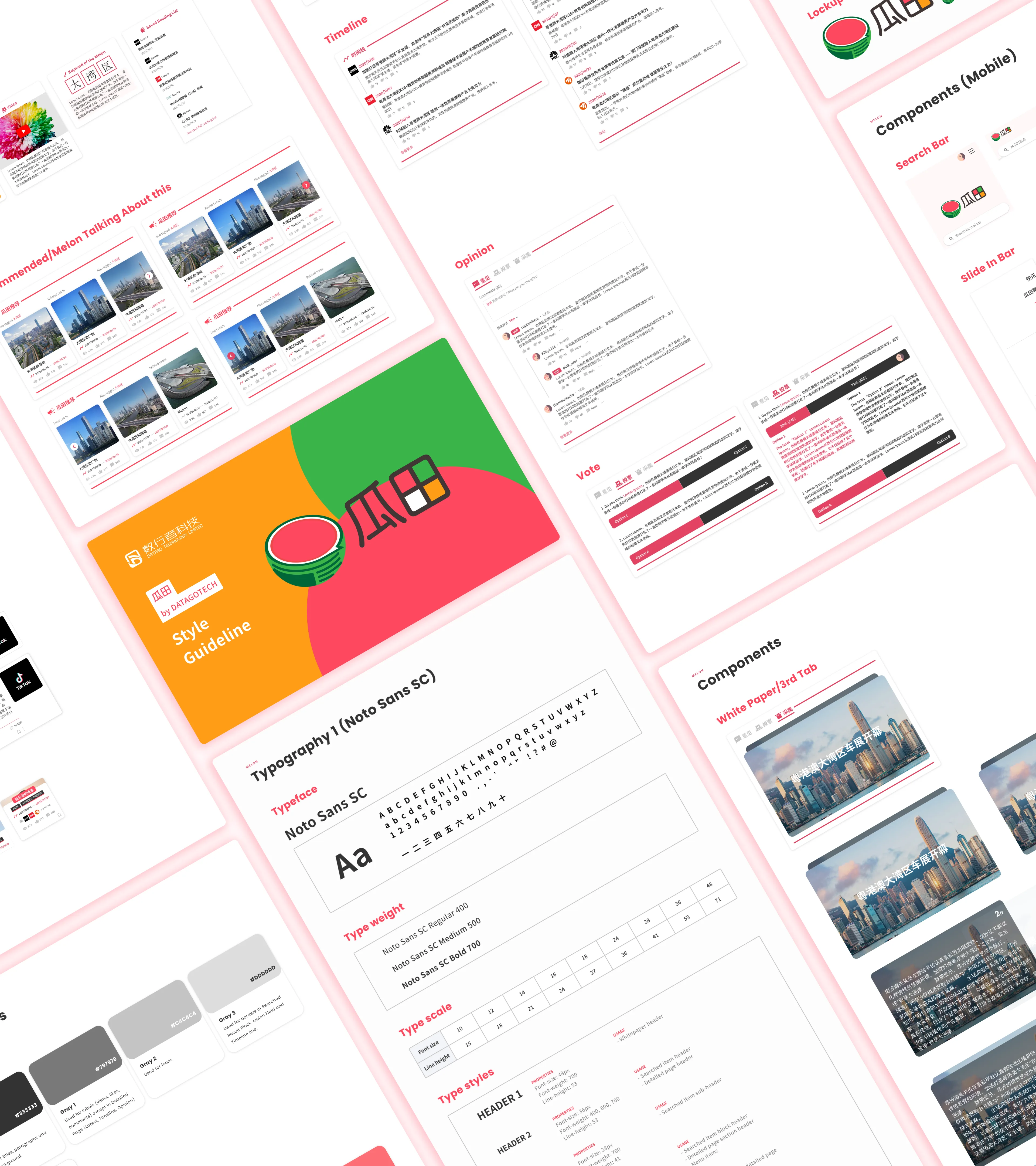
Melon Styleguide
Colors Themes
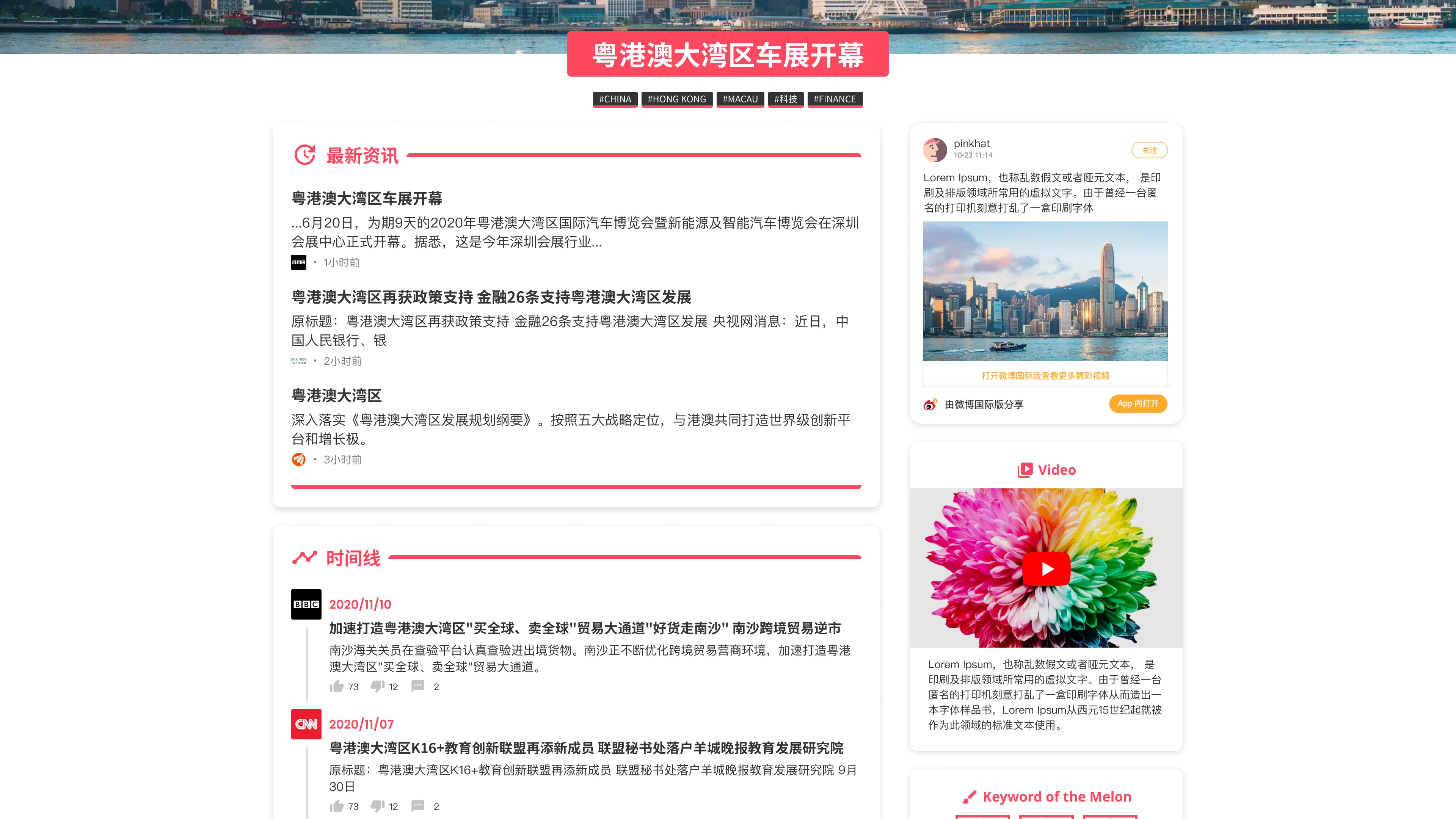
We could further incorporate the Chinese character "田" in the logo to illustrate a variety of topics with different colors in the UI design as well.
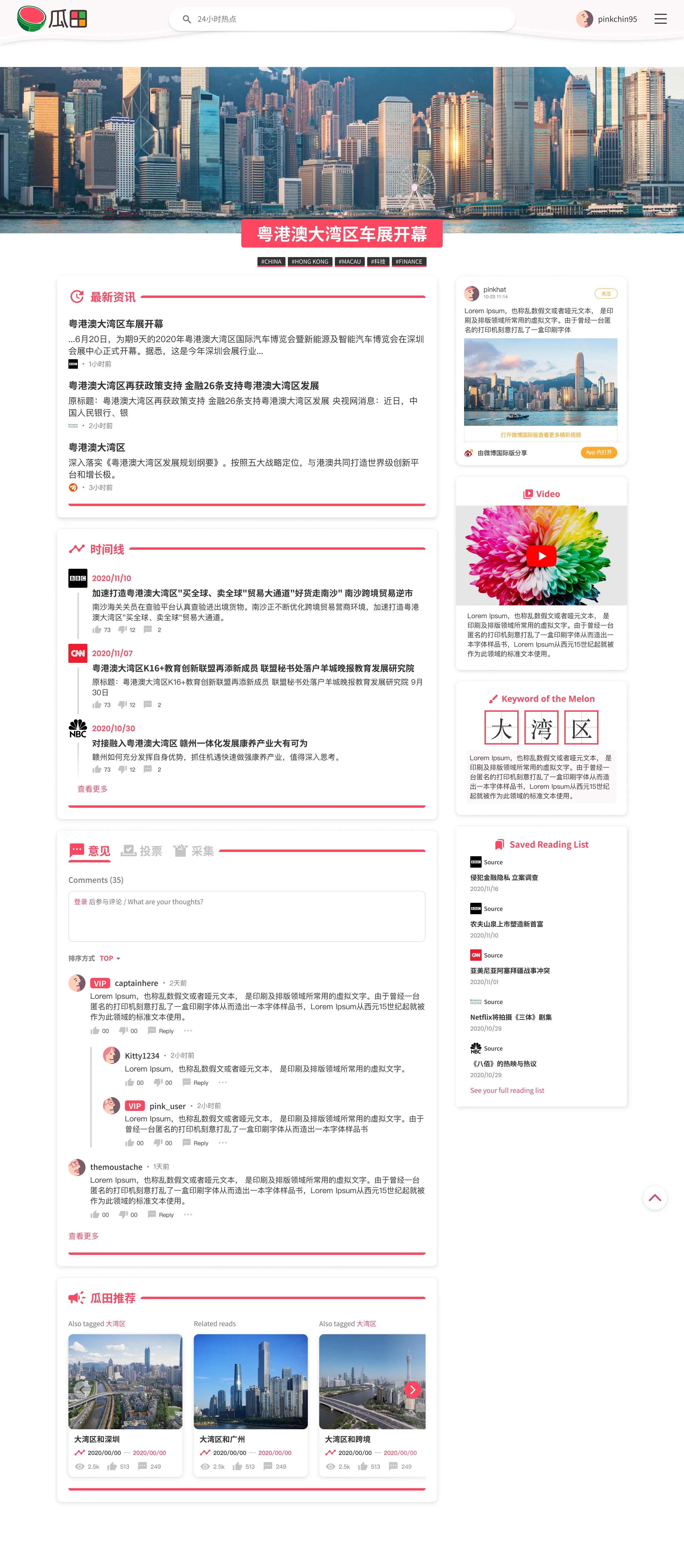
Melon Pink Site Theme
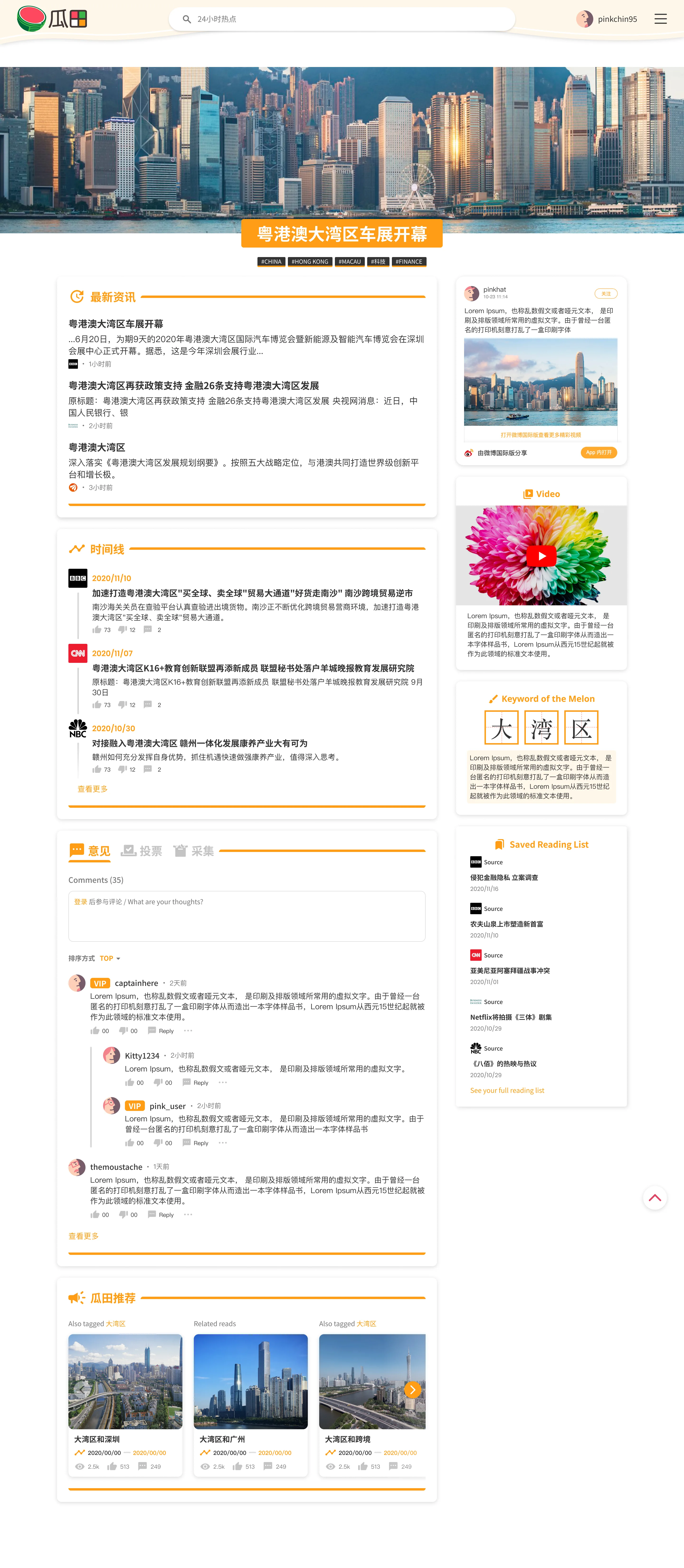
Melon Orange Site Theme
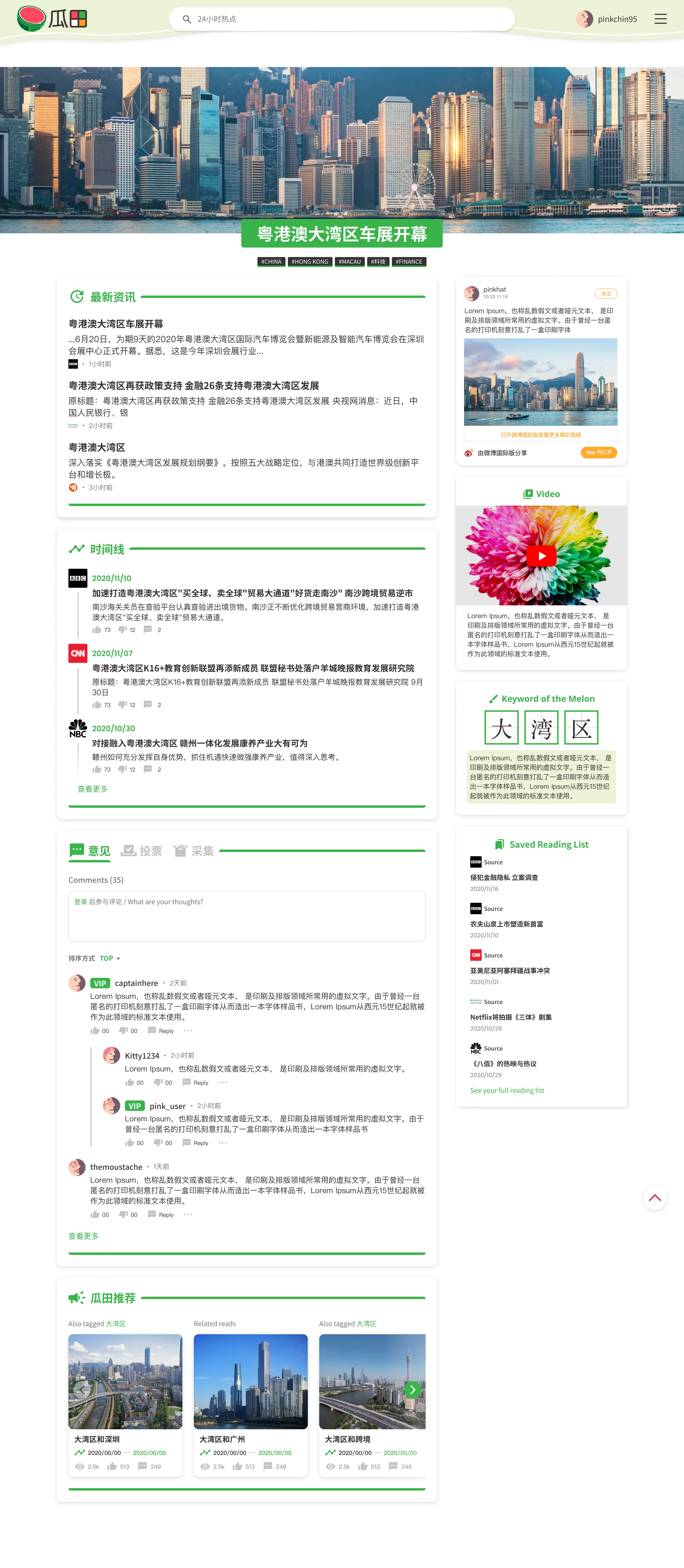
Melon Green Site Theme
Melon Brown Site Theme