Neuromatics (Trials)
OVERVIEW
Trials is a web application that allows doctors to create clinical trials for participants. These trials are the primary means through which researchers evaluate if a new type of treatment or prevention, such as a new medicine, diet, or medical gadget, is both safe and effective in humans. At the time of writing, this is being used in America and Mexico.
TIMELINE
June 2022 - Dec 2022
MY ROLE
UX/UI Designer
THE TEAM
Solo designer, CEO, and 2 developers
TOOLS USED
Figma
The Breakdown
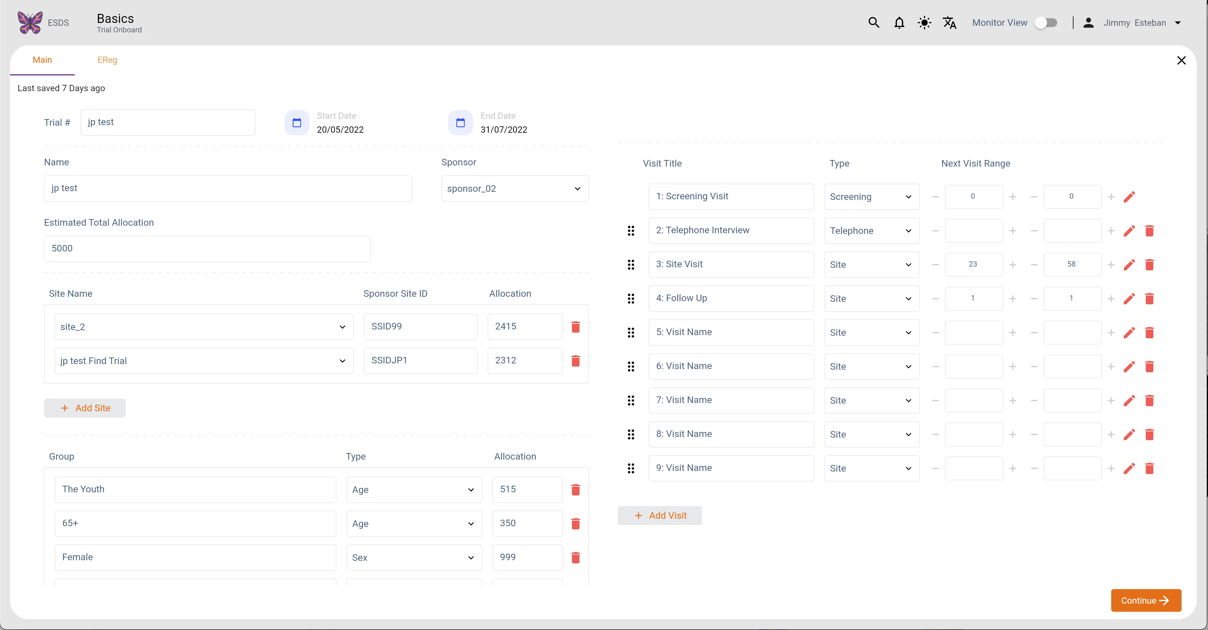
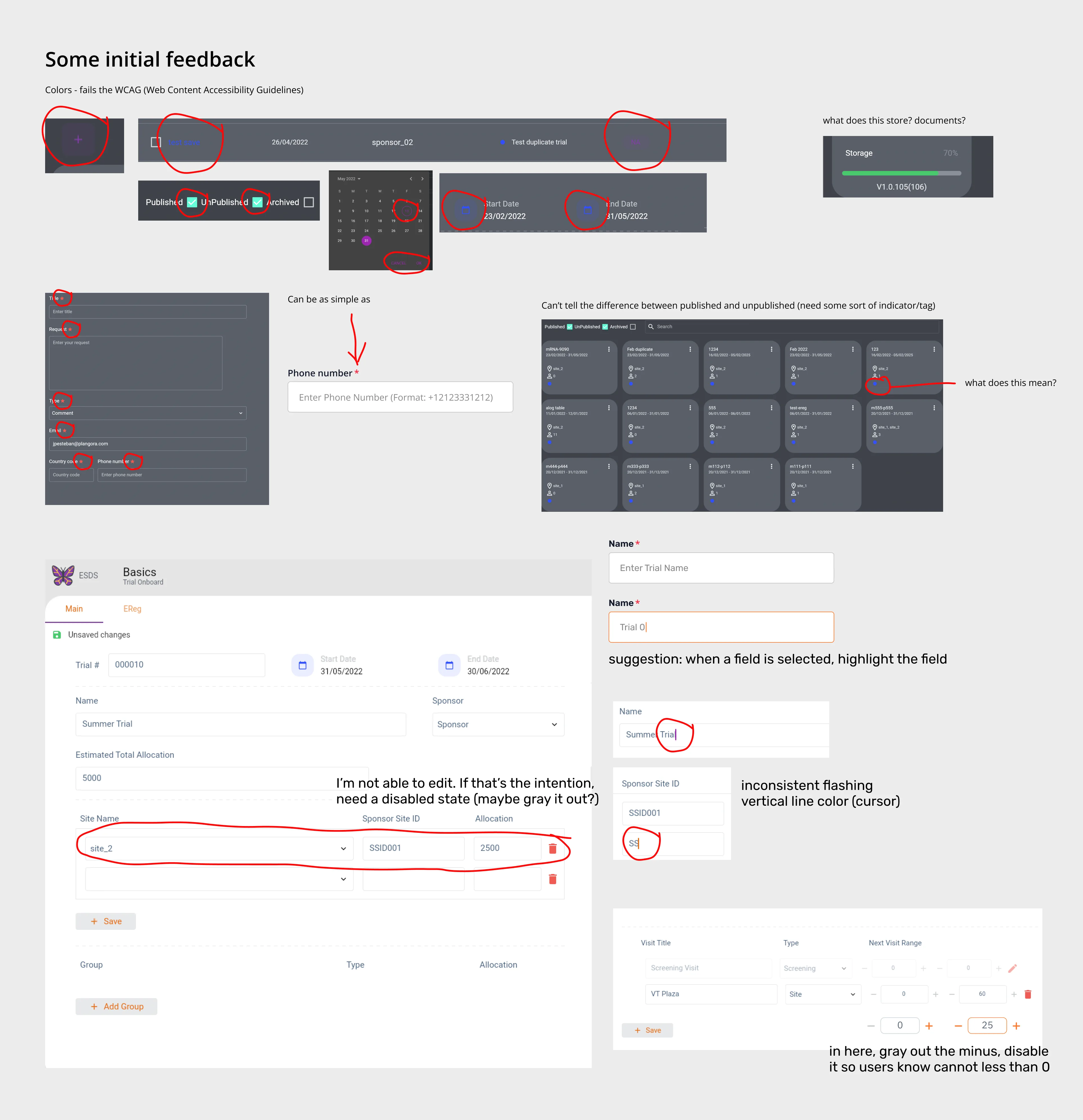
I was given the task of redesigning the entire application. At first glance, UI-wise, the colors in the dark mode failed the accessibility guidelines, the blue dot indicator isn't apparent what it represents, and some fields aren't editable, if that's the intention, graying it out would help.
UX-wise, it's just difficult to navigate around; generating a new form through the form builder is a pain; and when you have a long list of checklist items, you have to scroll to the end in a little display box to simply add a new item and to remove an item, you have to horizontally scroll to the end when an item's width is long. There are numerous things to say about this application; it seems rushed, and doctors are already using this in their workflow.
Trials (Light Mode)
Trials (Dark Mode)
Trials Main (Light Mode)
Trials Main (Dark Mode)
Templates Main (Light Mode)
Templates Main (Dark Mode)
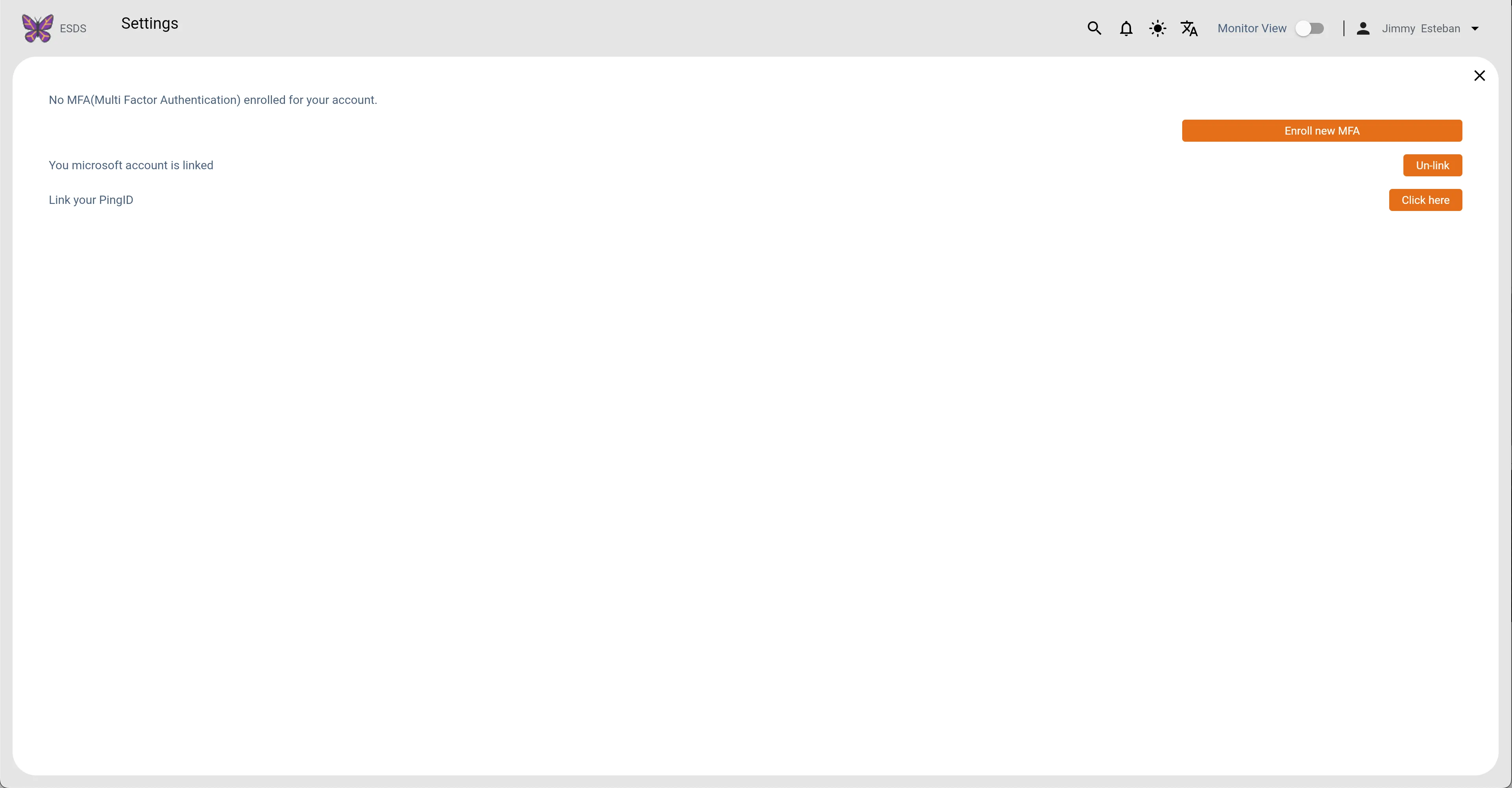
Settings (Light Mode)
Settings (Dark Mode)
First Glance
Research & Findings
There appears to be no documentation on this project other than the user interfaces; thus, I have to proceed somewhat from the beginning, starting with user research to the information architecture.
In general, they require a platform that aids in the centralization and organization of data. By providing doctors and their assistants with an efficient system for handling patient and trial data, healthcare practitioners may work more efficiently, discover areas for improvement, and ultimately devote more of their time and energy to delivering better medical outcomes.
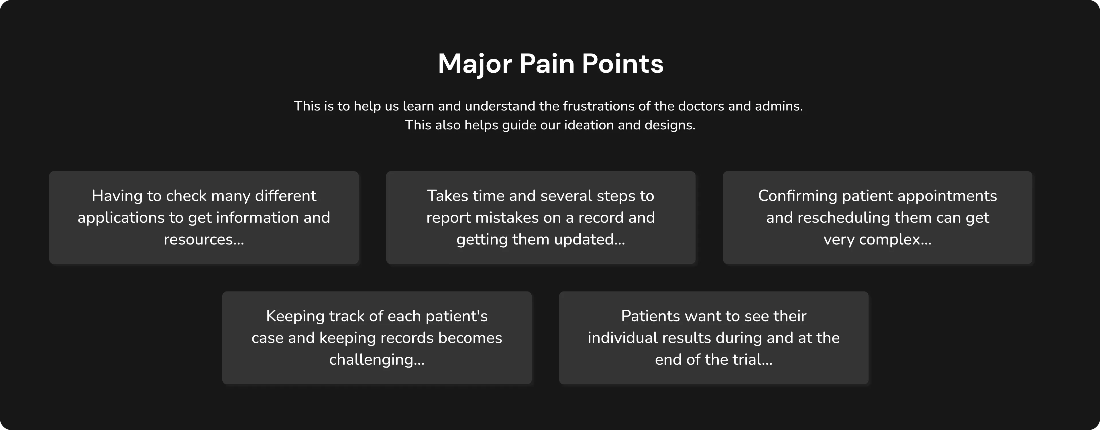
Major Pain Points
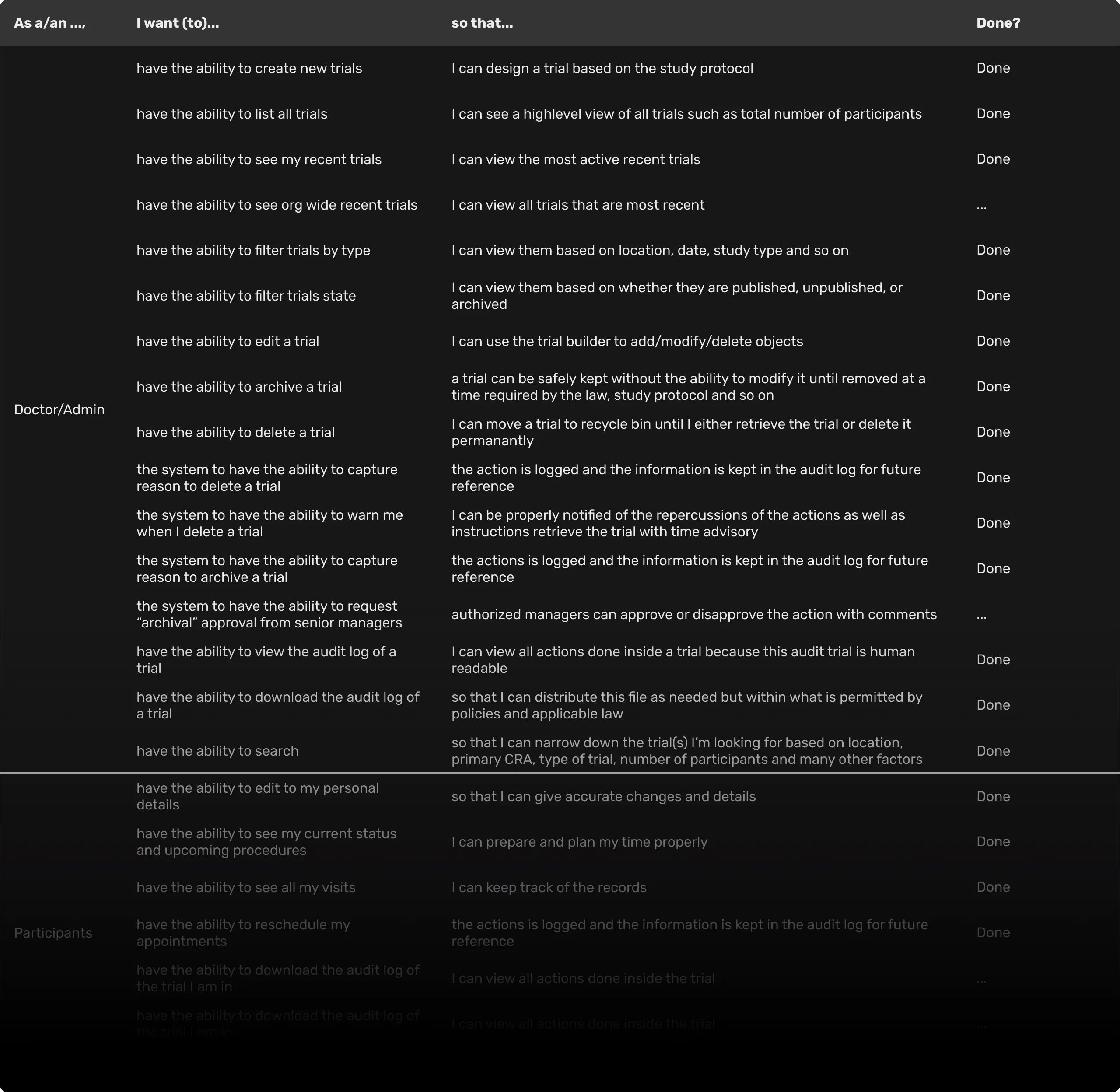
As I Want To Do That...
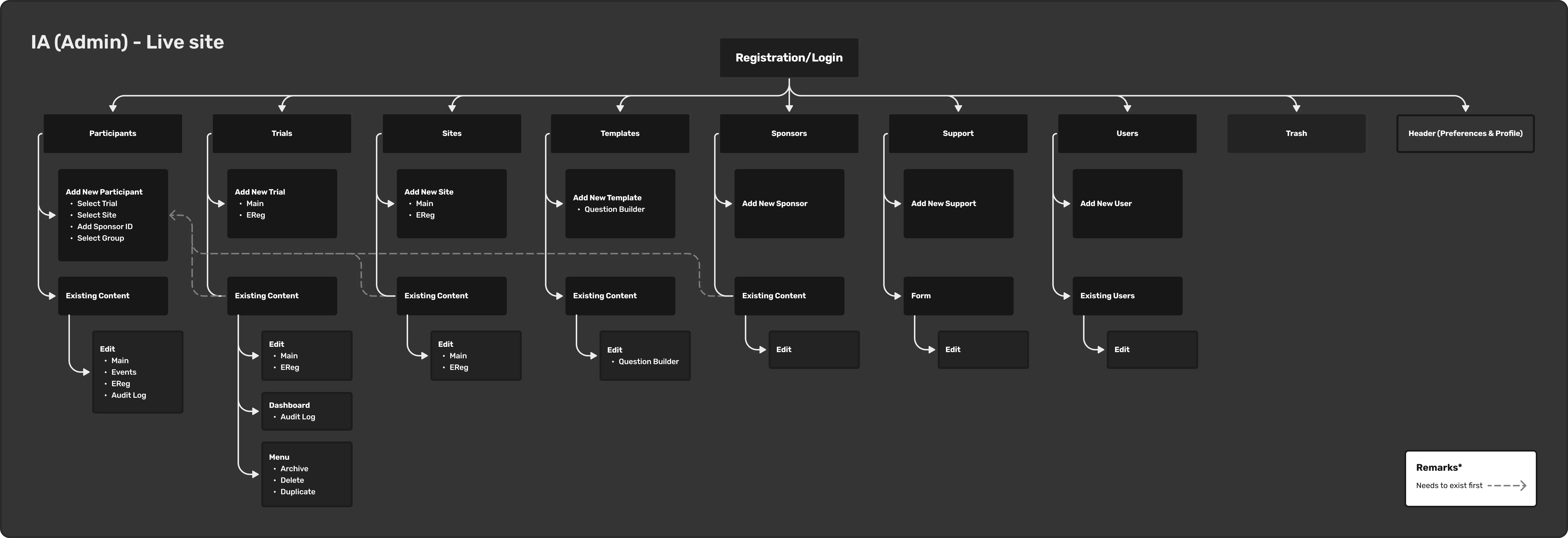
IA Admin
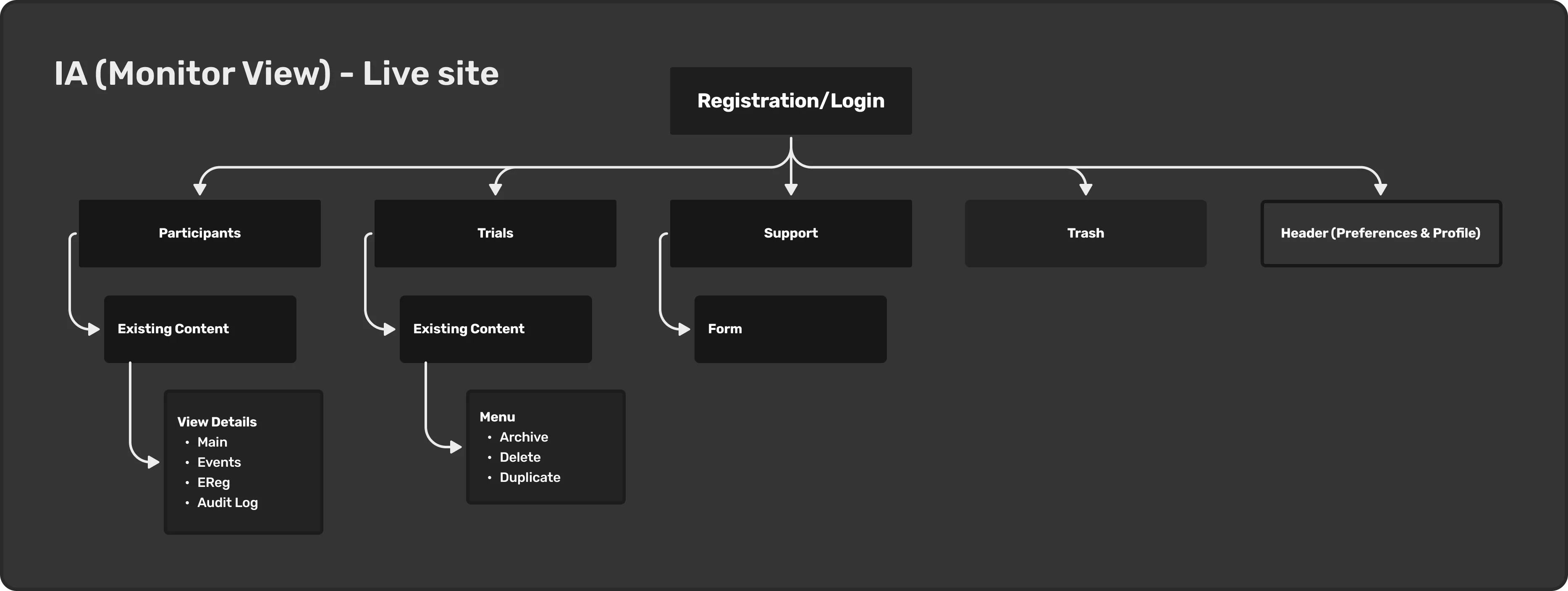
IA MonitorView
Design System
As the sole designer, I created the Design System in Figma, which allows for consistent design and the ability to swiftly swap and adjust elements in the UI such as colors, fonts, icons, and UI components especially having both light and dark themes. This also aids the development process by serving as a guide for the developers working on this project.
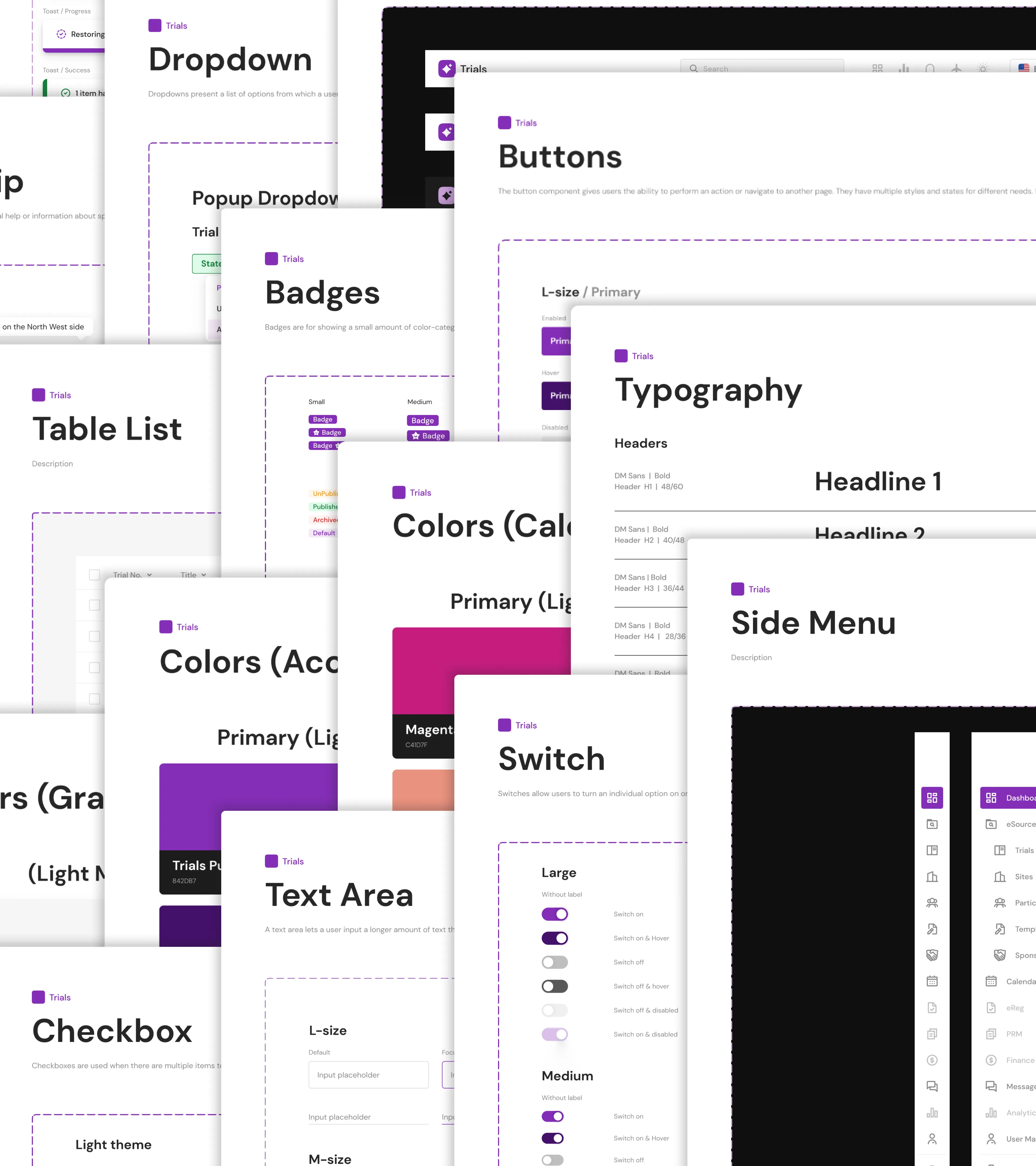
Trials Design System
Prototype
I created a handful of these to aid in further describing some of the desired interactions and to serve as a reference for the developers.
Login
Show/Hide Columns Trials
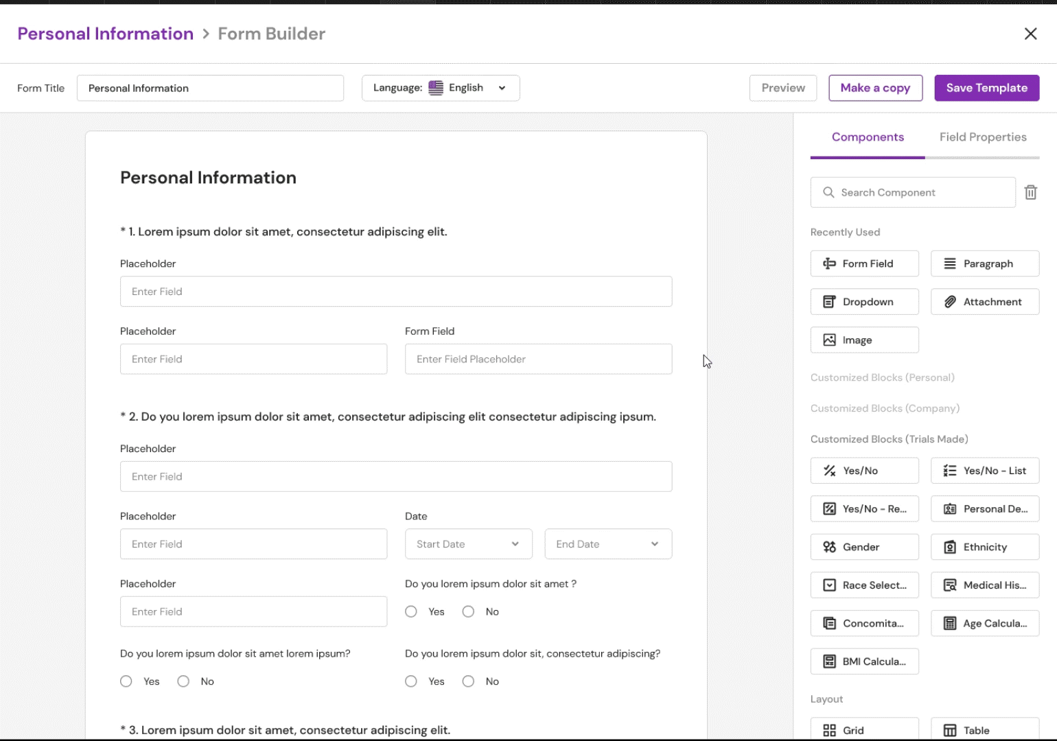
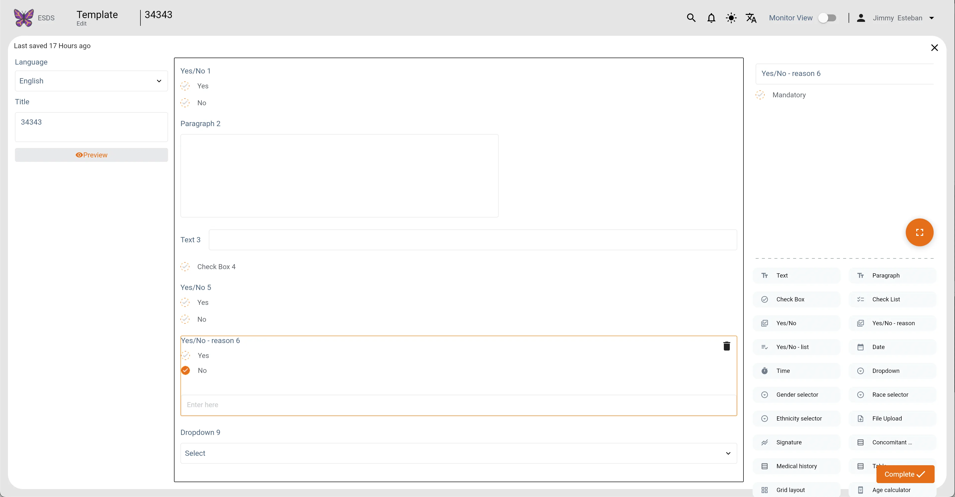
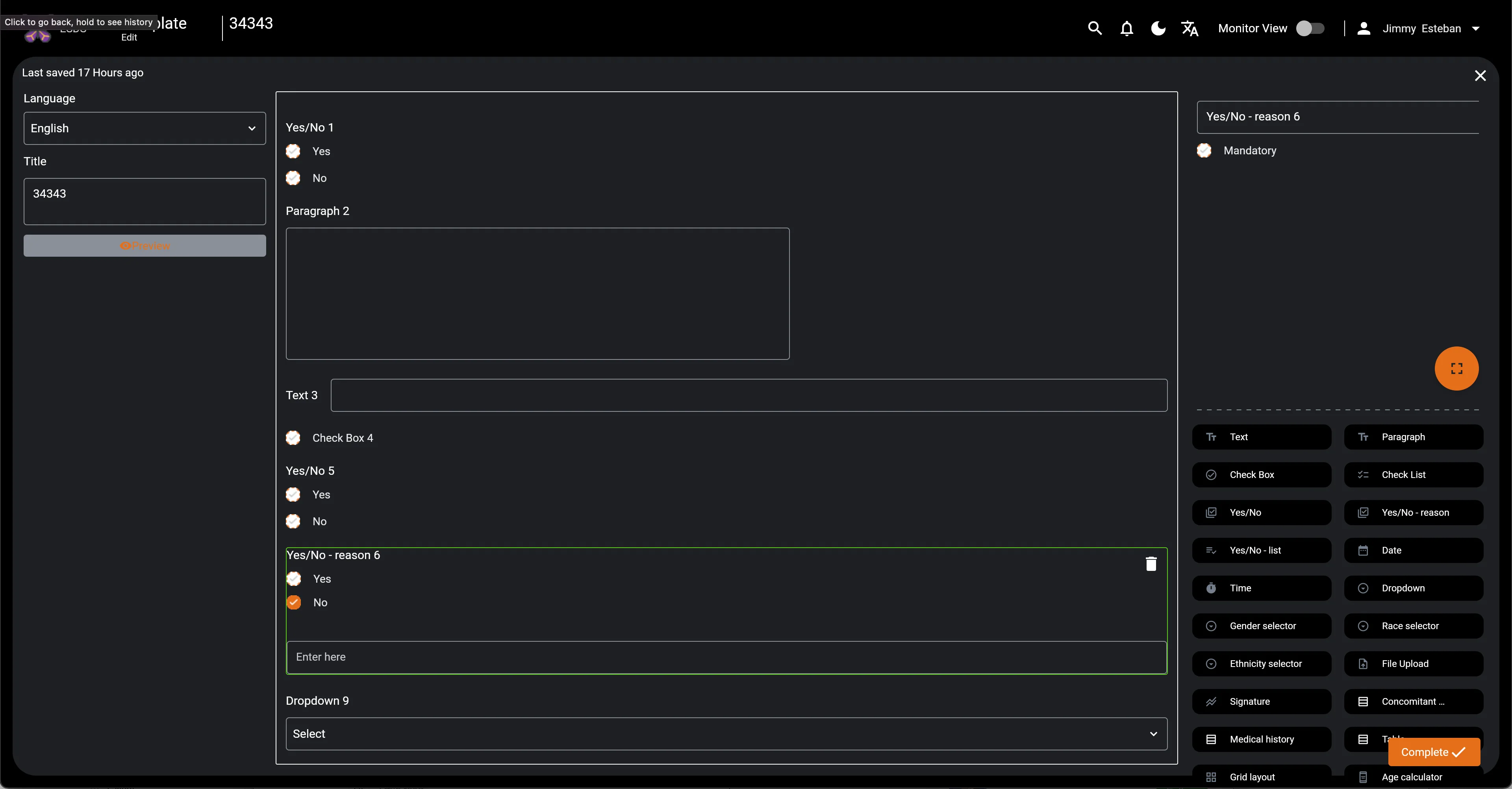
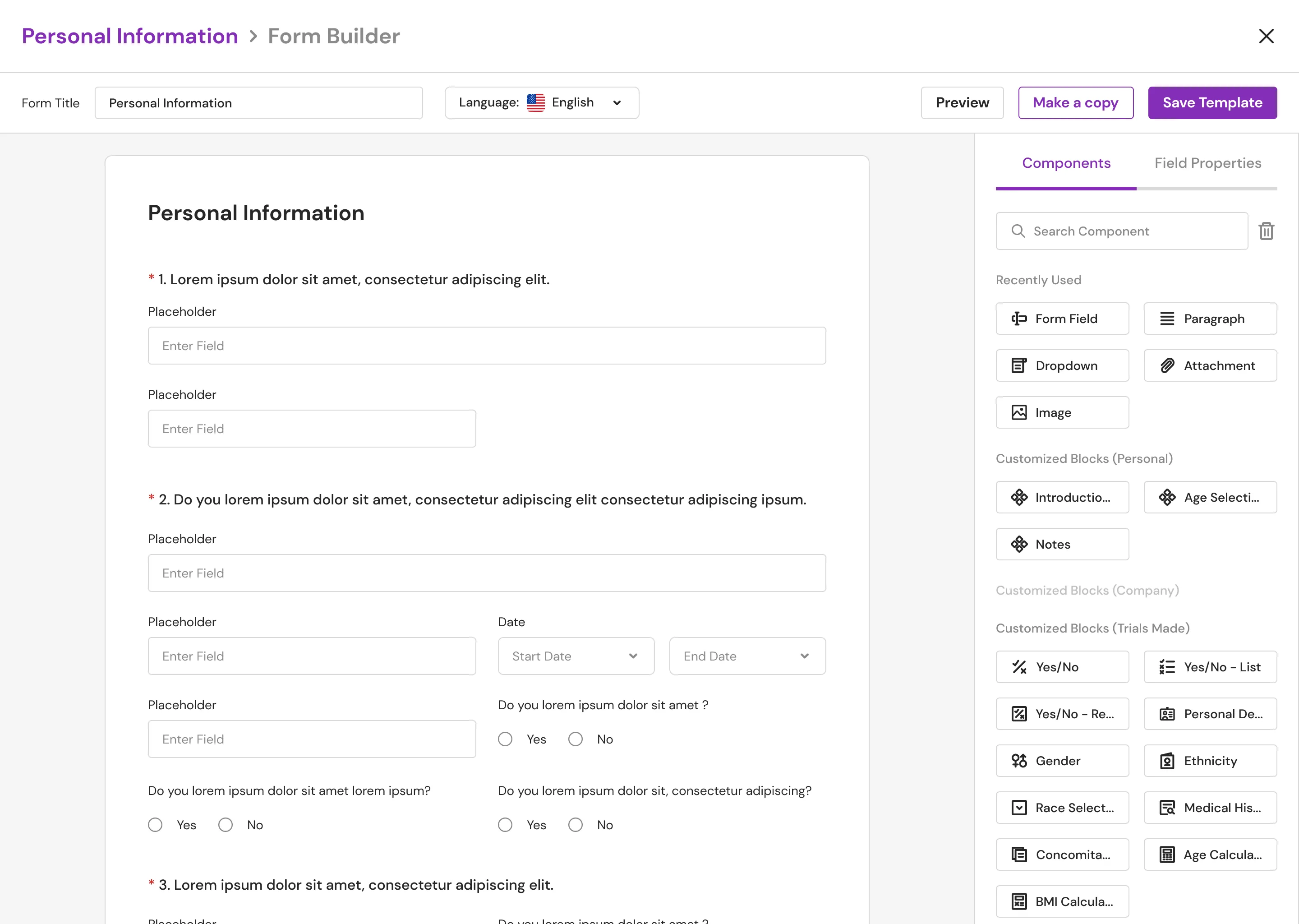
Form Builder: Creating a New Component
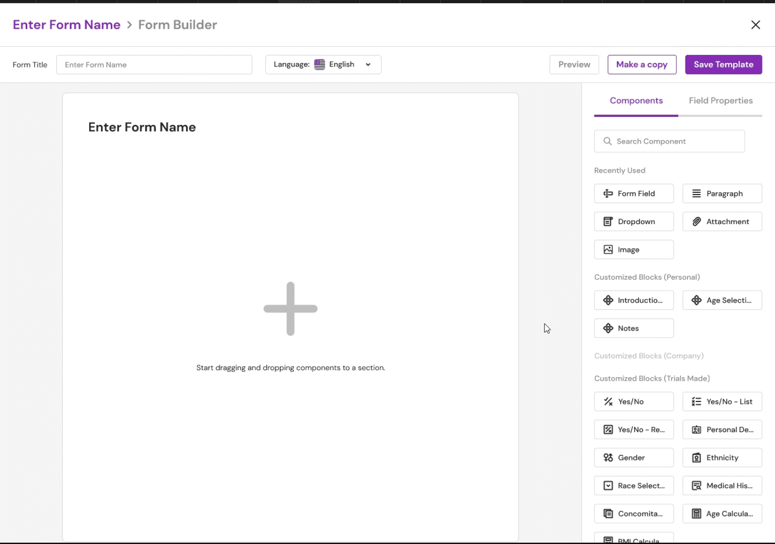
Form Builder: Using a Component
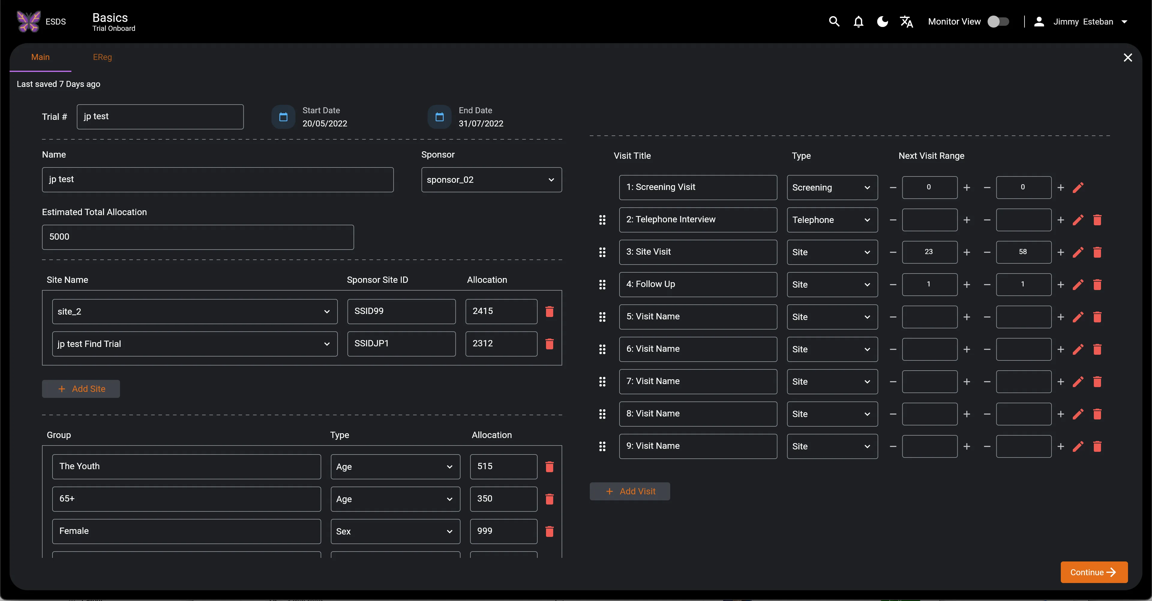
The Redesign
As mentioned in the goal above, colors are failing the accessibility guidelines. In Figma, I heavily relied on the "Stark" plugin to check the contrast ratio. I've also been using the 4-Point Grid System to space things out and to speed up the design and development process. Because the spacing rules have been established, components can always be designed and coded to adhere to these consistent spacings.
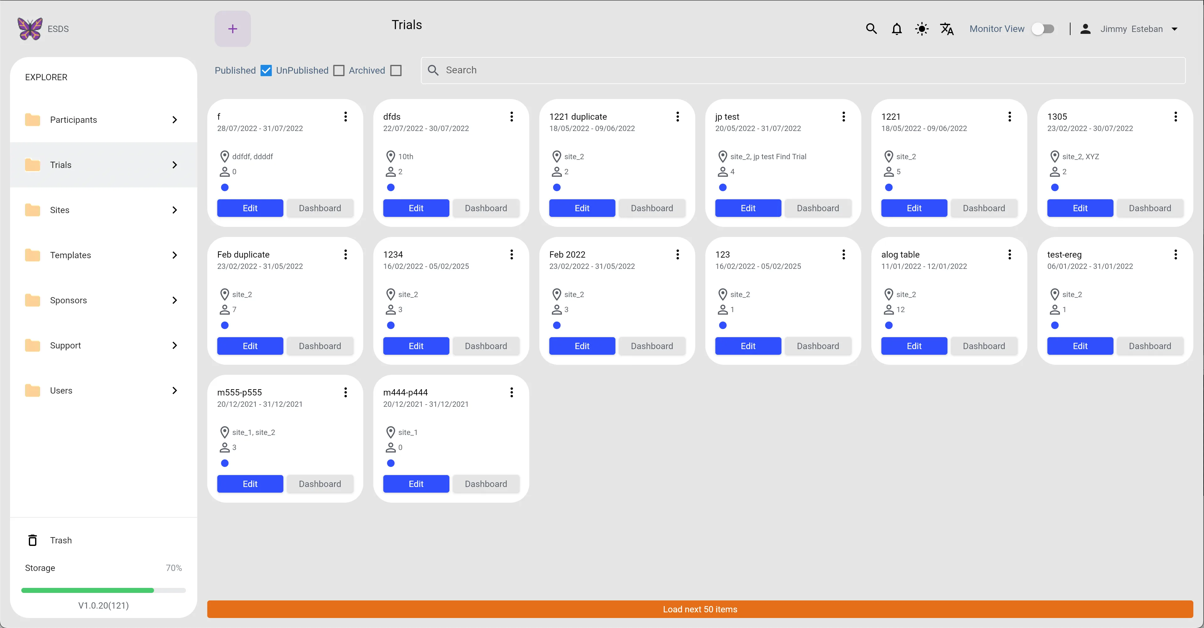
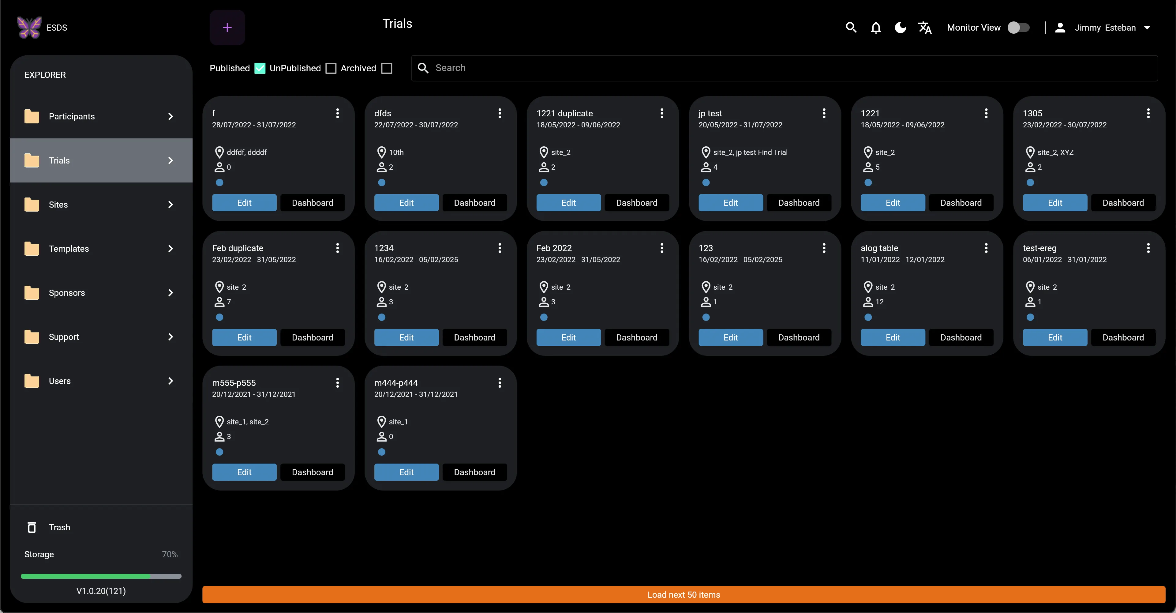
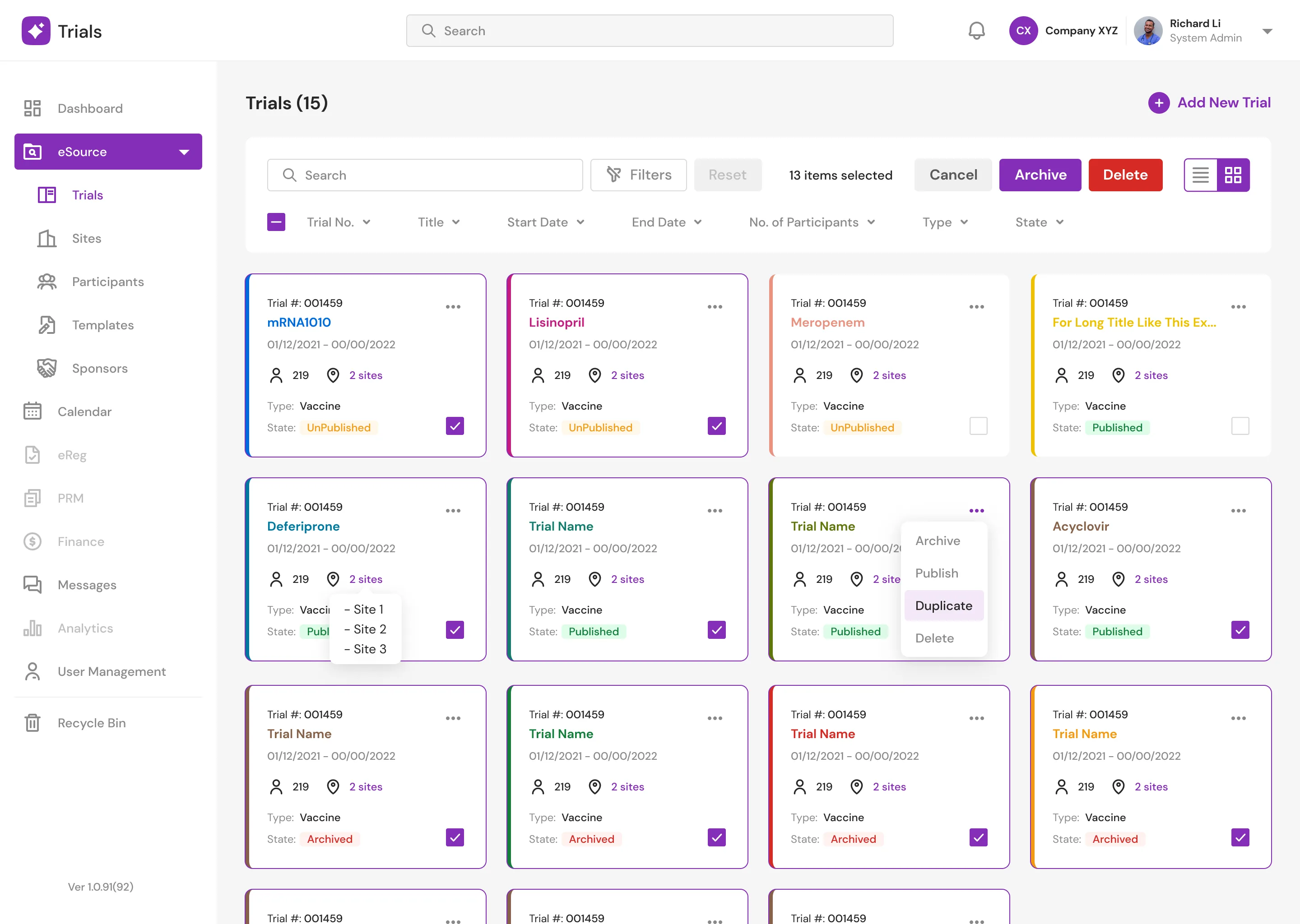
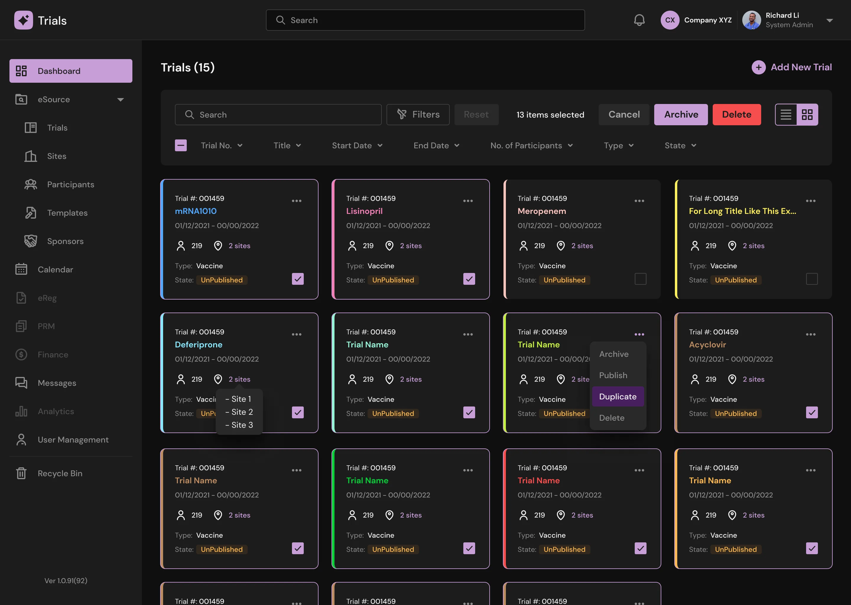
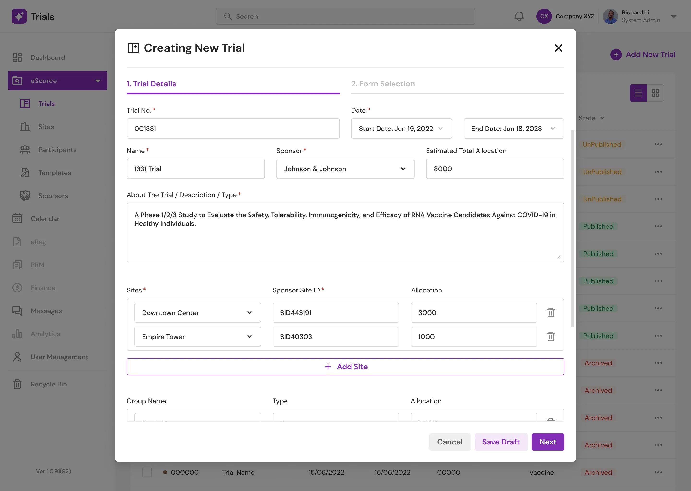
Trials Page
There's no telling the cards apart if we check Published, UnPublished, and Archived. As a result, I added a status section to each card. As more trials are created, we will require a filtering feature, which the previous design did not provide. Also, because some users prefer to view the information in a different way, I included an additional viewer mode (list mode or grid mode).
Trials (Light Mode)
Trials (Light Mode) New
Trials (Dark Mode)
Trials (Dark Mode) New
Trials Main (Light Mode)
Trials Main (Light Mode) New
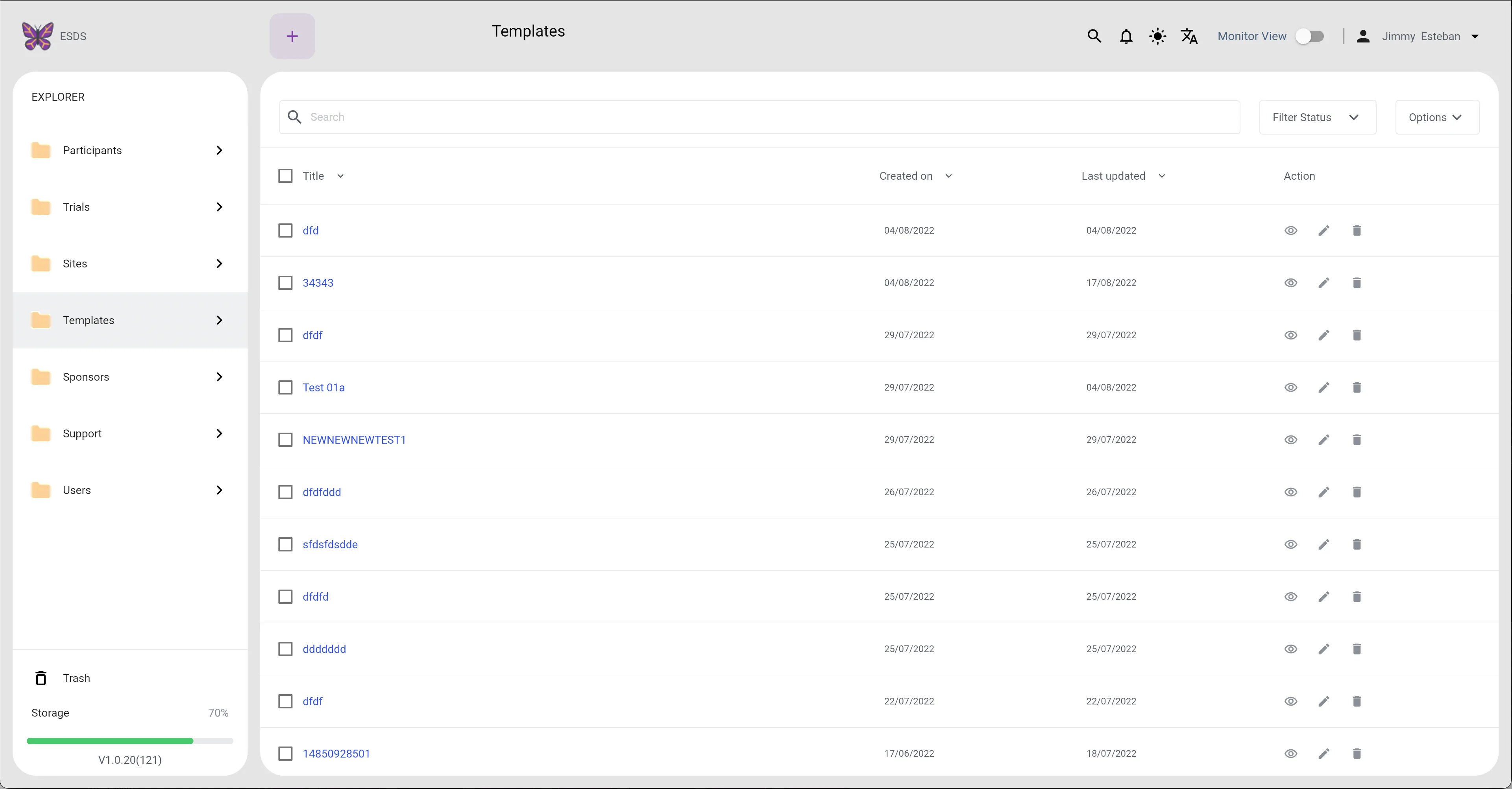
Templates Page
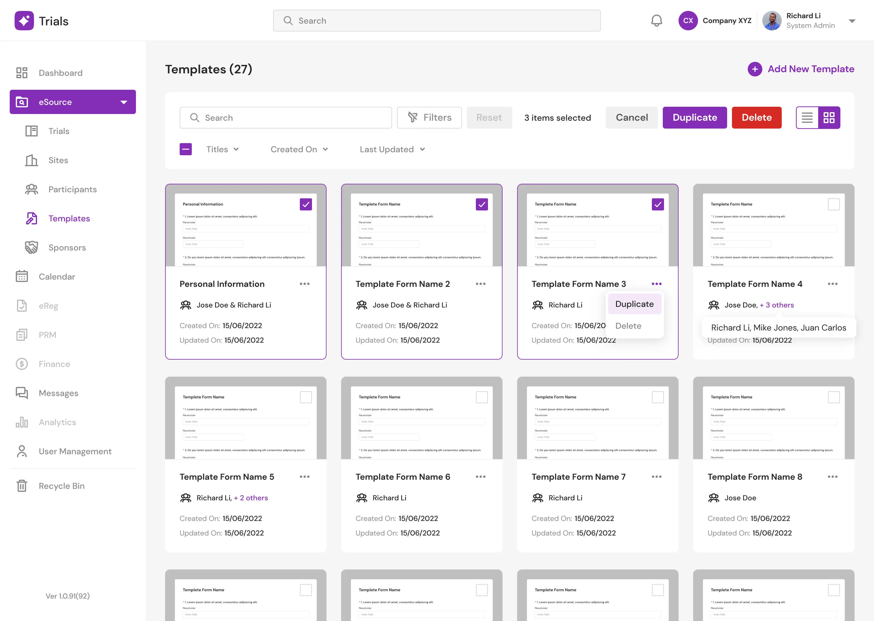
Templates are collections of forms designed by doctors. This page as well will require filtering. Doctors can see a preview of the form in grid view mode, which I think is a nice feature to have. Doctors can also see who helped create or edit the form.
As stated in the goal, the form builder can be difficult to use, and there will be a horizontal scroll when the width of an item exceeds the screen width. To address this issue, I added new component blocks. Doctors can also create new component sets that can be used by others within the same organization. The system also includes some starter component blocks to assist users in getting started.
Templates (Light Mode)
Templates Grid View
Templates Main (Light Mode)
Templates Main (Light Mode) New
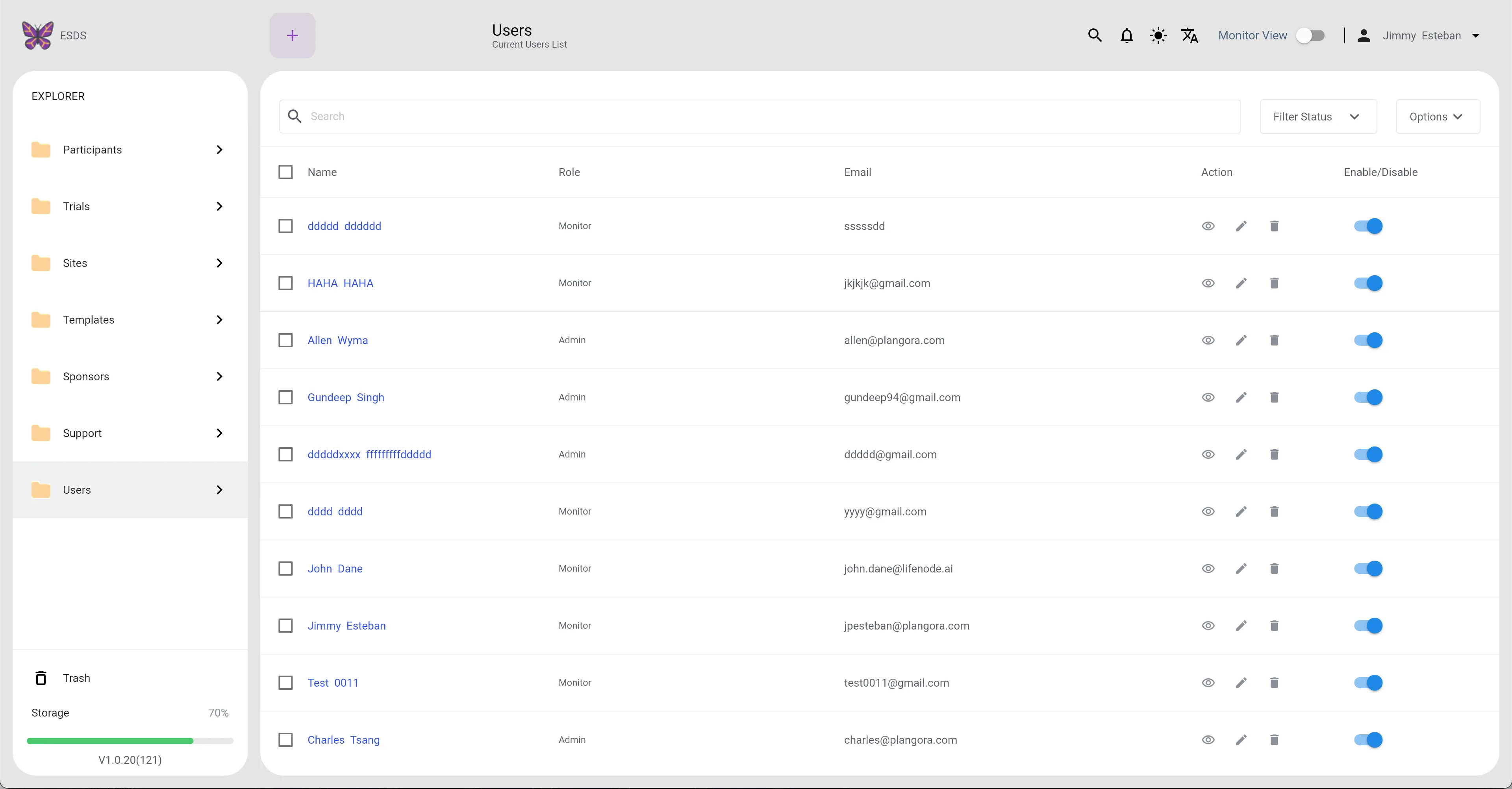
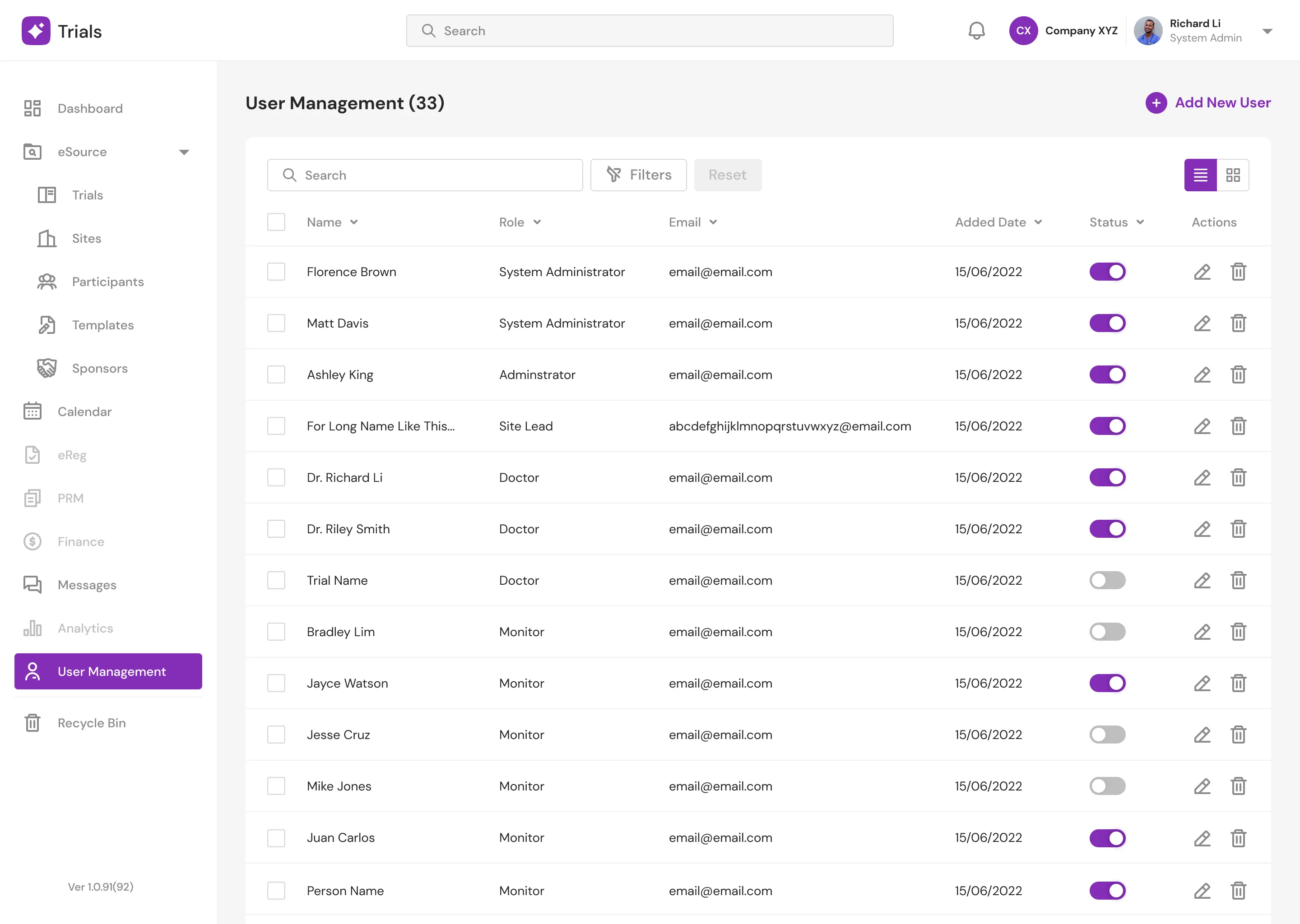
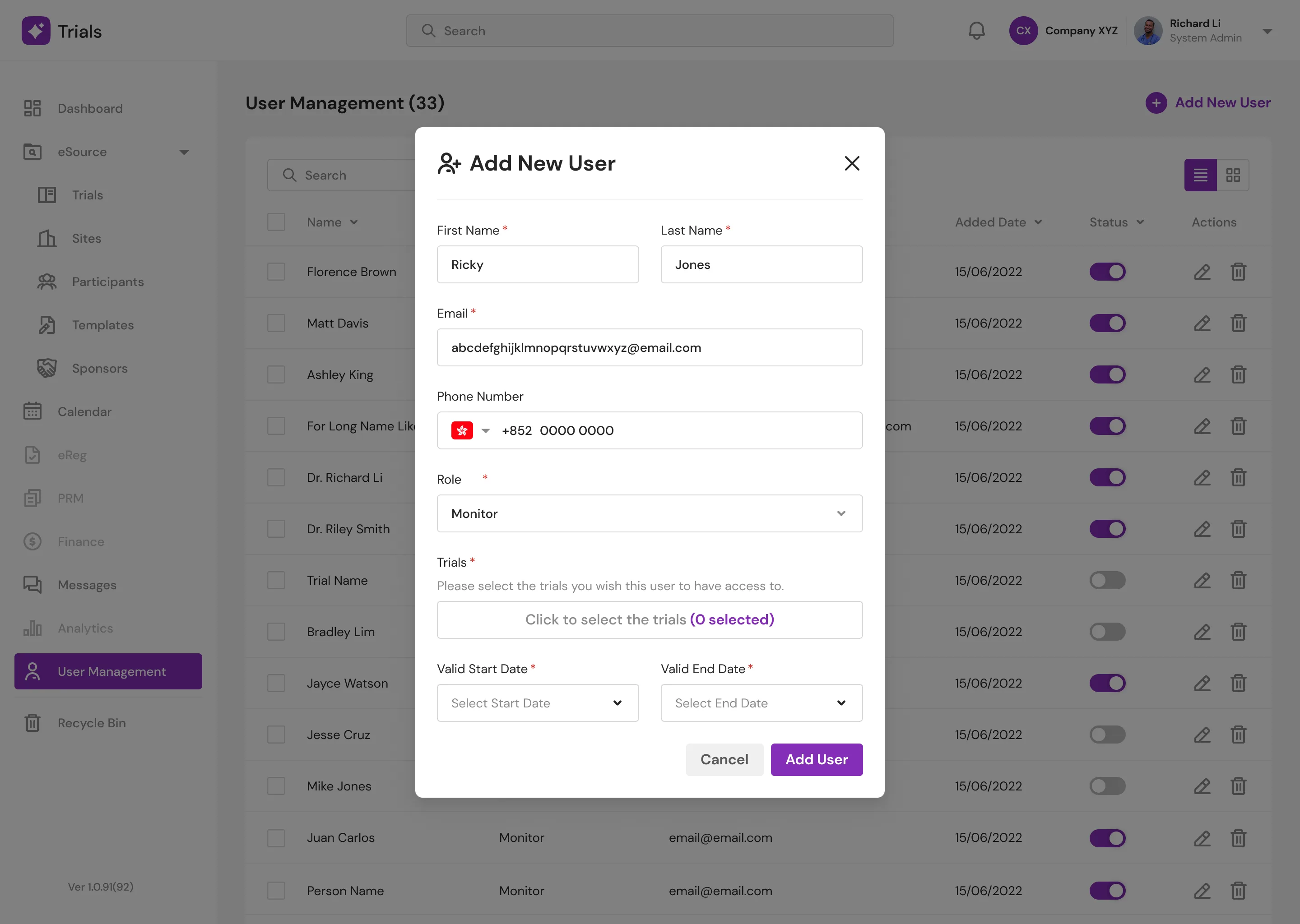
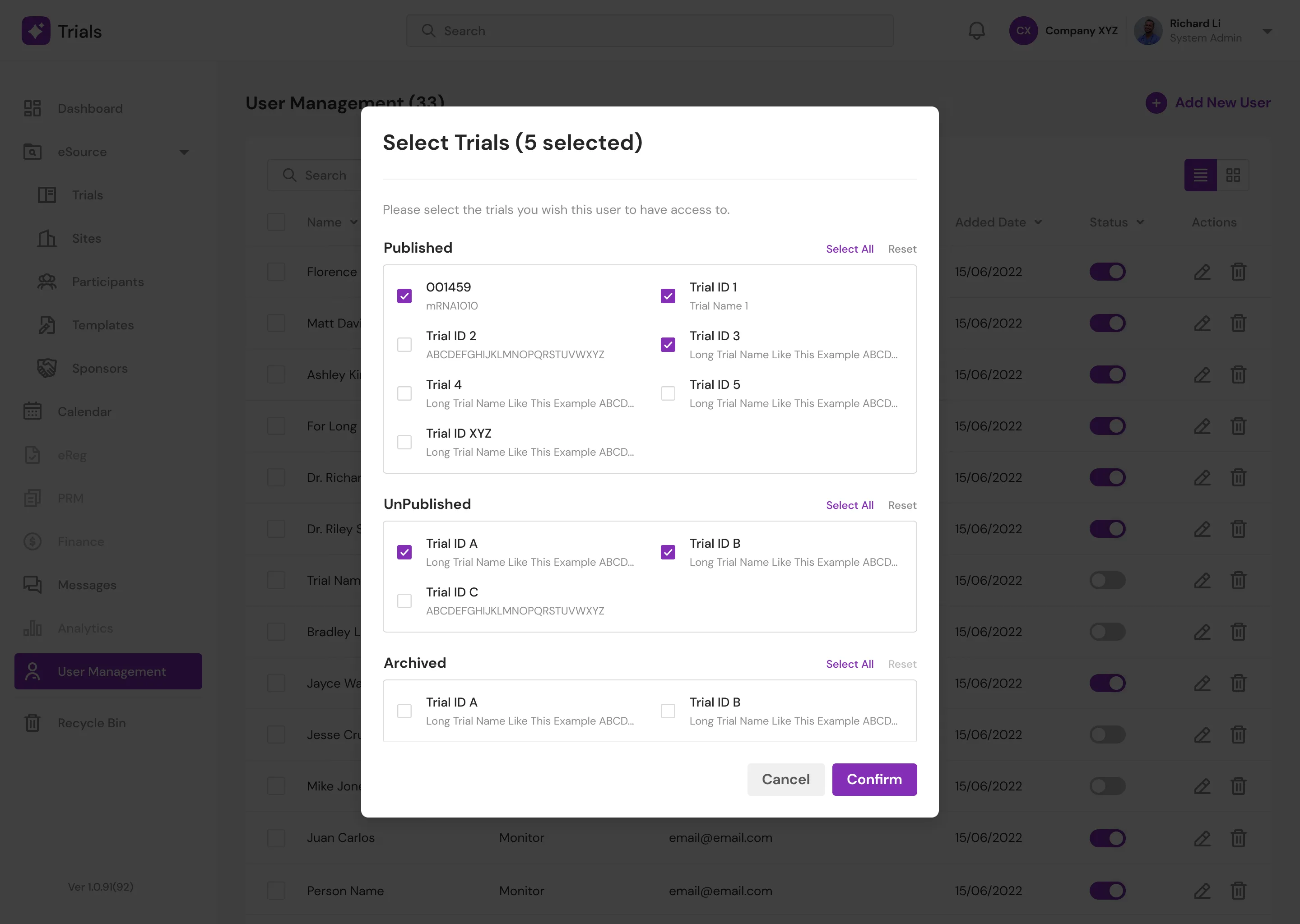
User Management Page
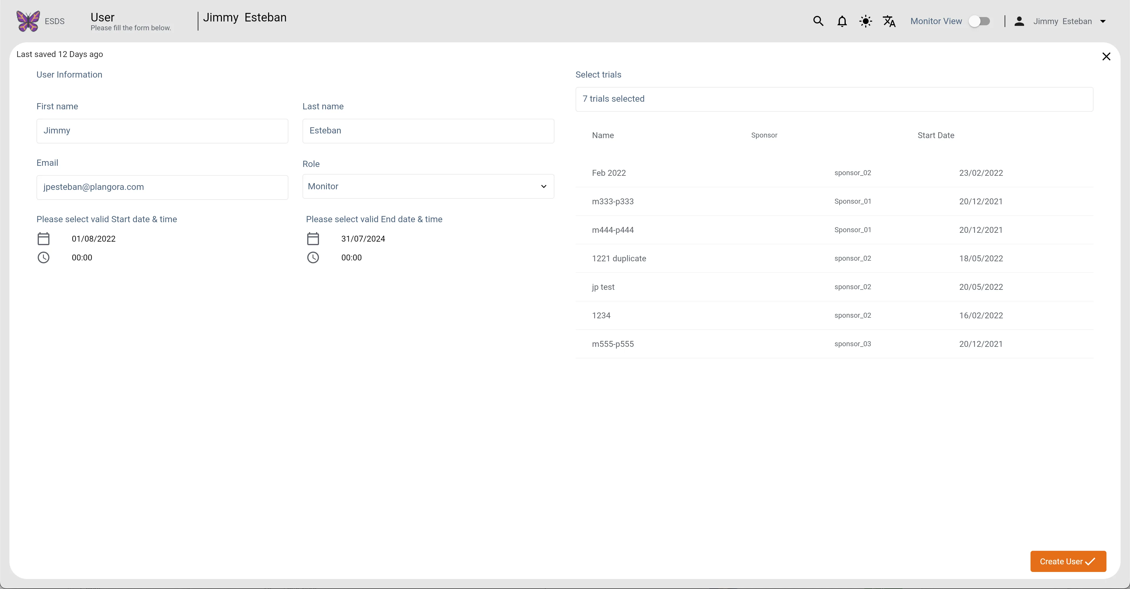
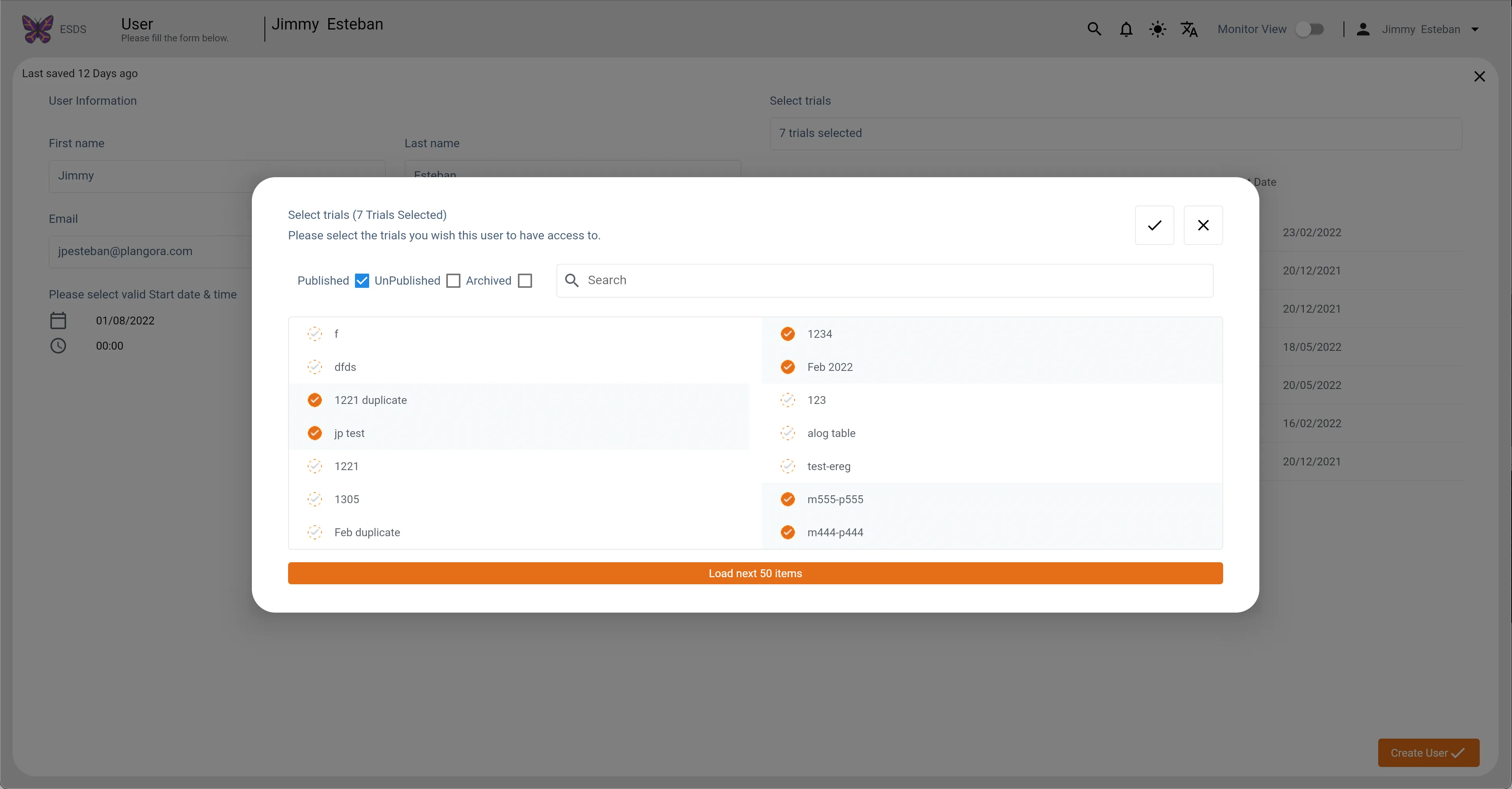
This page enables doctors to assign and manage "Monitors" which are their subordinates in the" Trials" to which they are assigned. There is a lot of white space in the old design to edit or create a new entry. For the amount of content here, a modal is sufficient. Also, when assigning "Trials" and checking all the check boxes, you can't really tell which items are published and which aren't. So I divided the three statues into three containers.
Users (Light Mode)
Users (Light Mode) New
Users Main1 (Light Mode)
Users Main1 (Light Mode) New
Users Main2 (Light Mode)
Users Main2 (Light Mode) New
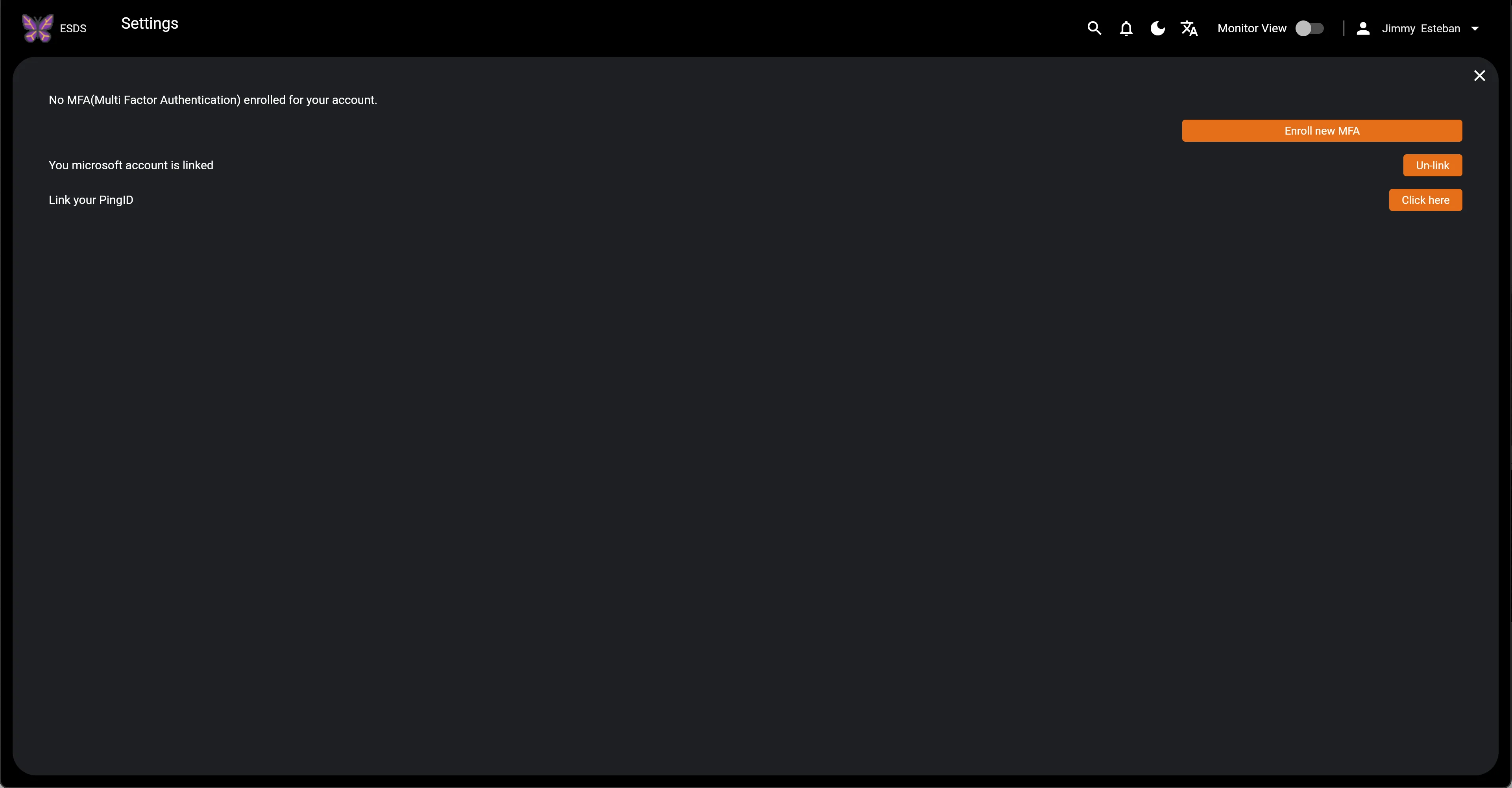
Audit
Audit is a critical component of the platform. It is primarily concerned with the analysis of retrospective data obtained from records. The old design makes it difficult to see what changes are being made. To see the changes, the doctors must submit a request to the Developers/Super Admin, which is super inefficient and time-consuming. As a result, I decided to eliminate this step and simply display it in the new design.
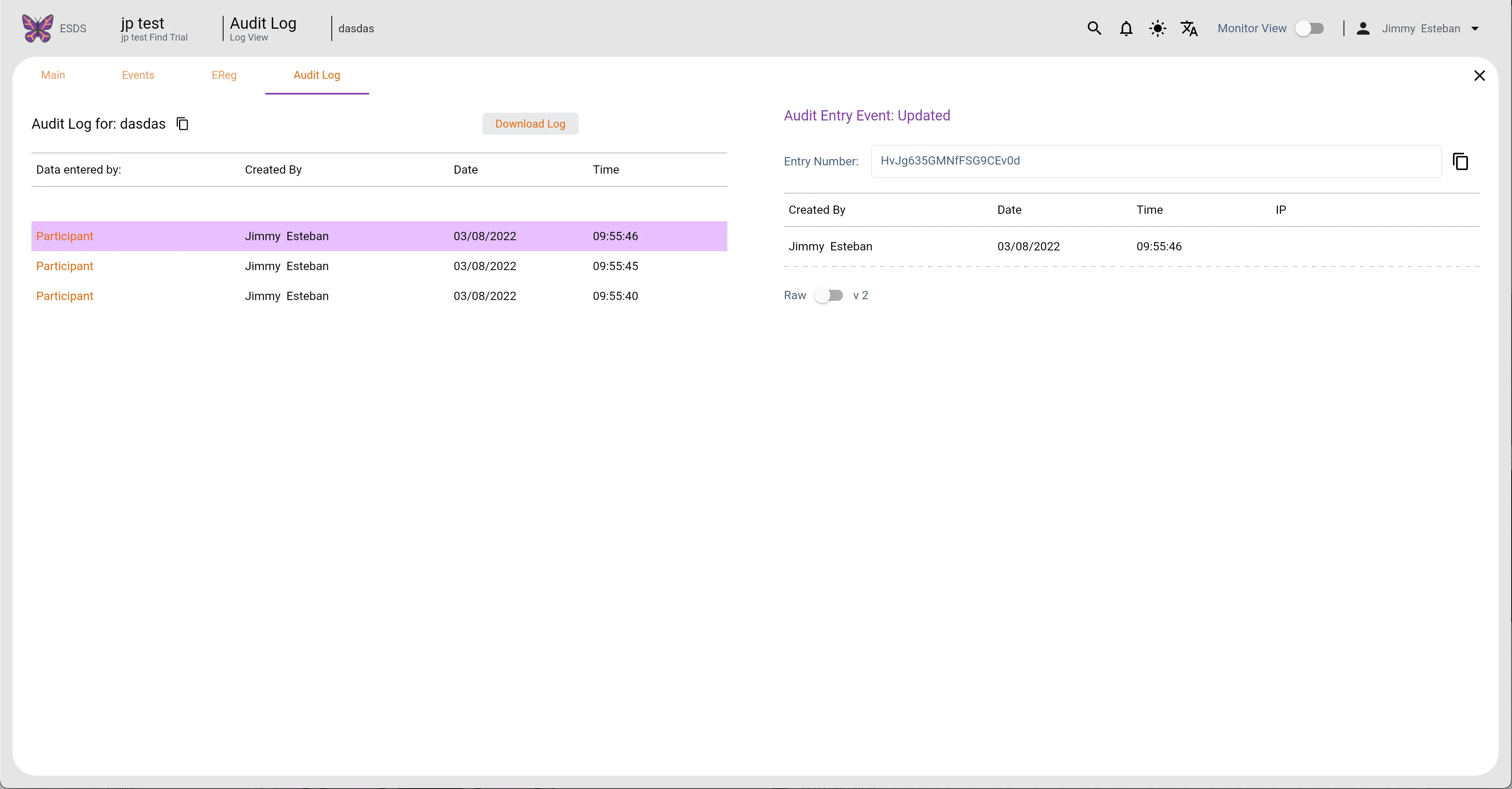
Participants Audit Log (Light Mode)
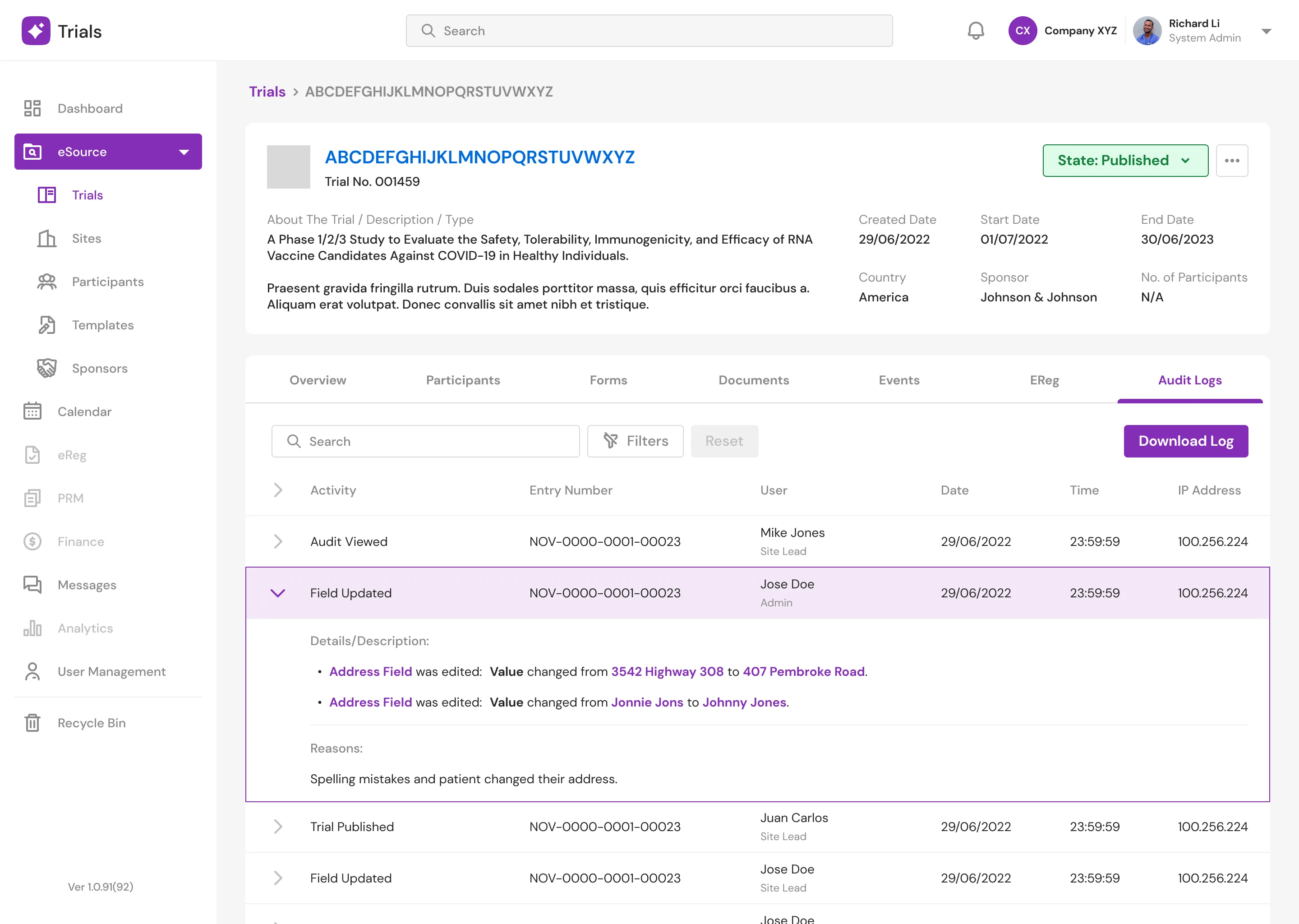
Detailed Page Audit Logs
New Screens
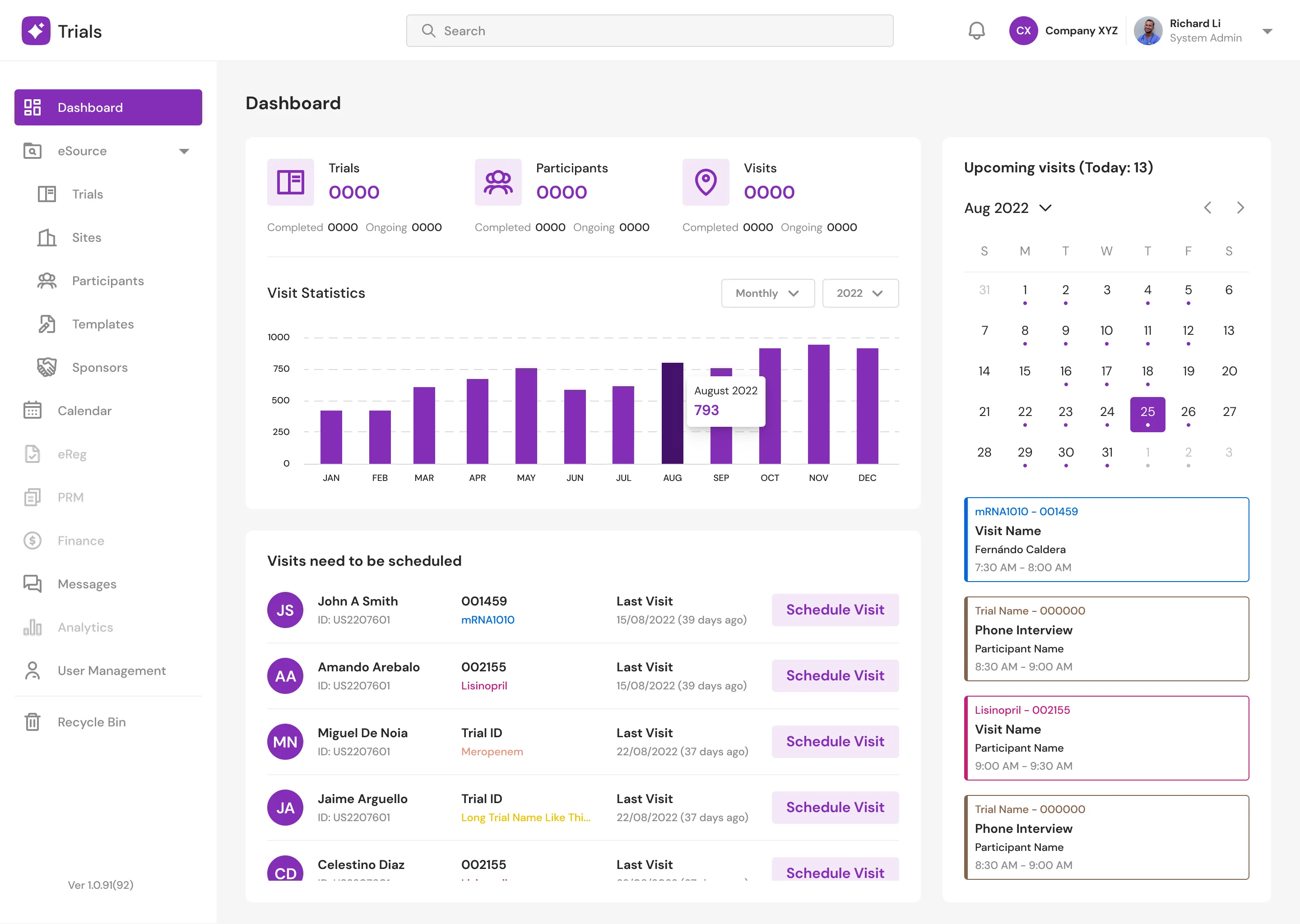
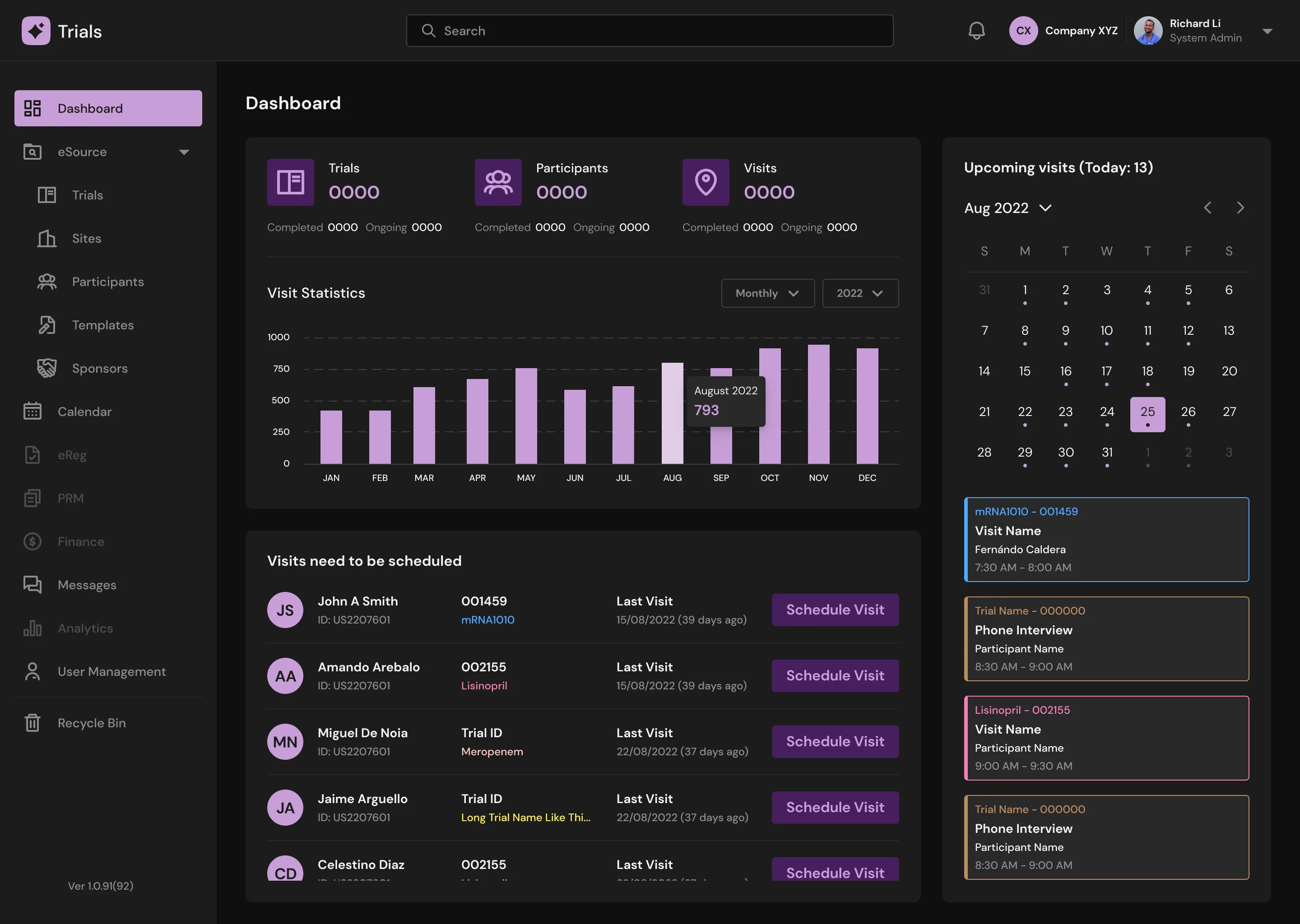
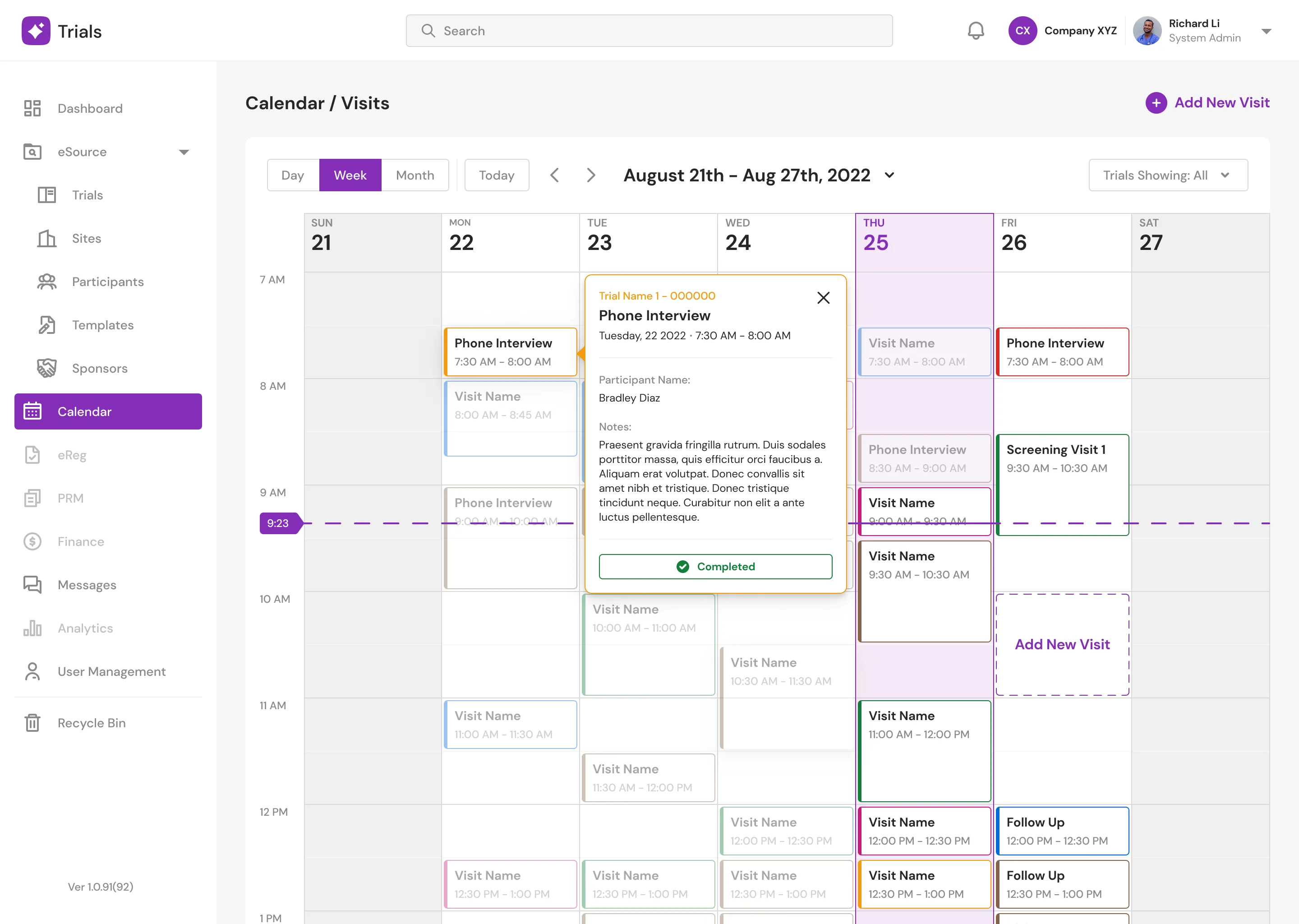
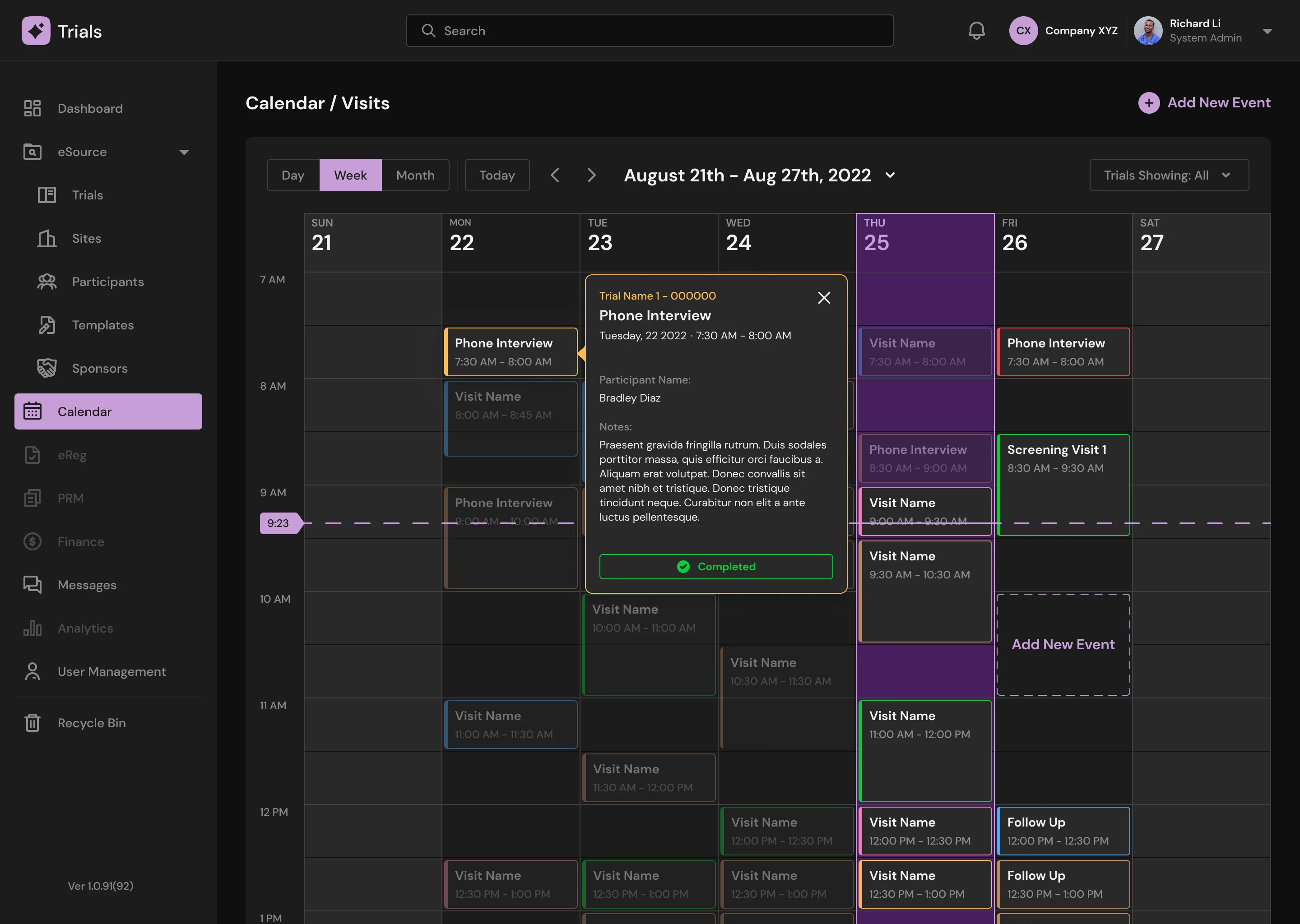
Dashboard and Calendar Page
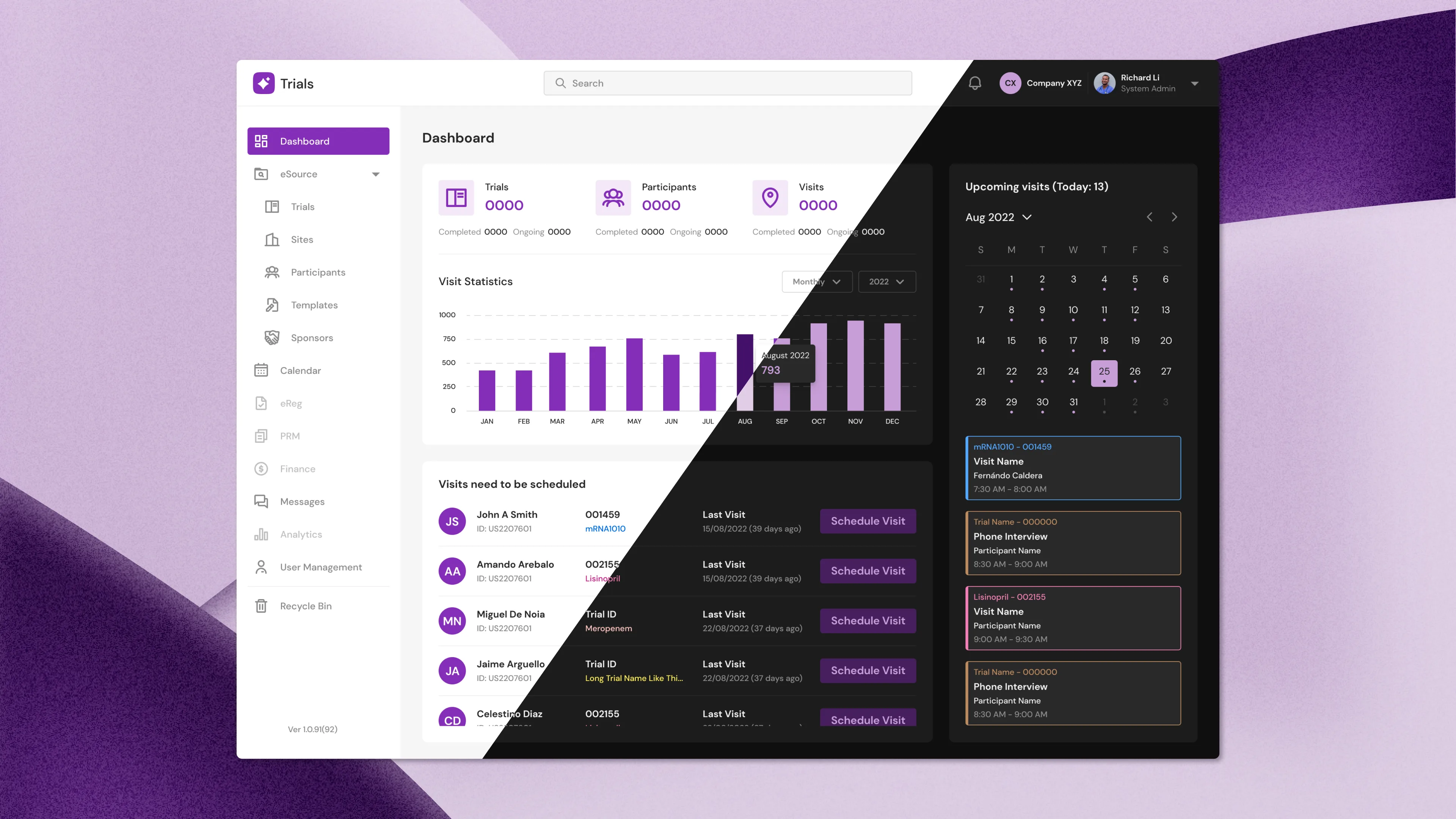
Doctors can view a variety of statistics on the "Dashboard" page, including the overall number of trials, participants, and visits. When appointments are available, doctors can schedule them right away. Doctors will be able to access their calendars and see if they have appointments, with a dot indicating that they do. On the "Calendar" page, they can also view their full appointments as well as their details.
Dashboard (Light Mode)
Dashboard (Dark Mode)
Calendar (Light Mode)
Calendar (Dark Mode)
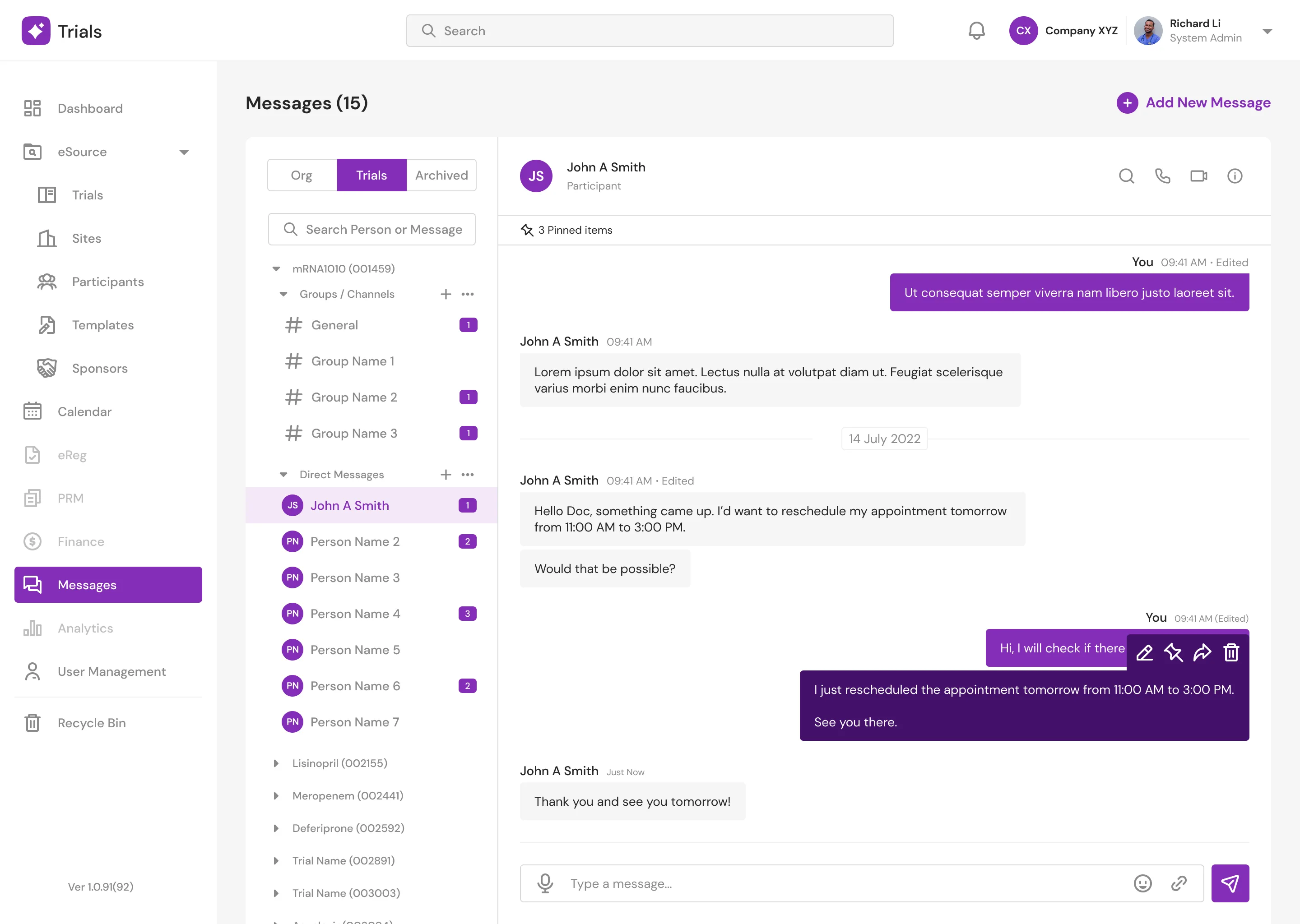
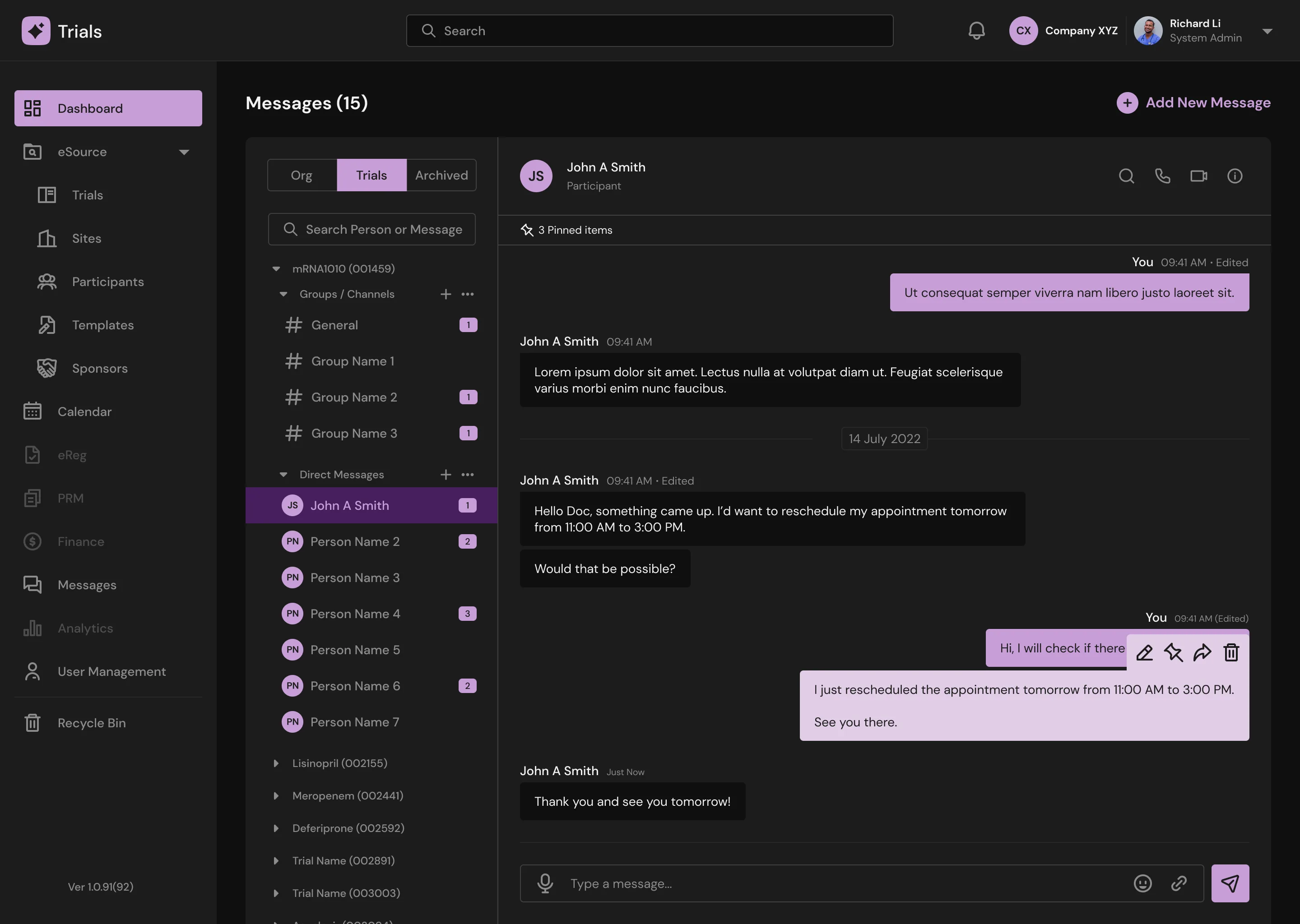
Messenger Page
Doctors can communicate with other doctors and participants in groups or individually via text messaging, audio, and video conversations. Doctors can also view an overview of other doctors and participants quickly with a popup modal.
Message (Light Mode)
Message (Dark Mode)
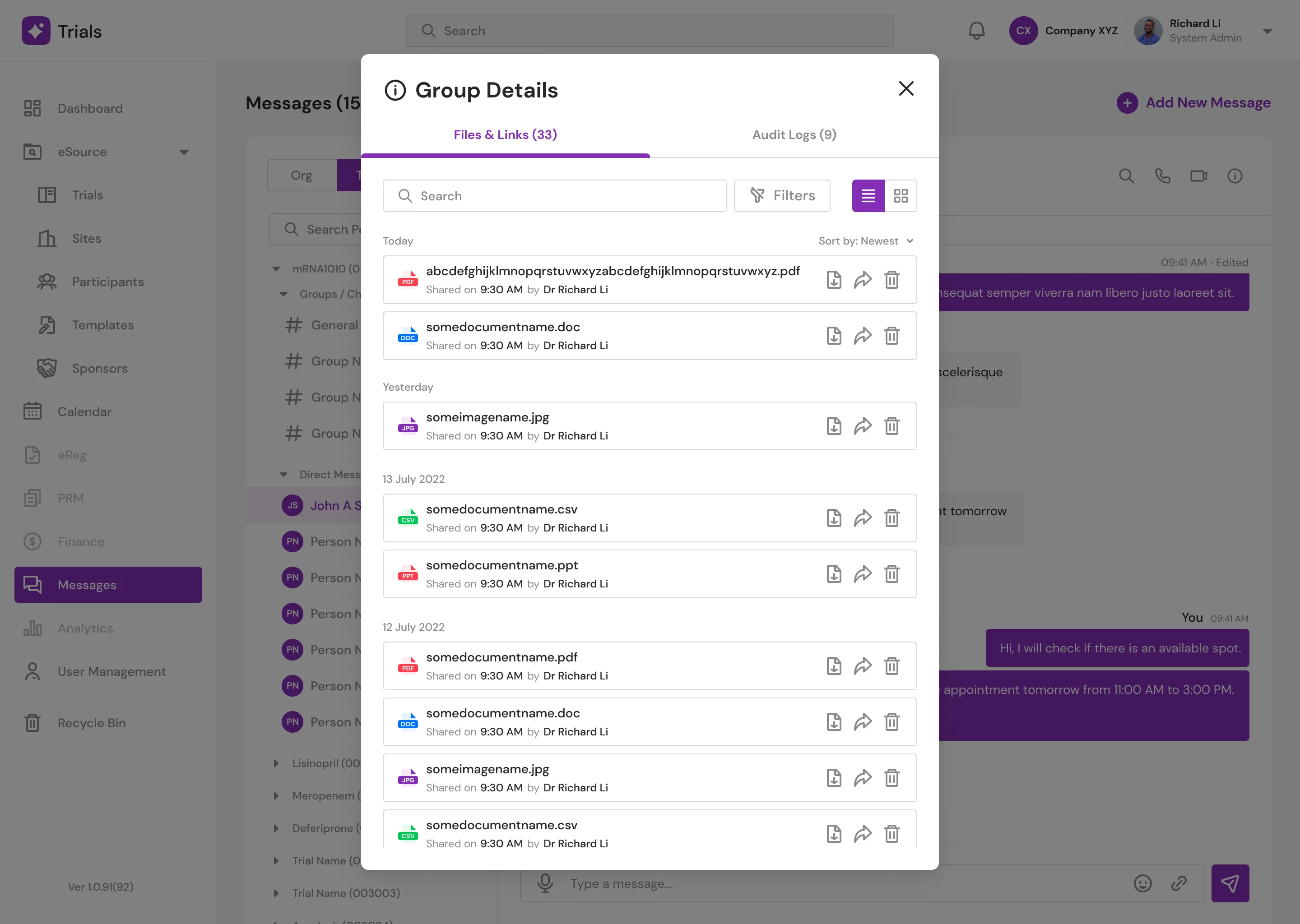
Message: Group Details (Light Mode)
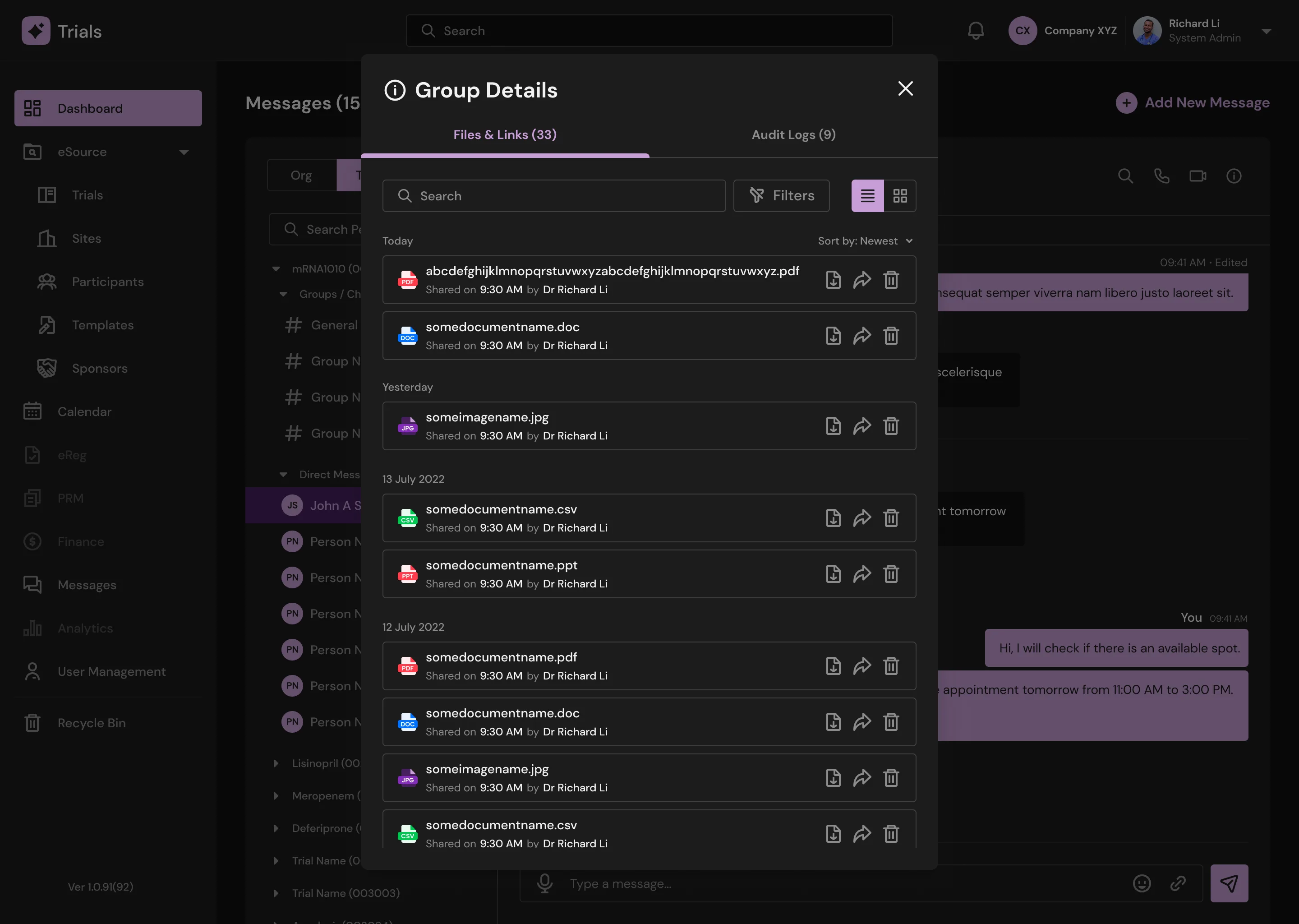
Message: Group Details (Dark Mode)
Support / Tickets
Results and Takeaways
There are several lessons, but the most important has to be dealing with people, particularly working with the founders and developers. Working with developers in the past was somewhat pleasant to the point where anytime I made changes, they were completed on the same day or even the following day at most, I went through the design verbally once in a while and generally left comments around the designs, and they just got it. Not to say the developers for this project were unpleasant; but, frequent communication was essential. After all, this is their first programming job, so I had to lead them as best I could and show them about the developer/designer relationship. By the time I left, they got a hang of it and understood the entire flow of the project, so I can say I have done my job.