OVERVIEW
Transigo is a Fintech firm that provides B2B marketplaces with a pay later solution. I was tasked with improving the UI and creating a bunch of email layout templates.
TIMELINE
Aug 2022 (2 weeks)
MY ROLE
UI Designer
THE TEAM
Solo designer and 1 developer
TOOLS USED
Figma, SendGrid
FormView Old FormView New Form
I was told customers were already using the form when I initially received it. I understand they were rushing in creating the form, but this will make an impression on the customers. First impressions are key, and how you present yourself will determine if the customer trusts you or not.
There seems to be a disconnection between the form and their official site, so to demonstrate consistency that the form is genuinely part of the company, I refer to their official website, their use of typography, colors, and so on.
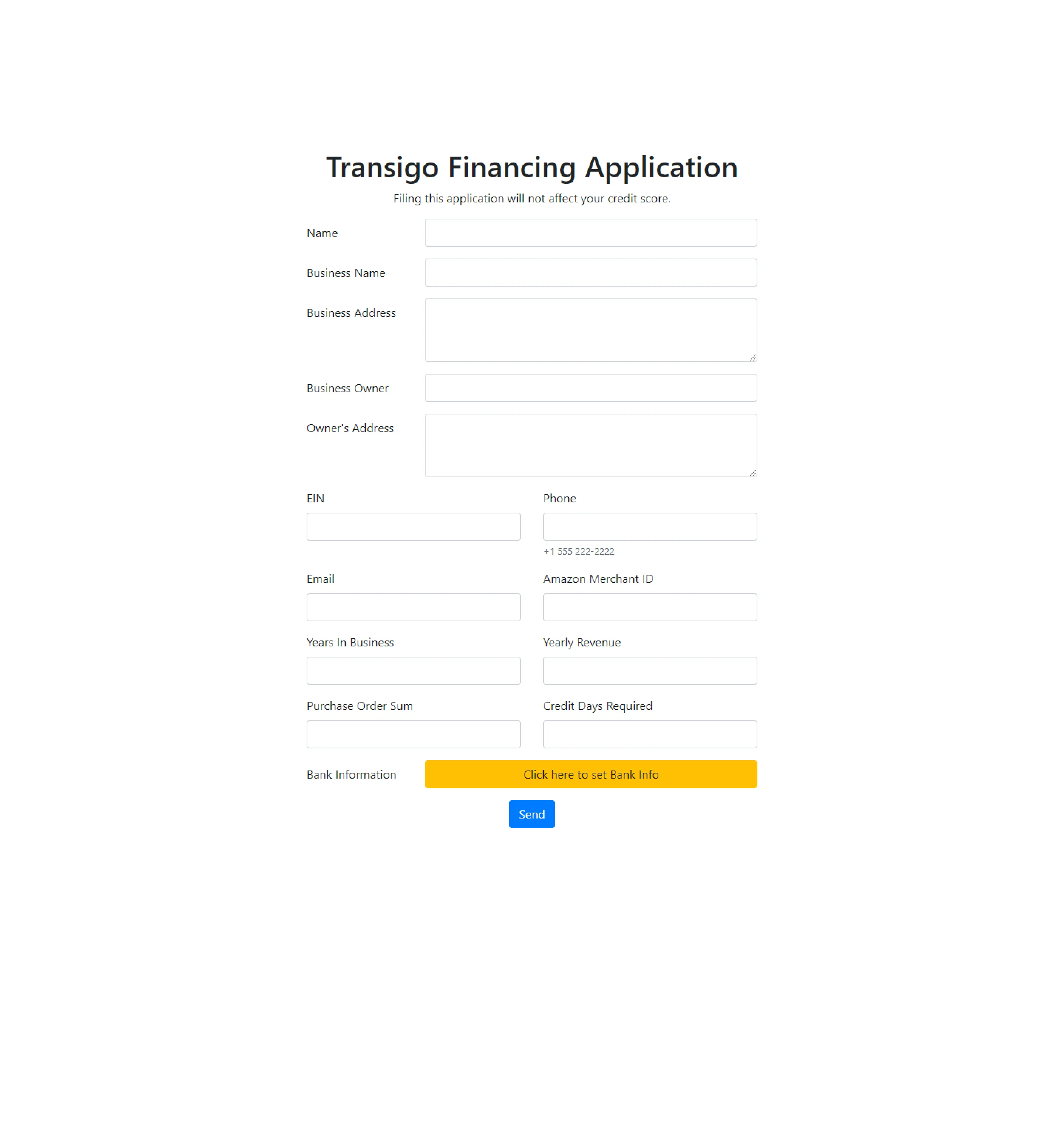
Form (Old)
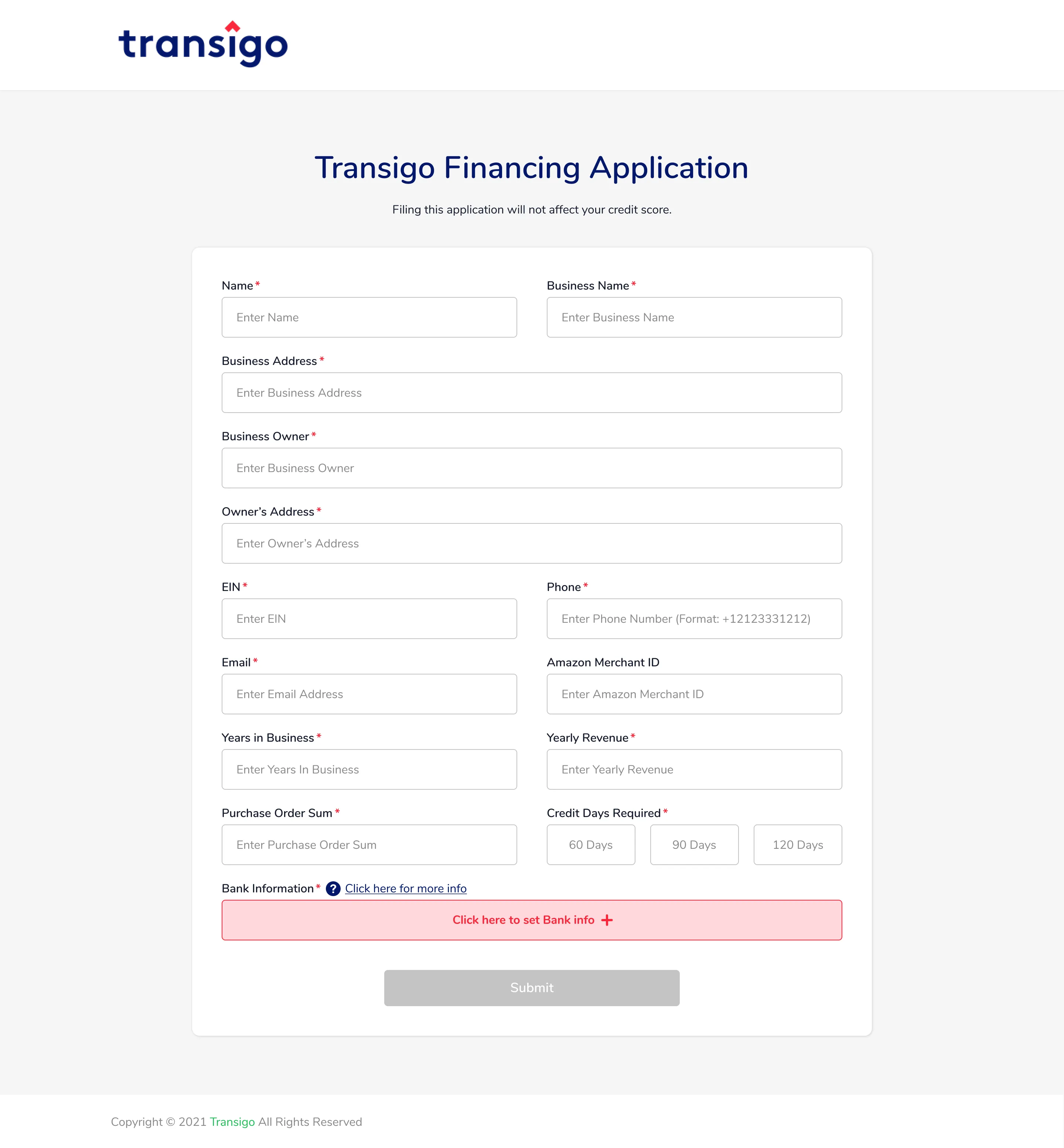
Form (New)
Desktop App
The same goes for the form, I've been referring to the official site, specifically their branding. The original app colors and fonts aren't even close to the brand.
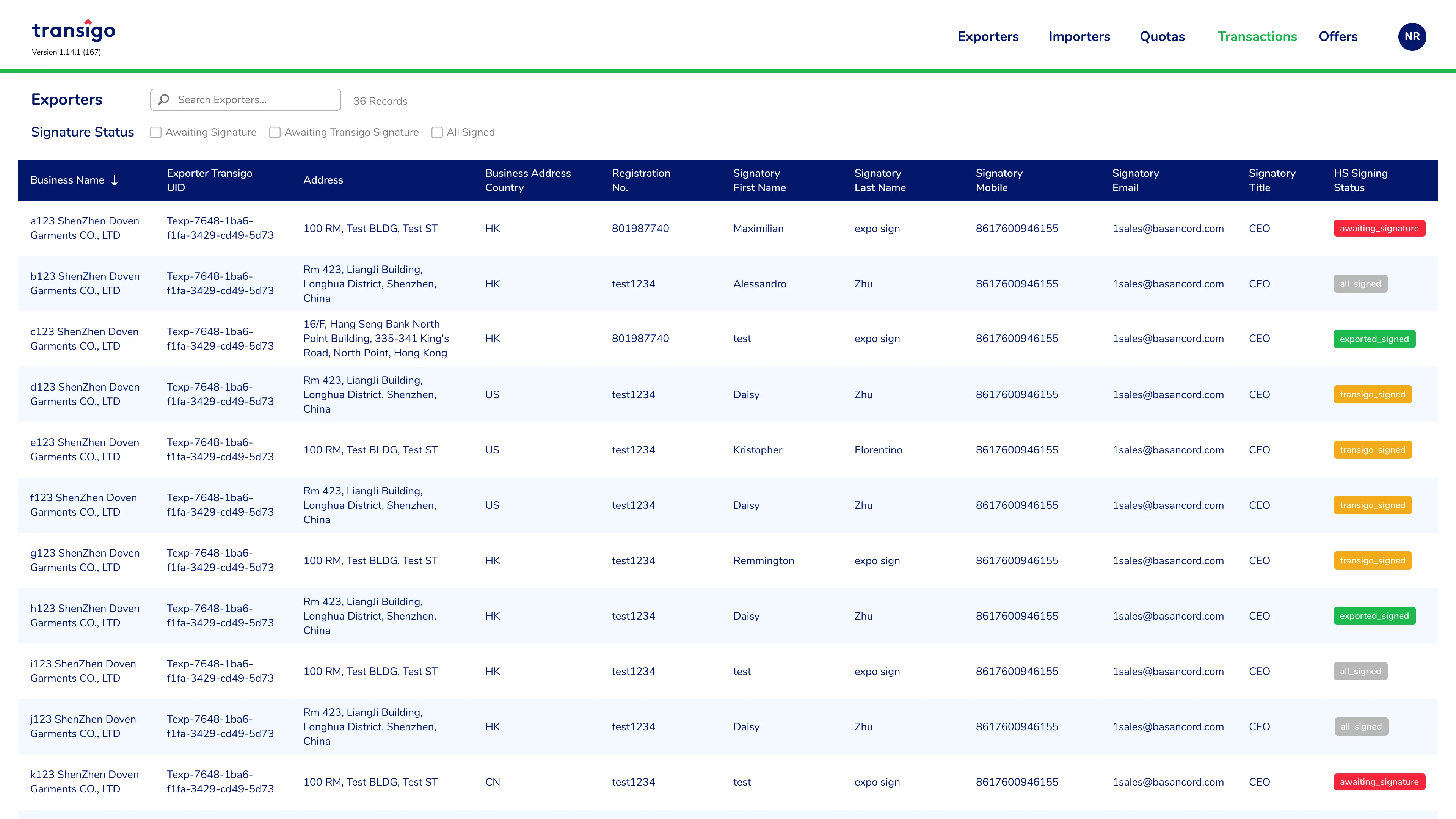
The table has a spacing problem. The image on the right shows one method for reducing table width that extends beyond the screen viewport, thus I combined two columns into one.
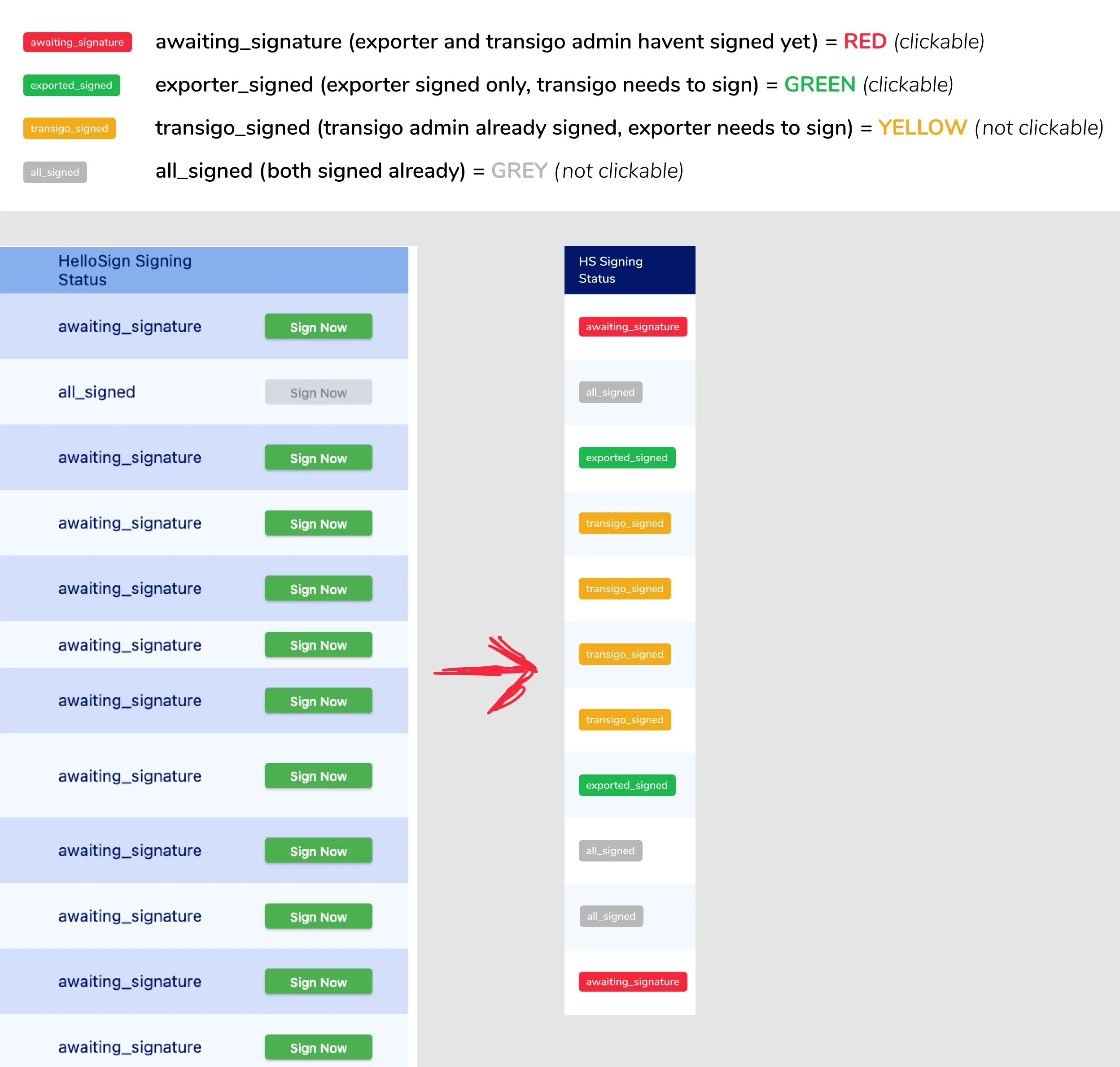
clickables
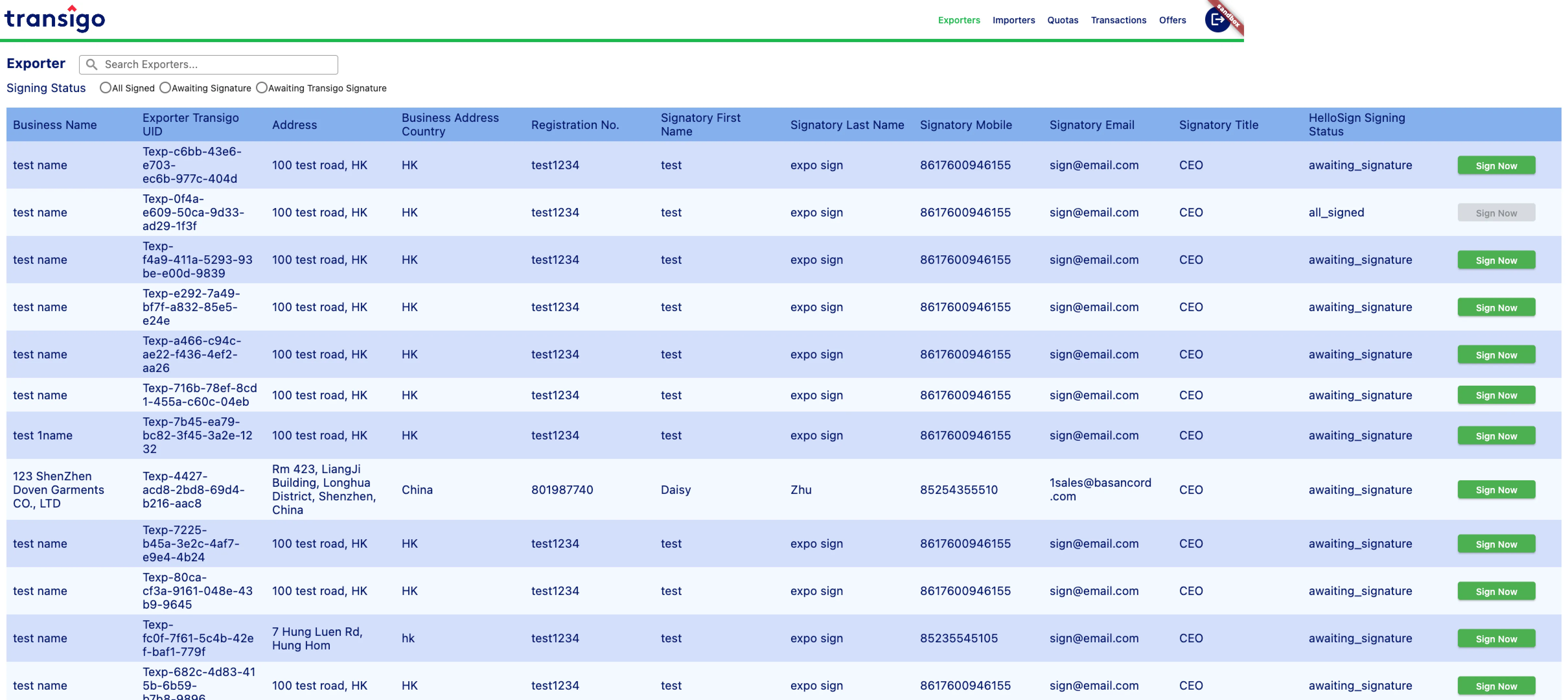
Exporters (Old)
Exporters (New)
The table's width can get too long when you have to keep horizontally scrolling to reach the end. Another way for reducing width is to reduce font size and set width restrictions for each column.
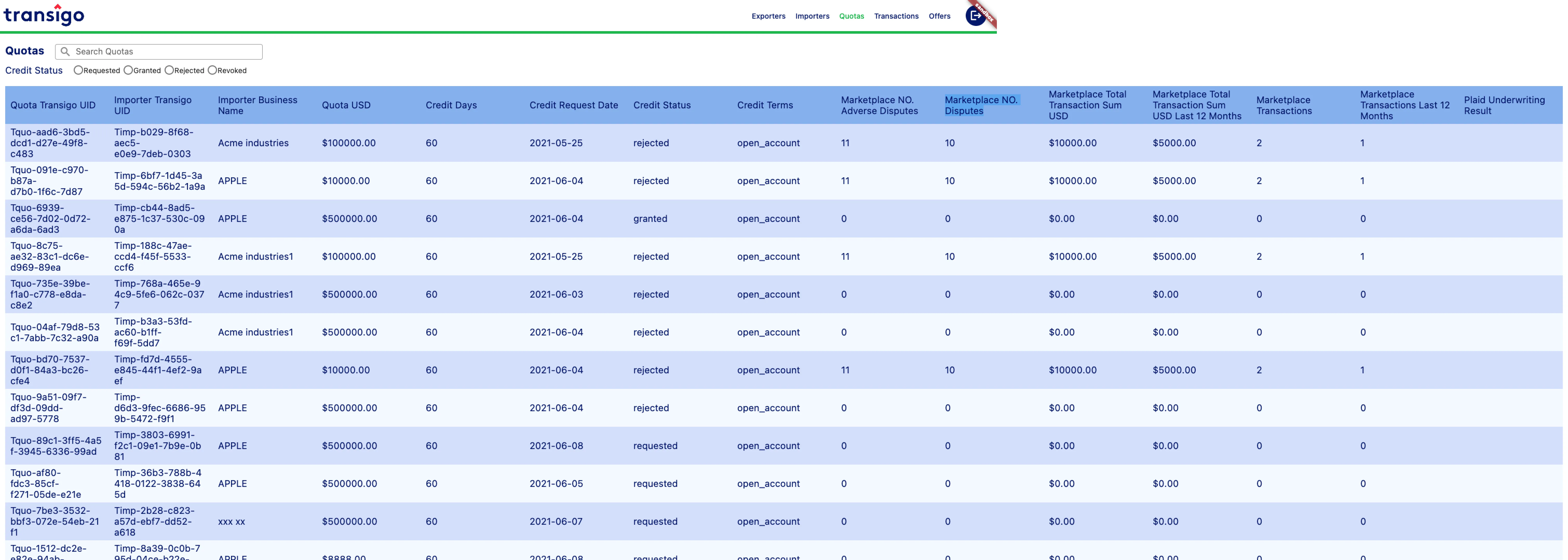
Quotas (Old)
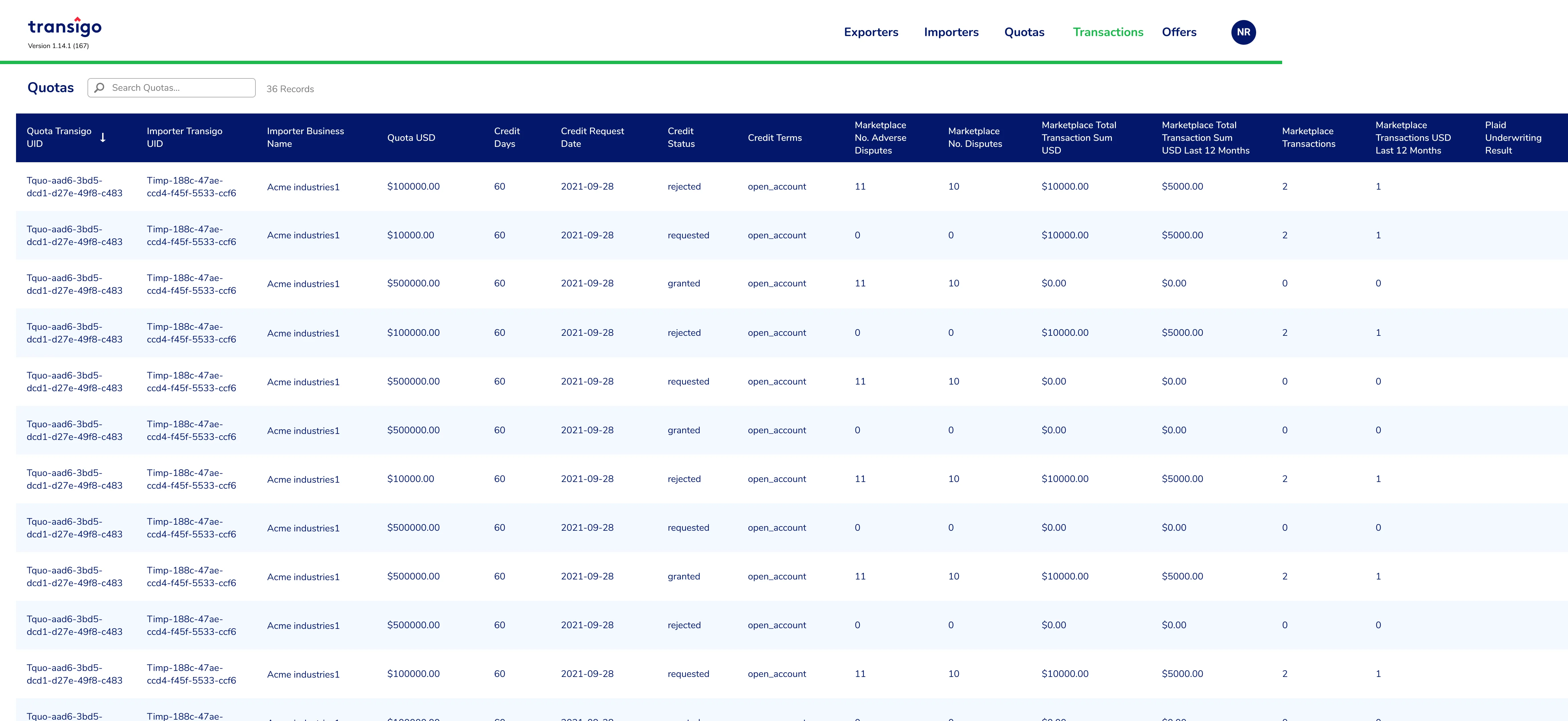
Quotas (New)
Results and Takeaways
There were definitely things to improve the UX, particularly the desktop app, such as eliminating horizontal scrolling and possibly incorporating an on/off toggle on data being presented or expandable rows to show more details to keep the table width from exceeding the screen's width. The client is already in his fifties, so you might say he is accustomed to this activity, as products such as Excel and Access have a horizontal scrolling option. In a nutshell, it is what the user desires after all.