
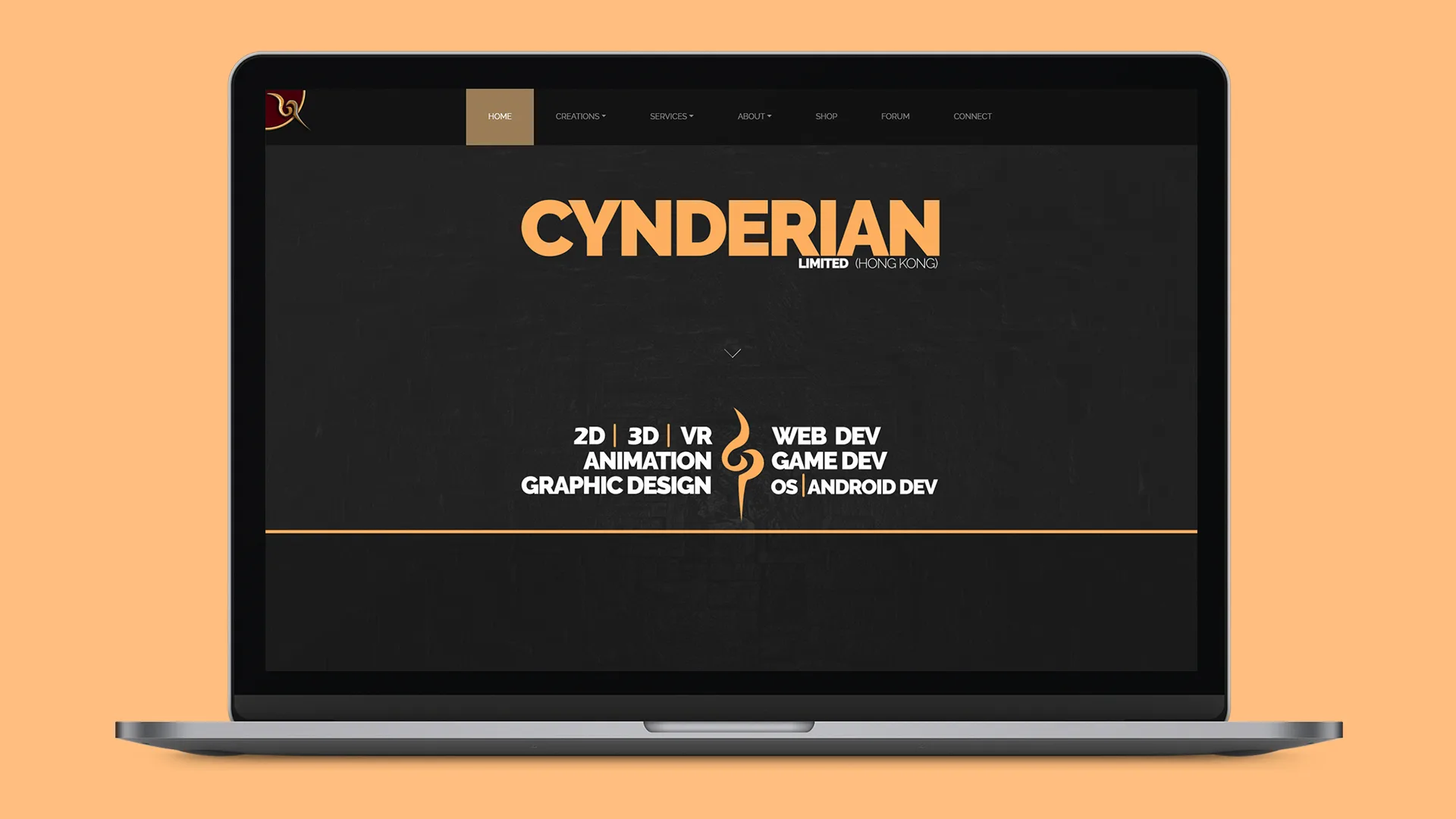
OVERVIEW
To design and launch a working site to showcase the company's work. Cynderian is a multimedia company that solves and innovates diverse creative solutions.
TIMELINE
Jan 2019 - Feb 2019 (4 weeks)
MY ROLE
Web Designer/Developer
THE TEAM
1 designer and 2 developers
TOOLS USED
Adobe XD, Dreamweaver/Atom, GoDaddy
Fixing Brand Alignment
Cynderian's original website struggled to capture what the company actually did. Because of the color palette and awkward image placement, visitors often mistook it for a niche game-illustration site instead of a comprehensive creative agency. The site also had a bloated user journey, requiring far too many clicks to access basic service details.
Cleaning Up the User Journey
My absolute first priority was completely reorganizing the site to get users to the right content faster.
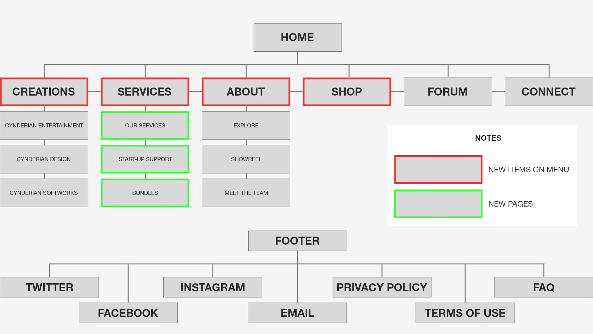
Sitemap
- Rebuilding the Sitemap: I restructured the navigation to clearly separate their core services (like Entertainment, Design, and Softworks) so potential clients knew exactly what the agency could do right away.
- Clear Wayfinding: I added large, high-impact introductory banners to the top of every major page so users immediately understood the context of what they were looking at.
- Using Modals to Save Time: To keep people from getting lost clicking through endless pages, I used quick-view popup modals to show service details and portfolio pieces directly on the page.
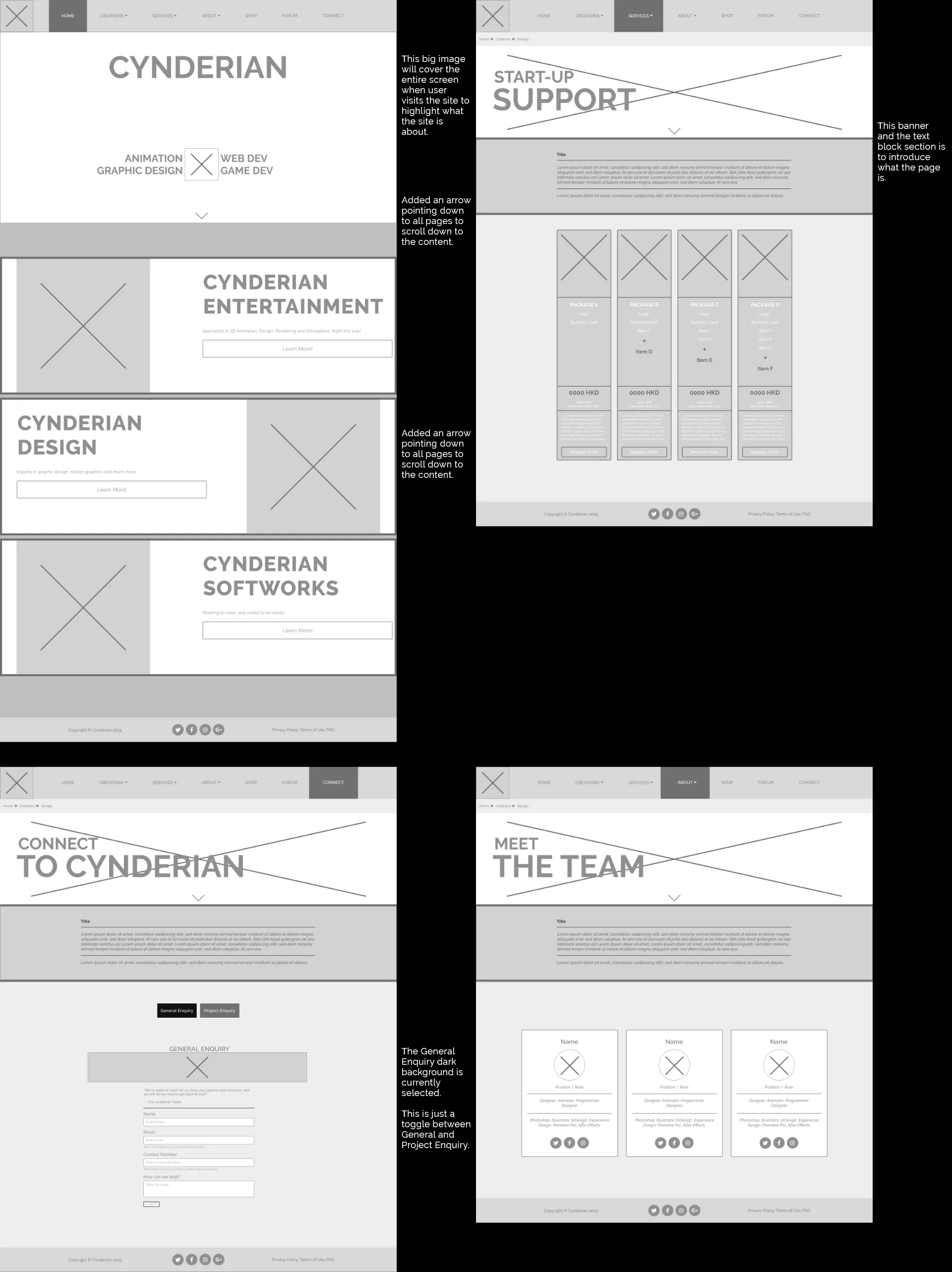
Wireframes 1
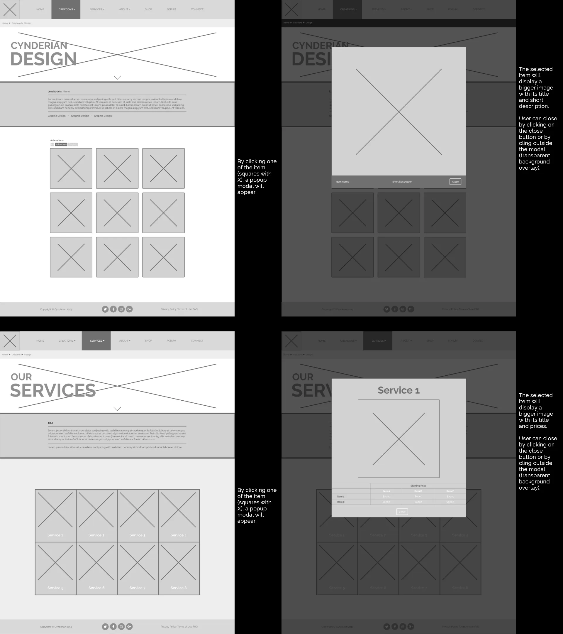
Wireframes 2
Prototyping & User Testing
Using the design team's graphics, I coded a functional prototype using HTML, CSS, Javascript, and Bootstrap, and sent it out to five testers for initial feedback.
- Visual Hierarchy: Users found the new colors, fonts, and content blocking much more professional and pleasing to look at.
- Navigation: The full-width blocks and breadcrumb navigation made wayfinding significantly easier.
- Efficiency: The quick-view modal popups were a hit for letting users view content without losing their place on the page.
- Outside of expected prototype issues (like broken links and placeholder content), the main piece of critical feedback was that the Project Enquiry form was way too long and intimidating.
The Solution:
To fix the form issue, I completely simplified the contact flow. Instead of making users navigate to different pages for general questions versus specific project quotes, I combined them into a single, clean form with a simple toggle switch to reduce the user's journey even further.
The Redesign: BEFORE AND AFTER
The result of the redesigned between the before and current version is very clear. The current version has an immediate understanding what the site is about from the bold texts highlighting what the company offers.
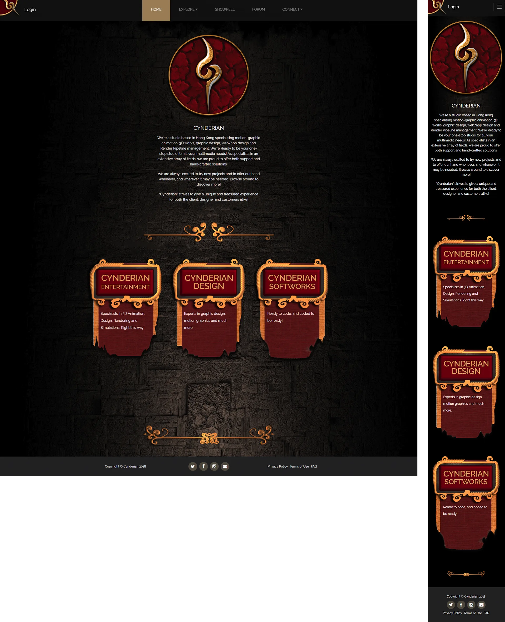
Homepage (Old)
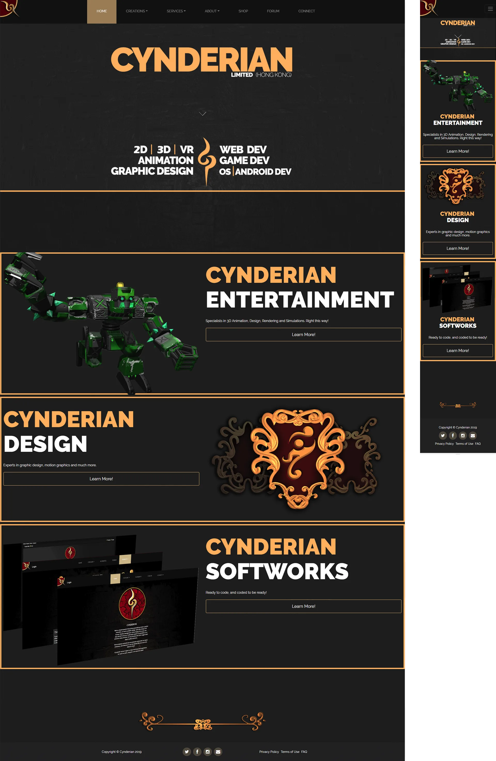
Homepage (New)
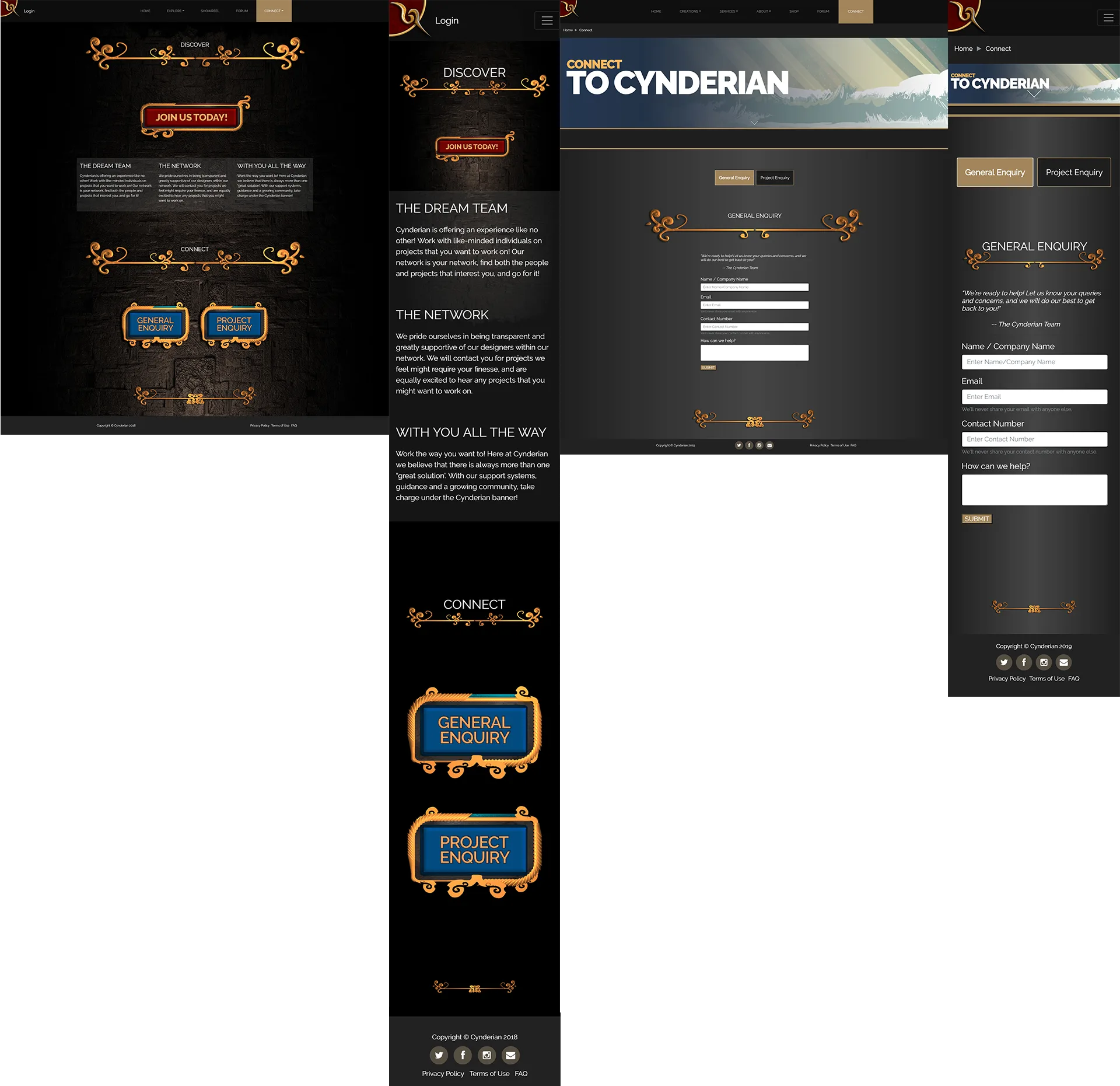
Connect Page (Old & New)
OTHER PAGES
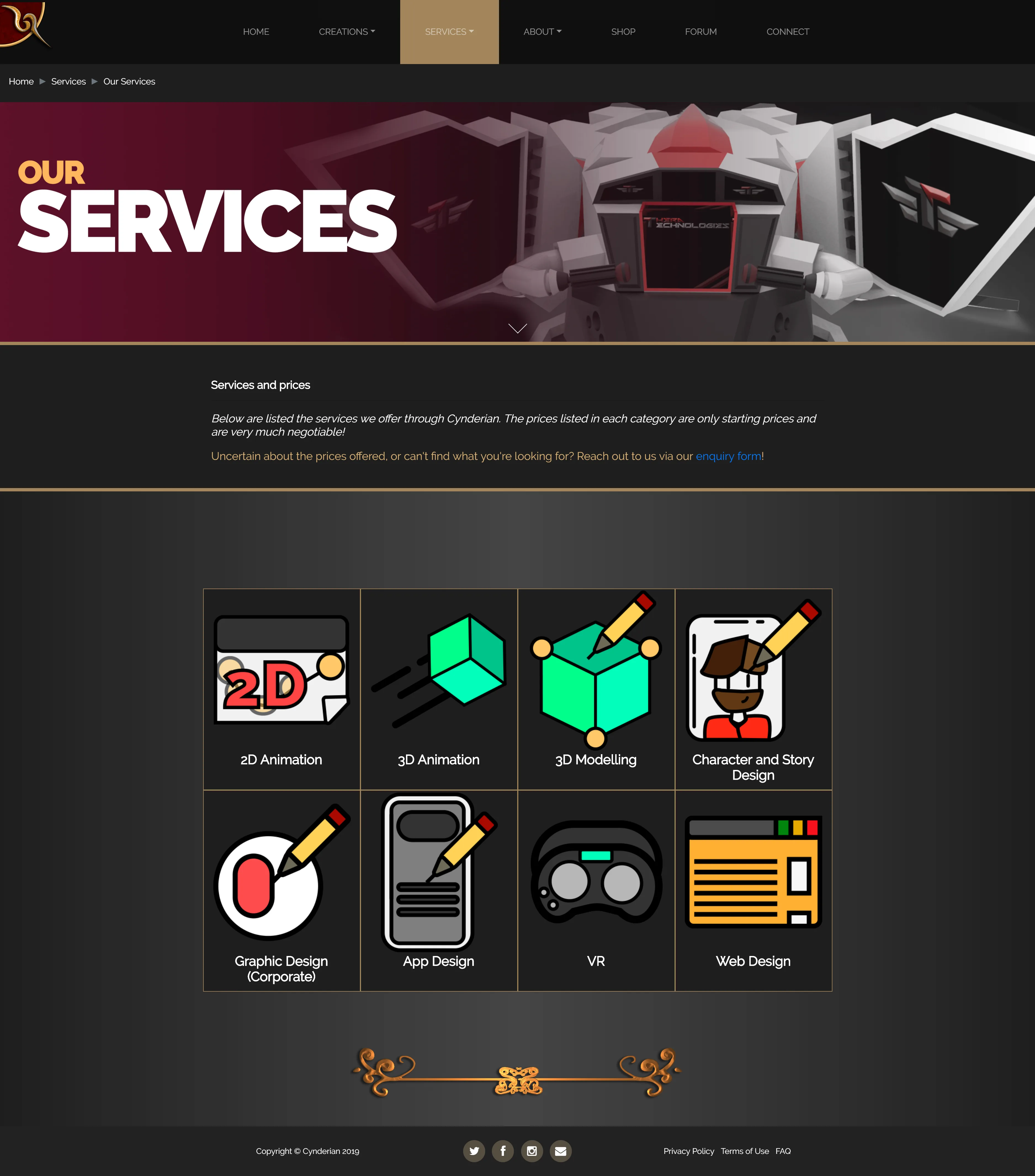
Services Page (New)
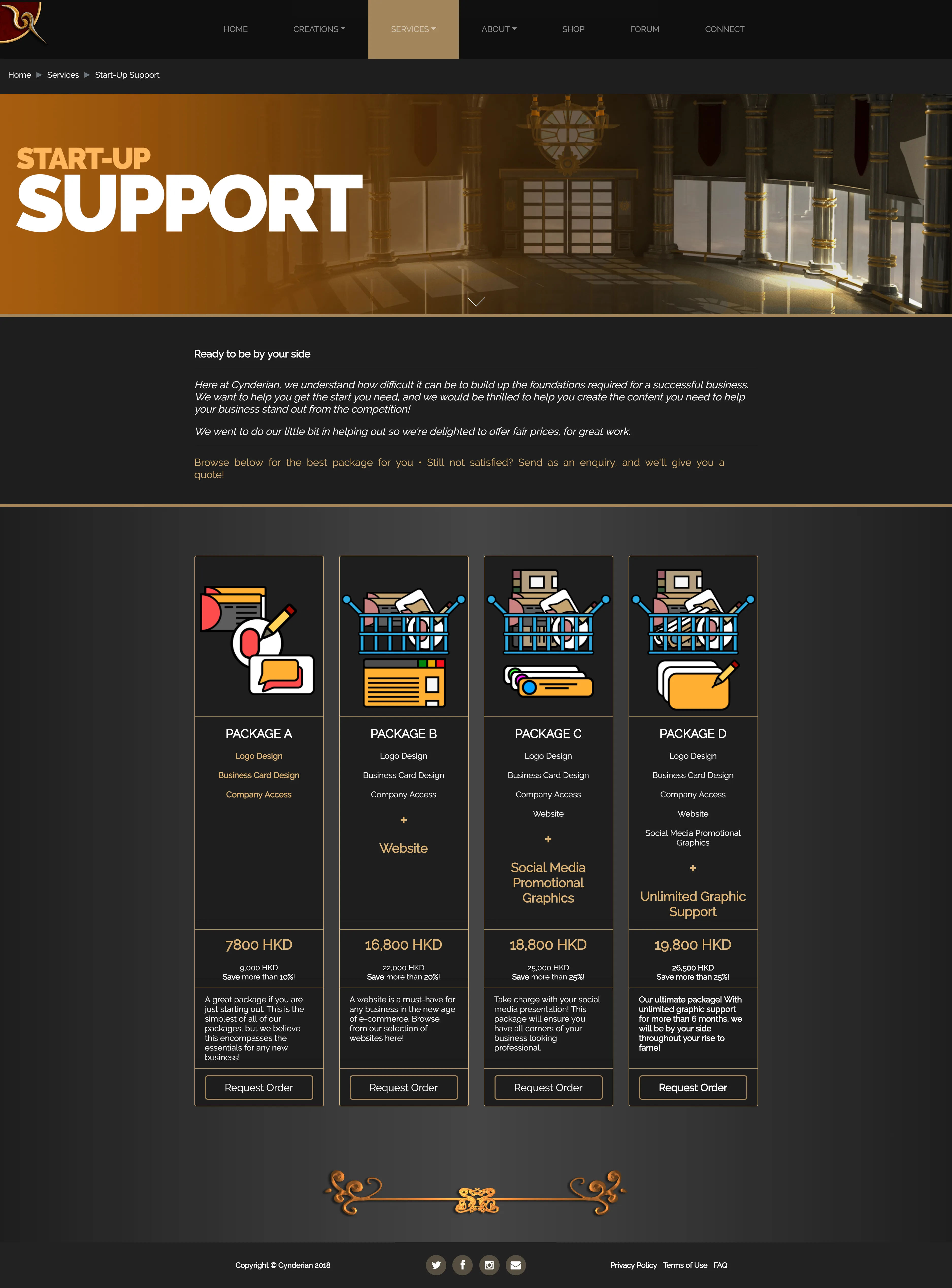
Support Page (New)
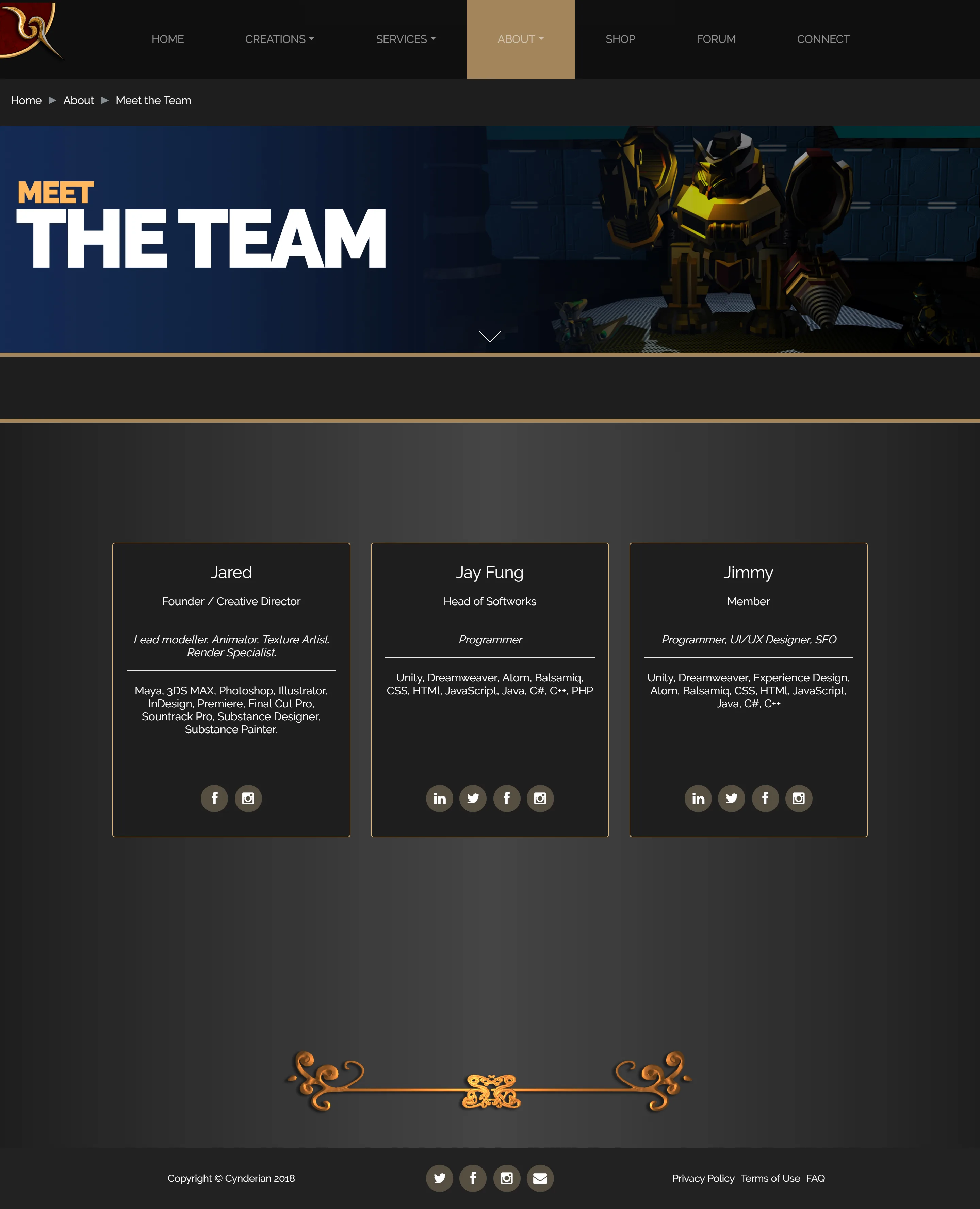
Team Page (New)
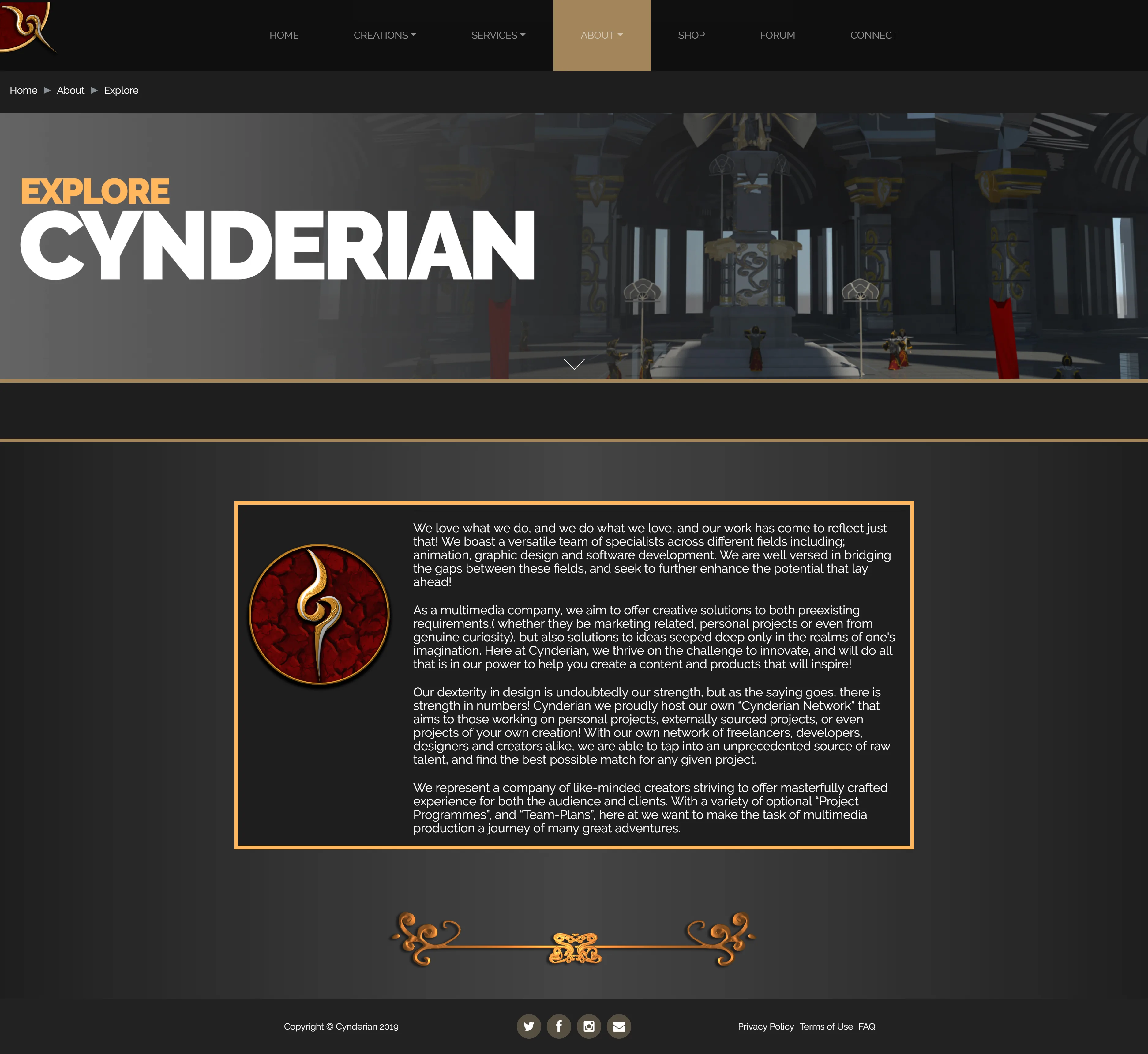
Explore Page (New)
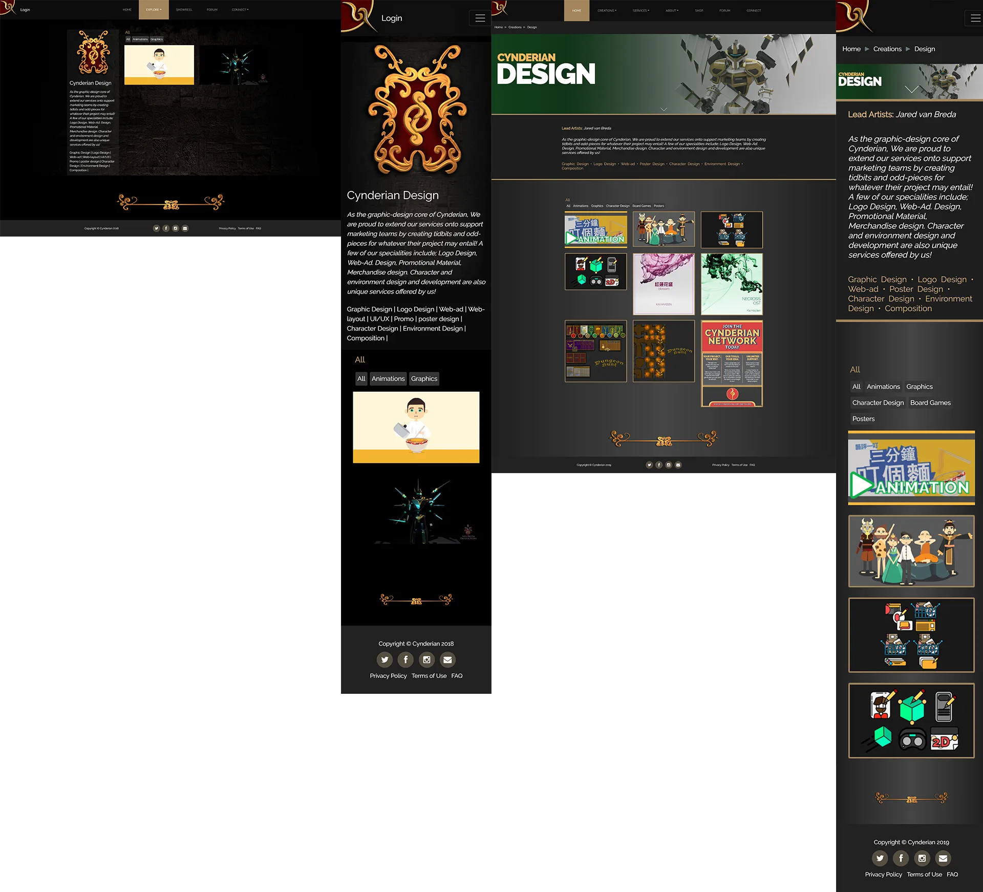
Design Page (Old & New)
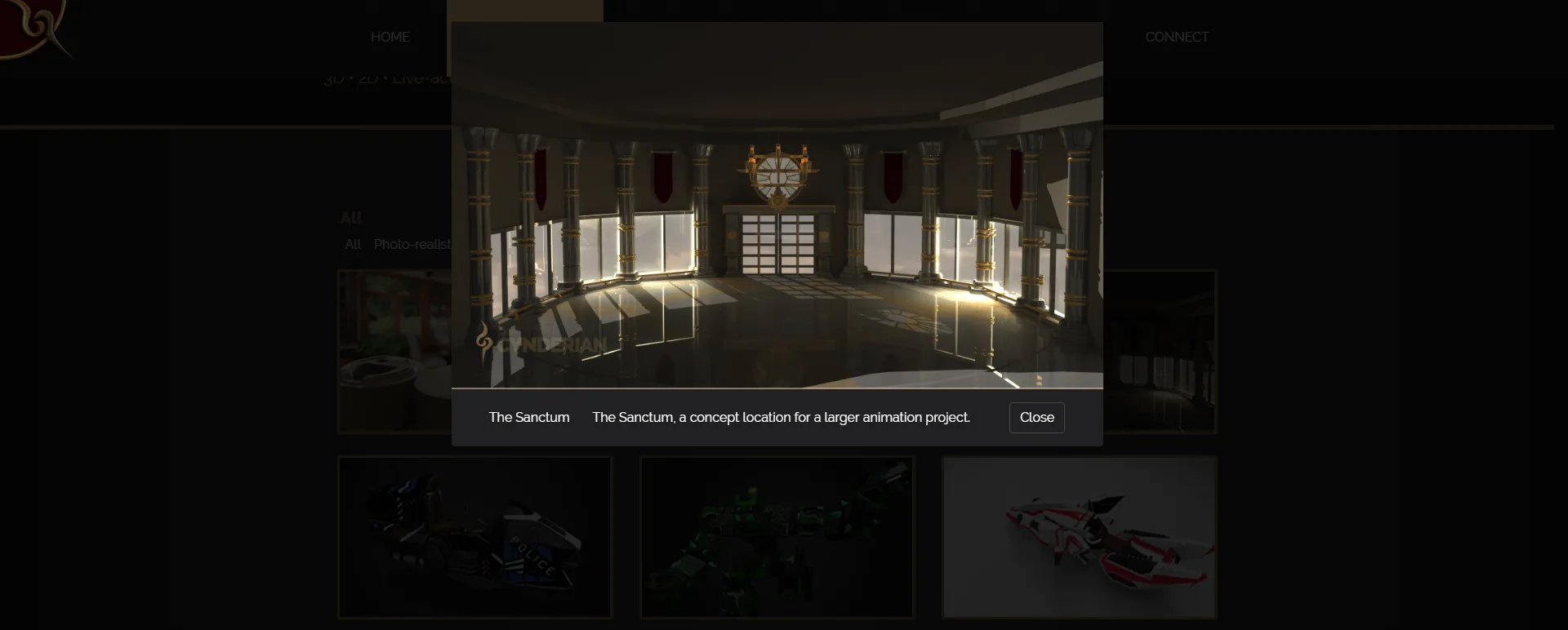
Popup Modal (New)
The Final Outcome
Redesigning an agency's own website is always a bit nerve-wracking, but relying heavily on user feedback really paid off. By cleaning up the confusing navigation and creating a cohesive visual identity, we turned a frustrating portfolio site into a professional platform that actually helps the agency showcase its work properly and connect with new clients.