
OVERVIEW
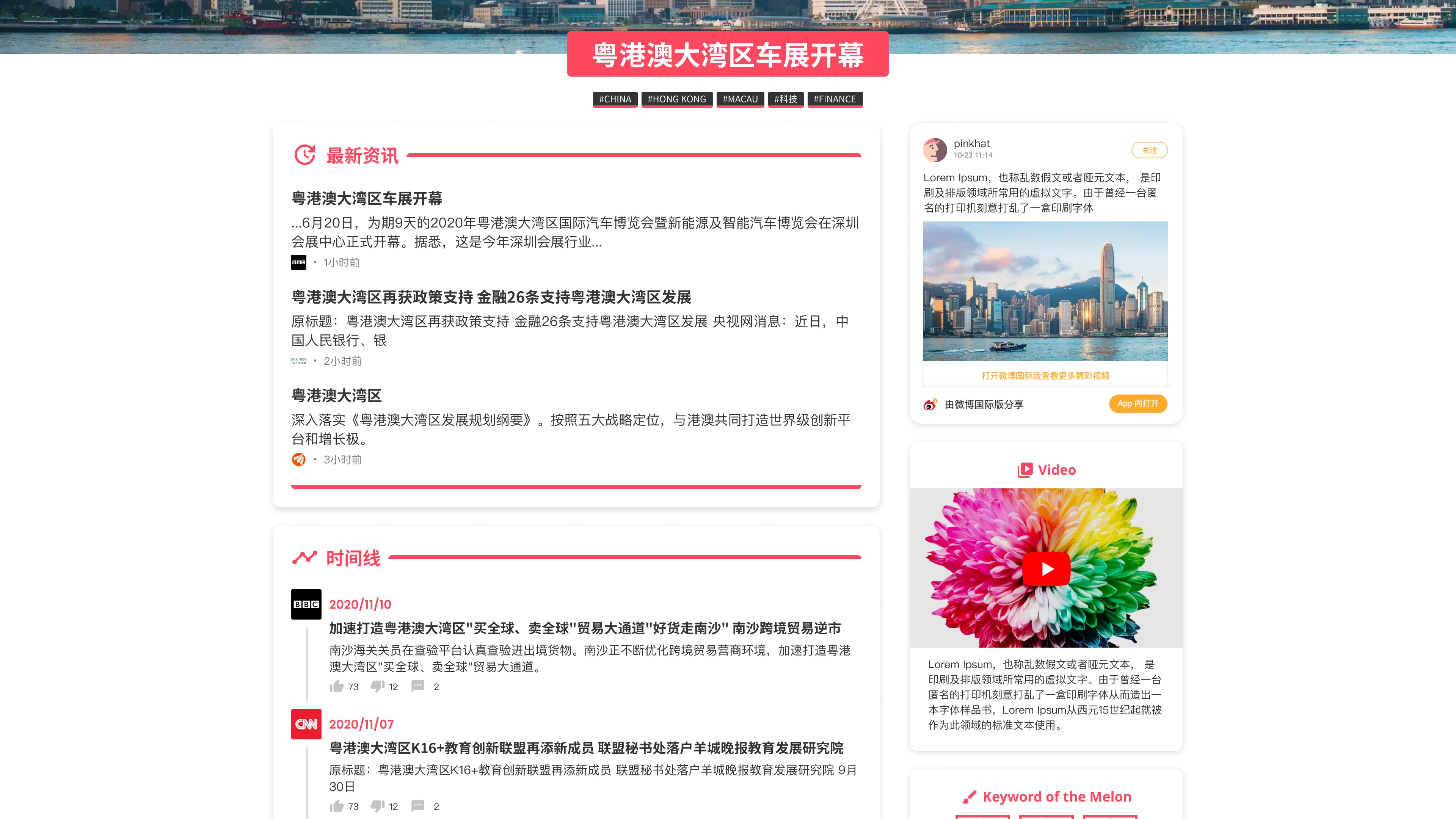
Melon was conceived as a conceptual spin-off for Datago Technology—a social news aggregation and discussion platform designed to expand beyond financial data into broader lifestyle, entertainment, and sports verticals. The objective was to design an engaging content hub from the ground up, tailored specifically for Millennial and Gen Z demographics.
TIMELINE
October 2020 - December 2020
MY ROLE
Lead UI/UX & Brand Designer
THE TEAM
Cross-functional conceptualization with 1 Developer and 2 Data Scientists
TOOLS USED
Figma, Illustrator
Audience Definition & Market Localization
The biggest challenge of this project was making the platform feel authentic to our target audience—young, tech-savvy users in Mainland China. To ensure the entire cross-functional team was aligned on who we were building for, I developed a core behavioral archetype: Tom (28, Tech-Savvy Professional). Rather than relying on generic demographics, this archetype served as our anchor for evaluating feature priorities.
Tom represented our target user's real-world behaviors and frustrations:
- Content Fatigue:
He felt overwhelmed by the sheer volume of unreliable news across multiple apps. - Efficiency:
He needed a single, centralized hub to check trending topics quickly during his morning routine. - Social Friction:
He wanted a frictionless way to save articles for his commute and easily discuss them with his peers.
By filtering our design decisions through this archetype, we stayed laser-focused on solving actual user problems rather than just adding features.
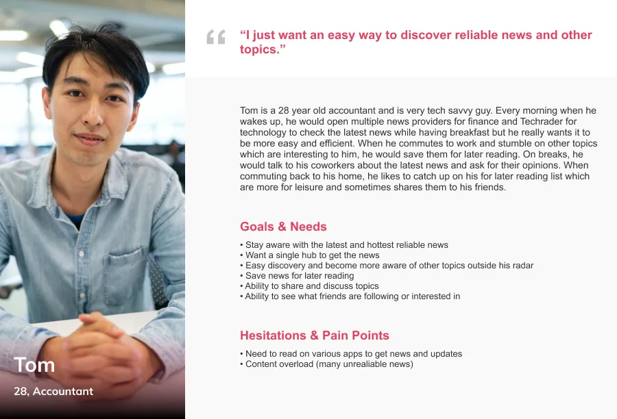
Persona
Cross-Cultural UX Paradigms
Designing for this market meant I had to unlearn a lot of standard Western design habits. For example, the way users chat on live streams is completely different. On Western apps like Twitch or Instagram, comments live in a neat little box at the bottom or side of the screen. But on Chinese apps like Bilibili, comments fly directly across the video screen—a feature called "Danmaku". Understanding these unique cultural differences was key to making the app feel like home for our users.
Brand Identity & Conceptual Architecture
I was responsible for building the brand from scratch, and I wanted it to lean heavily into local internet culture.
The Story Behind the Name
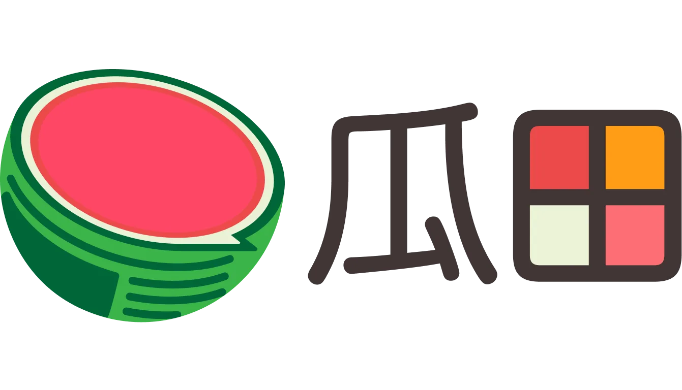
We named the app "瓜田" (Melon Field). This is a nod to a popular Chinese slang term about "eating melon"—which basically means grabbing some popcorn and watching internet drama unfold as an onlooker.
Designing the Identity
I turned this fun concept into a flexible visual identity. The main logo features a bitten melon integrated with a chat bubble, symbolizing active discussion. From there, I used different colored melons throughout the app to quickly visually communicate different news topics to the reader.
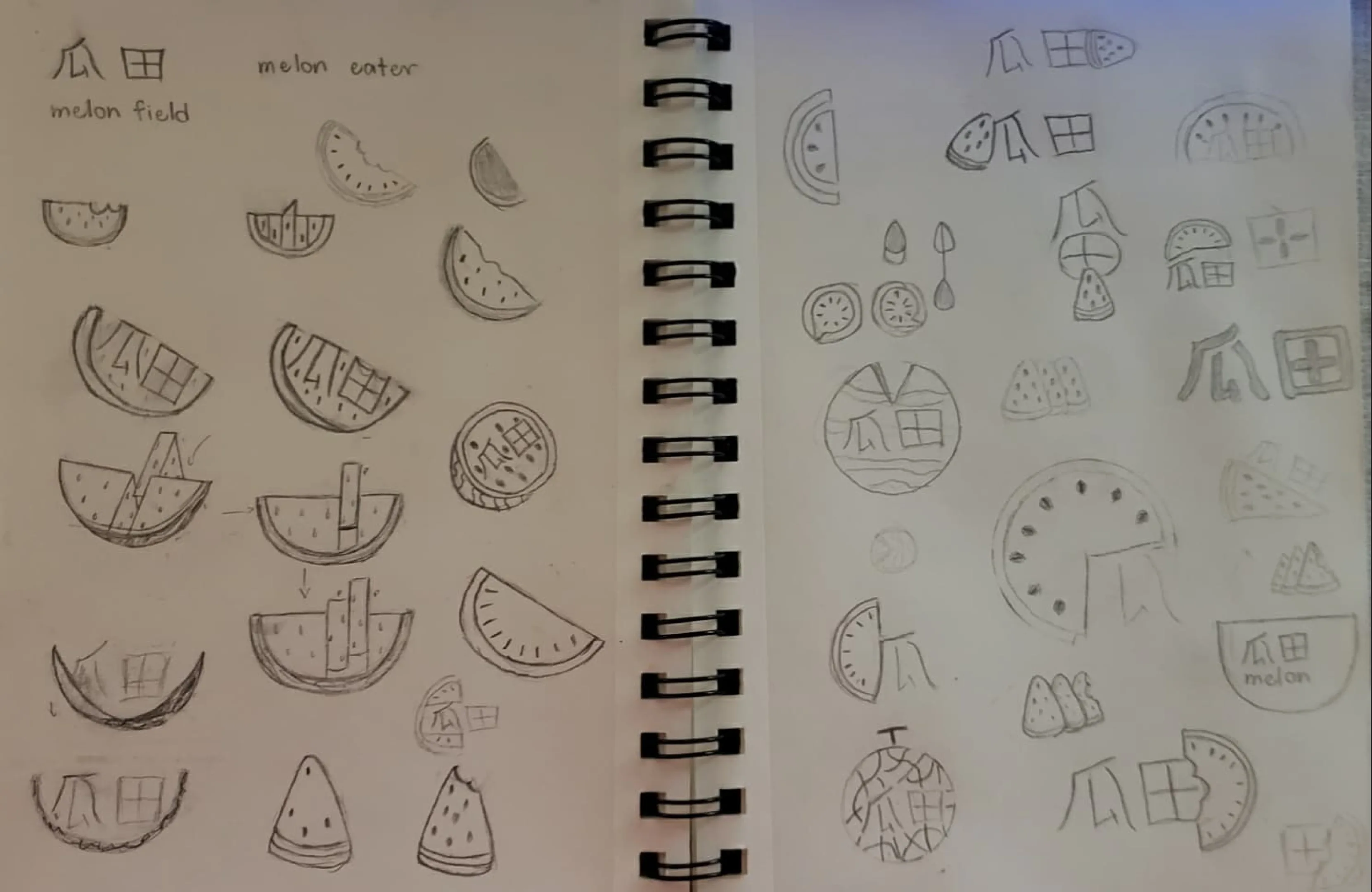
Paper Exploration
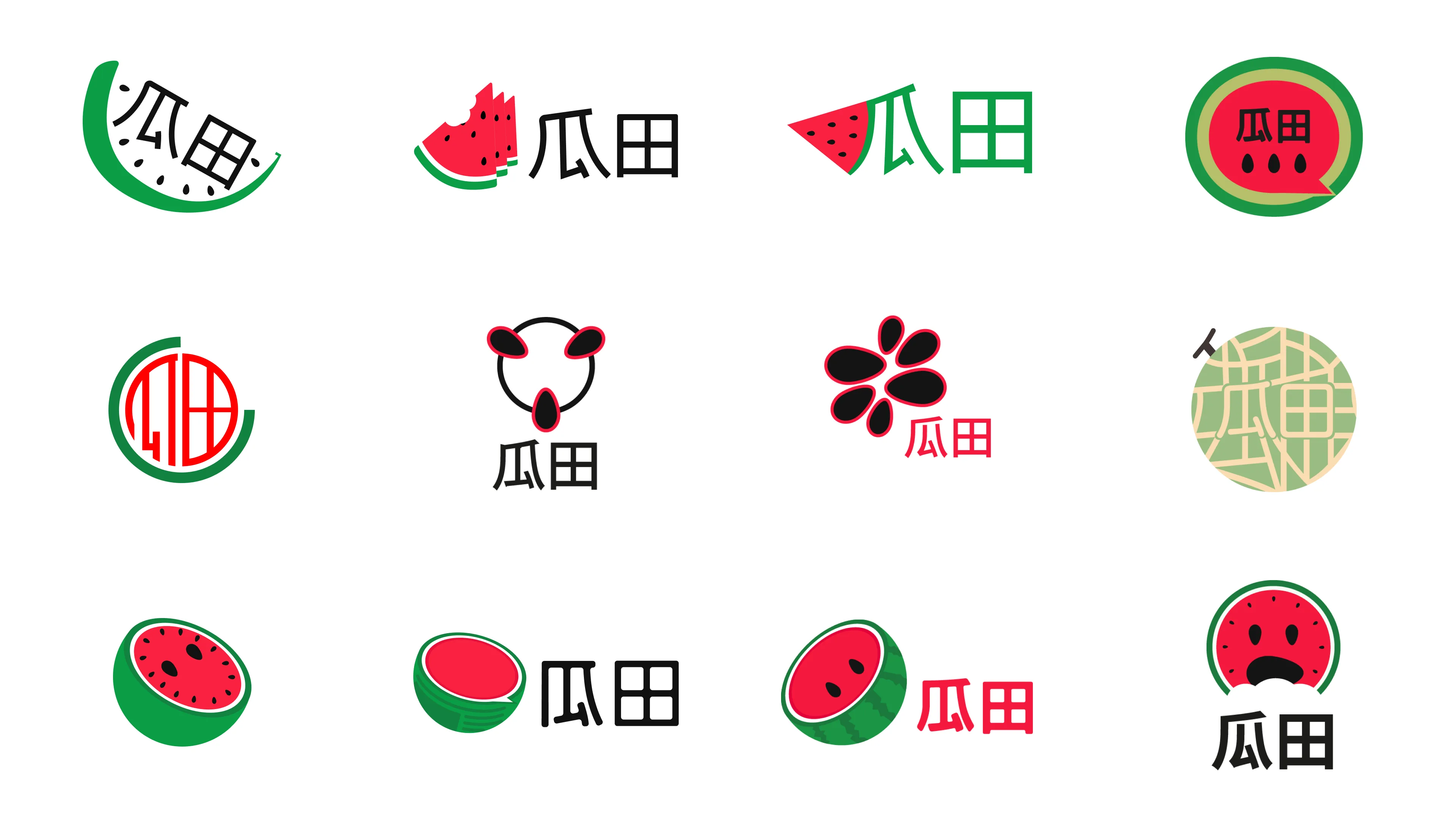
Digital Exploration
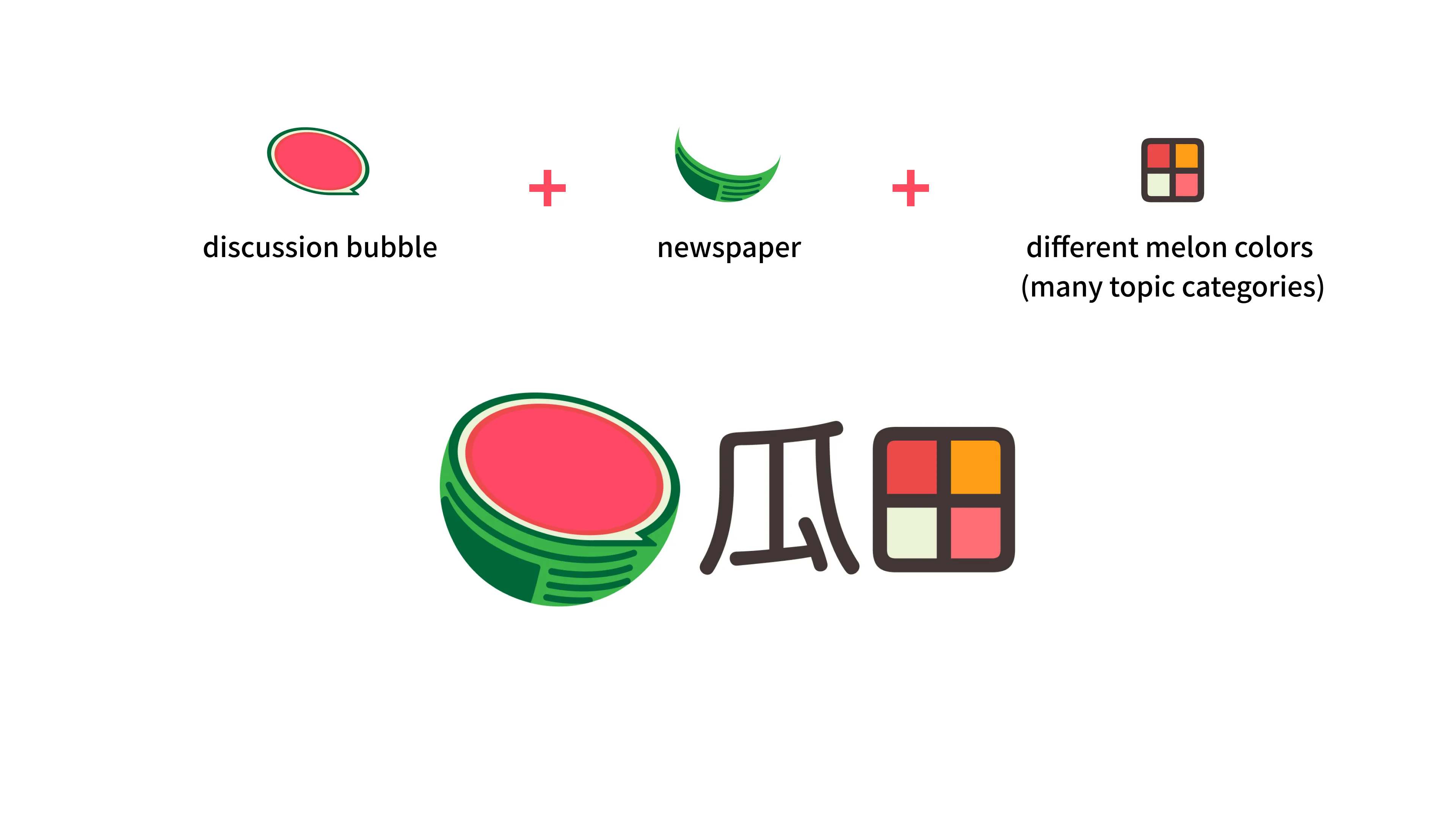
Melon Logo Breakdown
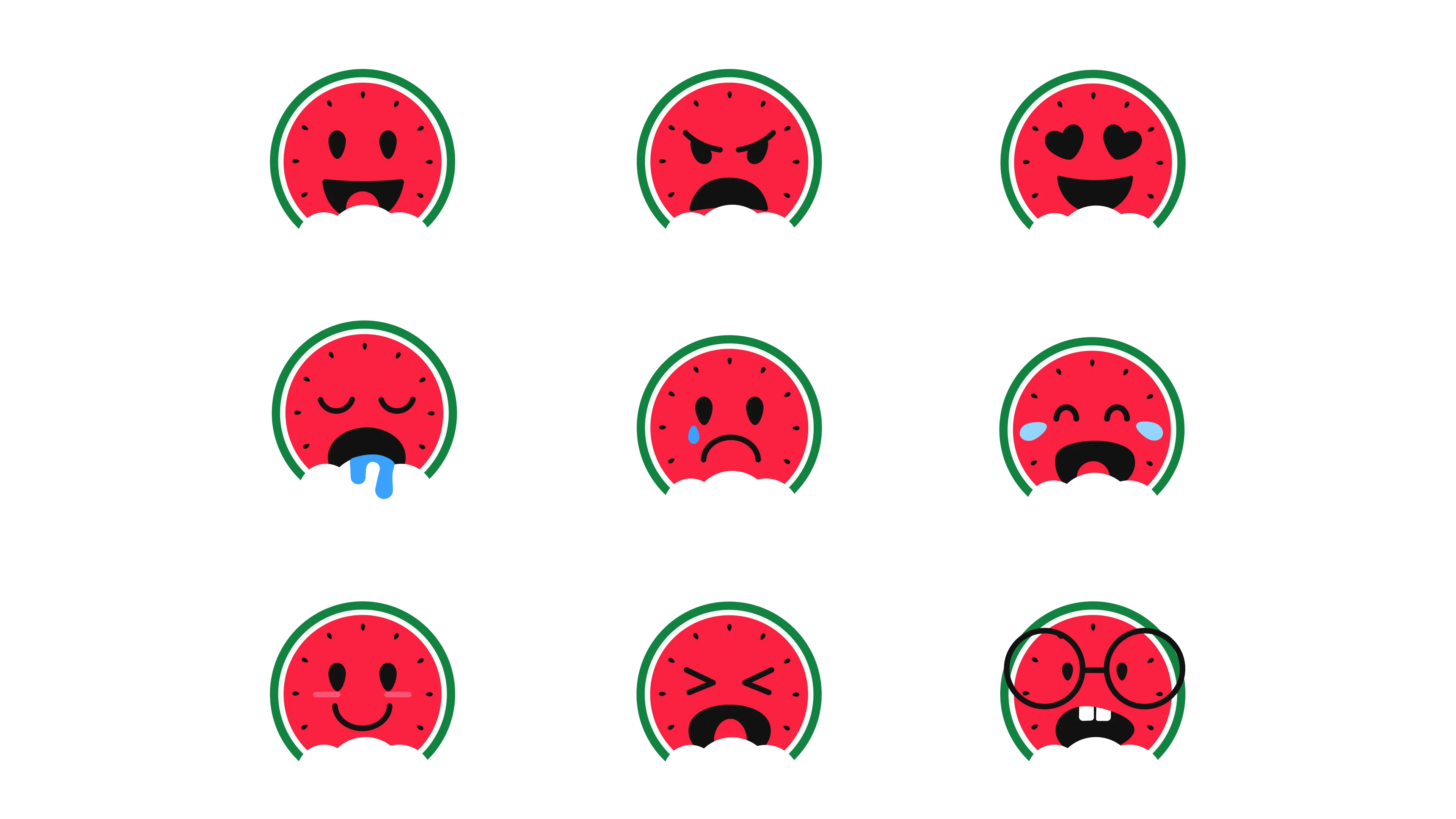
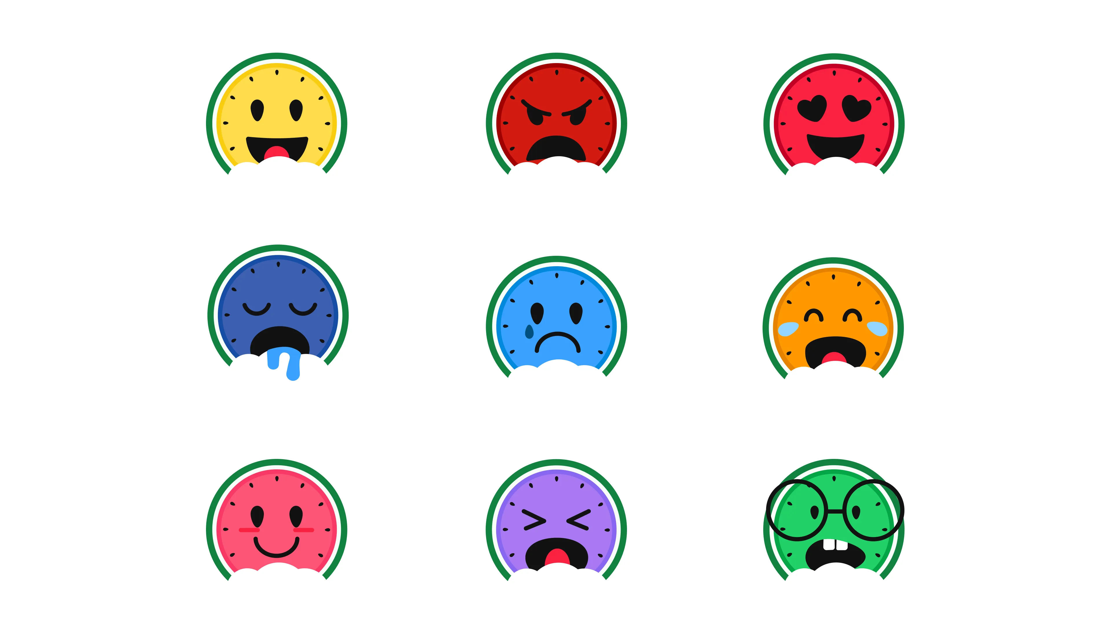
Melon Emojis Colorful Alternative
Scalable UI System & Theming
Since this was going to be a heavy content platform, I needed to build a design system that could grow with it.
- Color Theming:
I created a dynamic theme system (Pink, Orange, Green, Brown) that automatically changes based on the news category you're reading, giving users an instant visual cue. - Custom Emojis:
I designed a custom set of melon-themed emojis to make the community discussions feel unique and engaging. - Responsive Layouts:
I mapped out the entire experience across desktop and mobile to make sure reading long articles felt effortless on any screen.
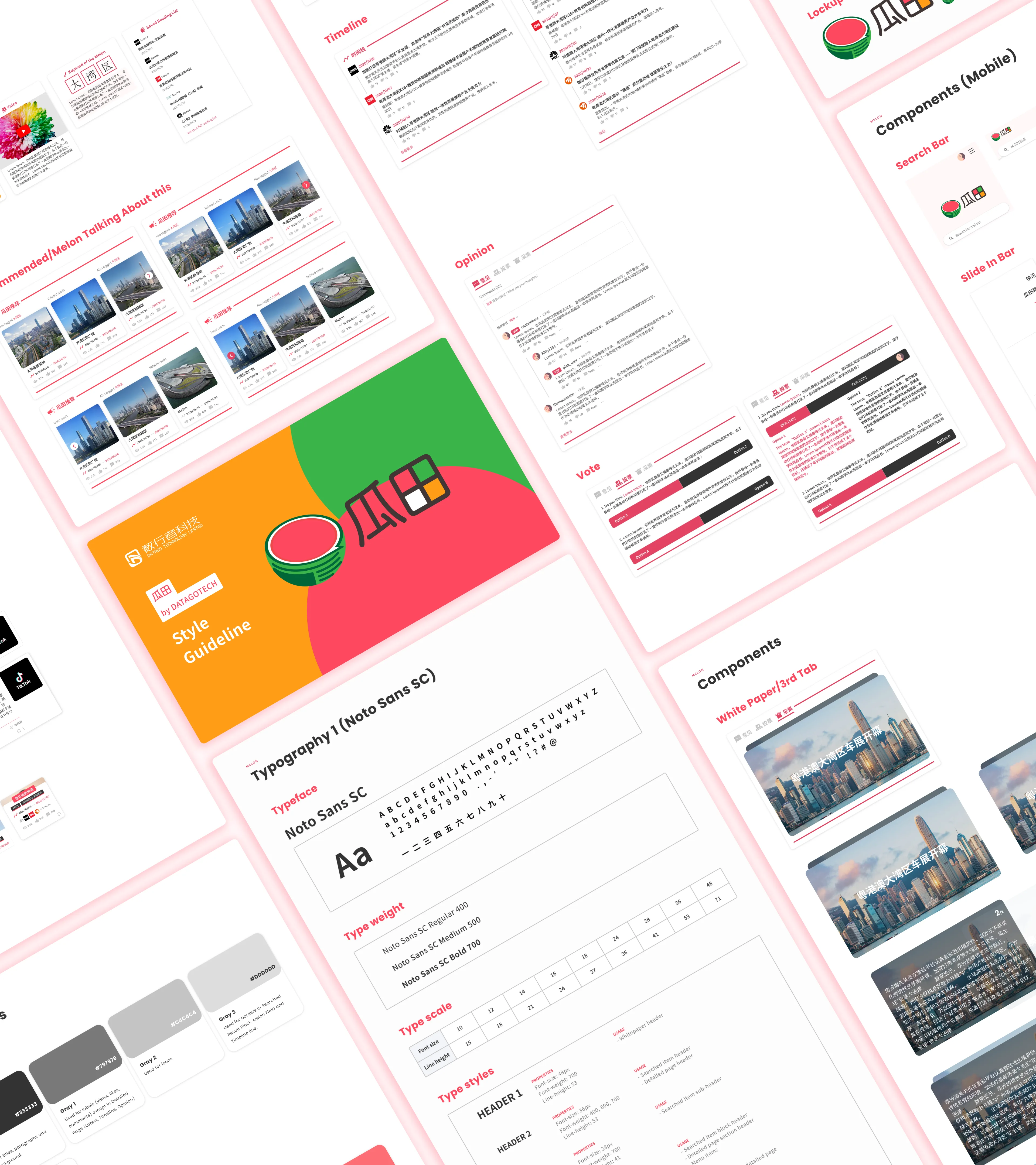
Melon Styleguide
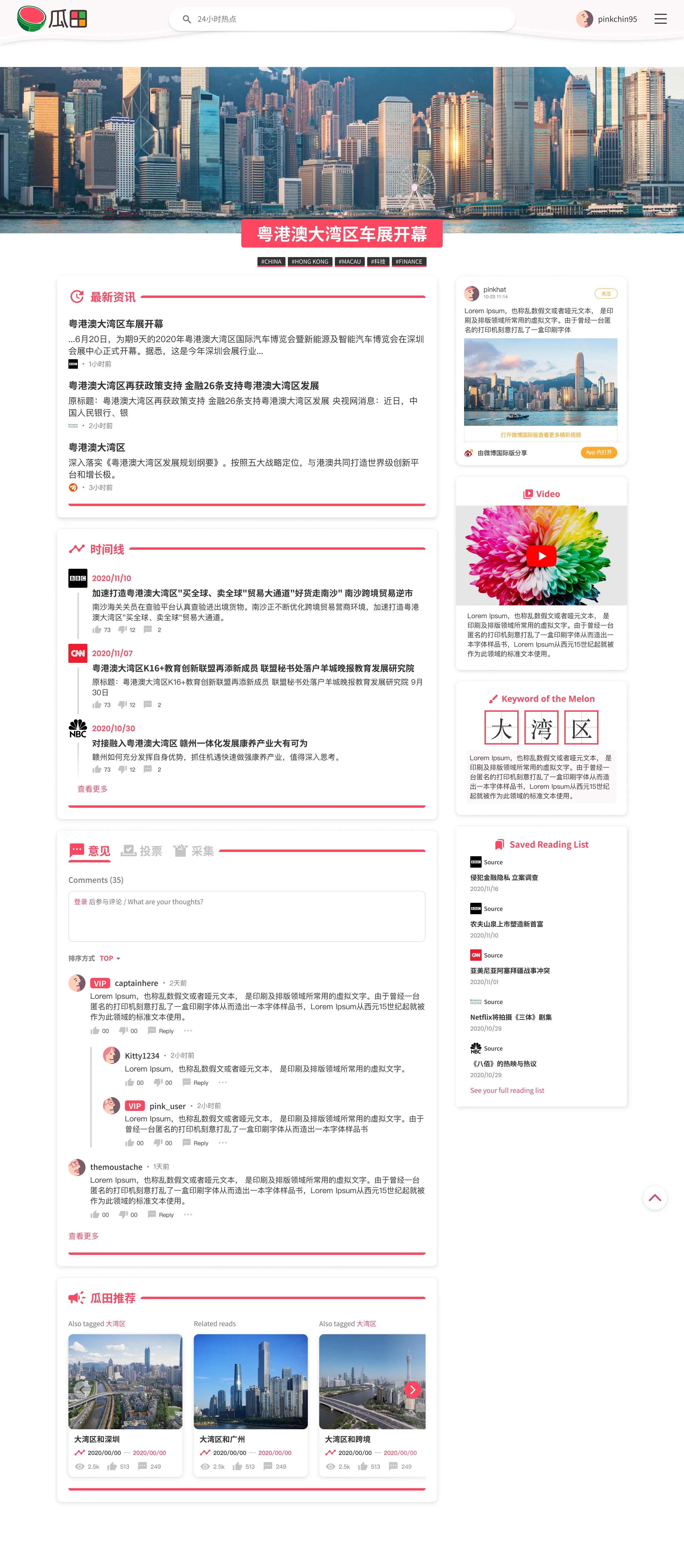
Melon Pink Site Theme
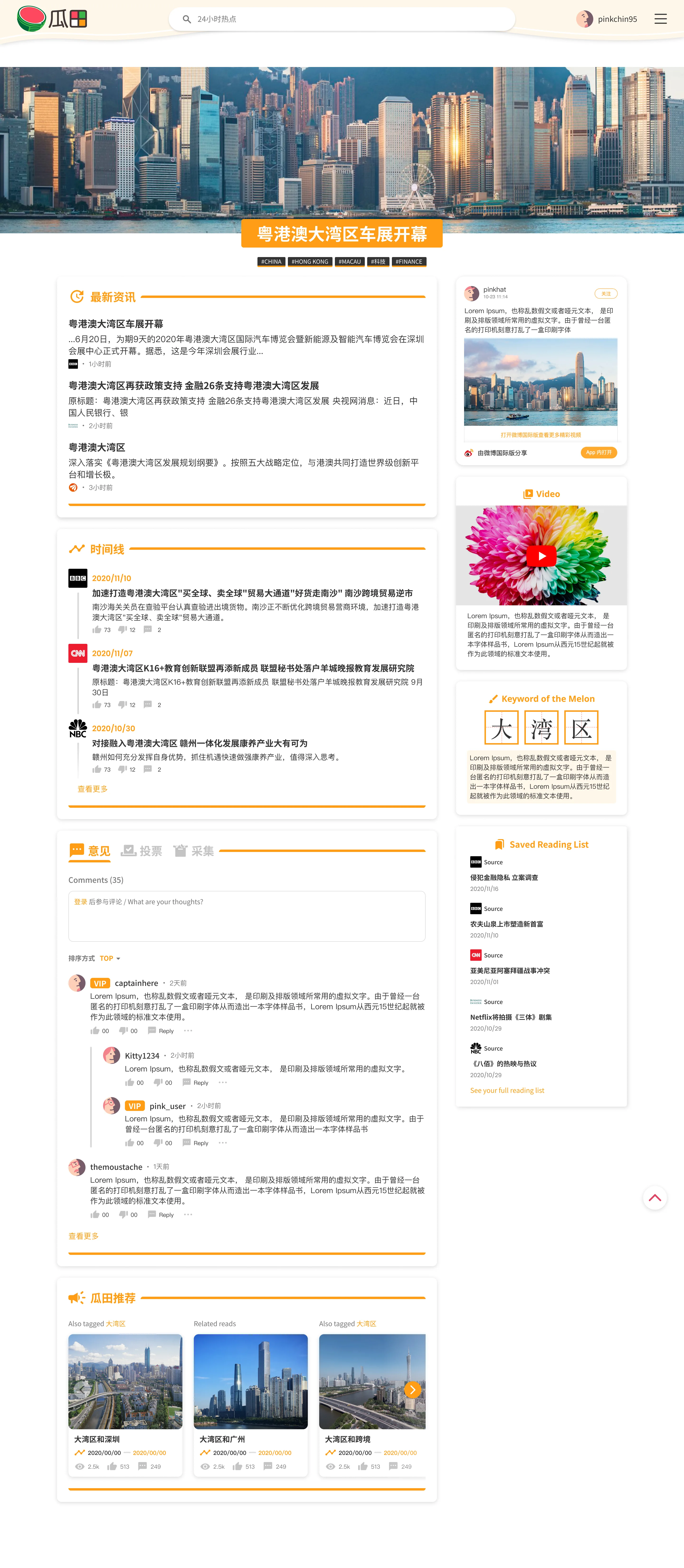
Melon Orange Site Theme
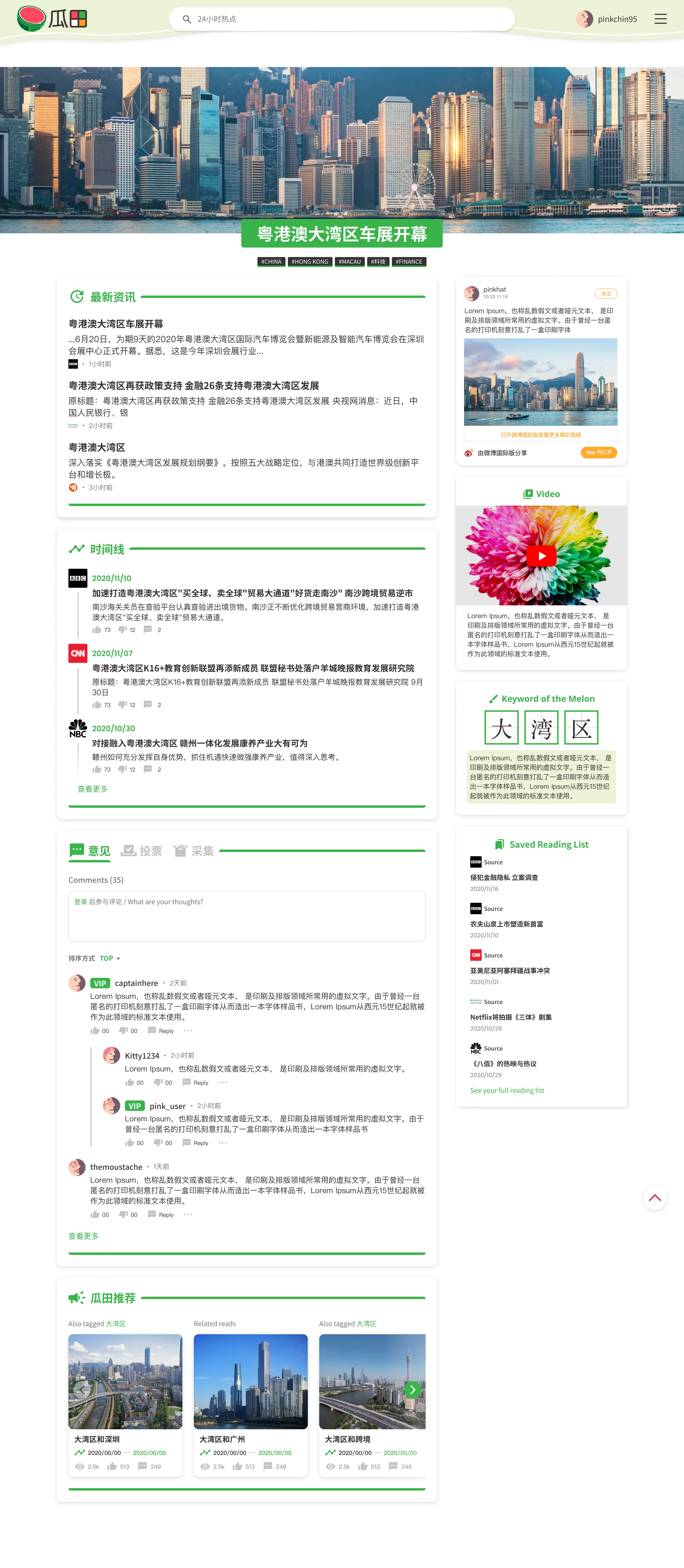
Melon Green Site Theme
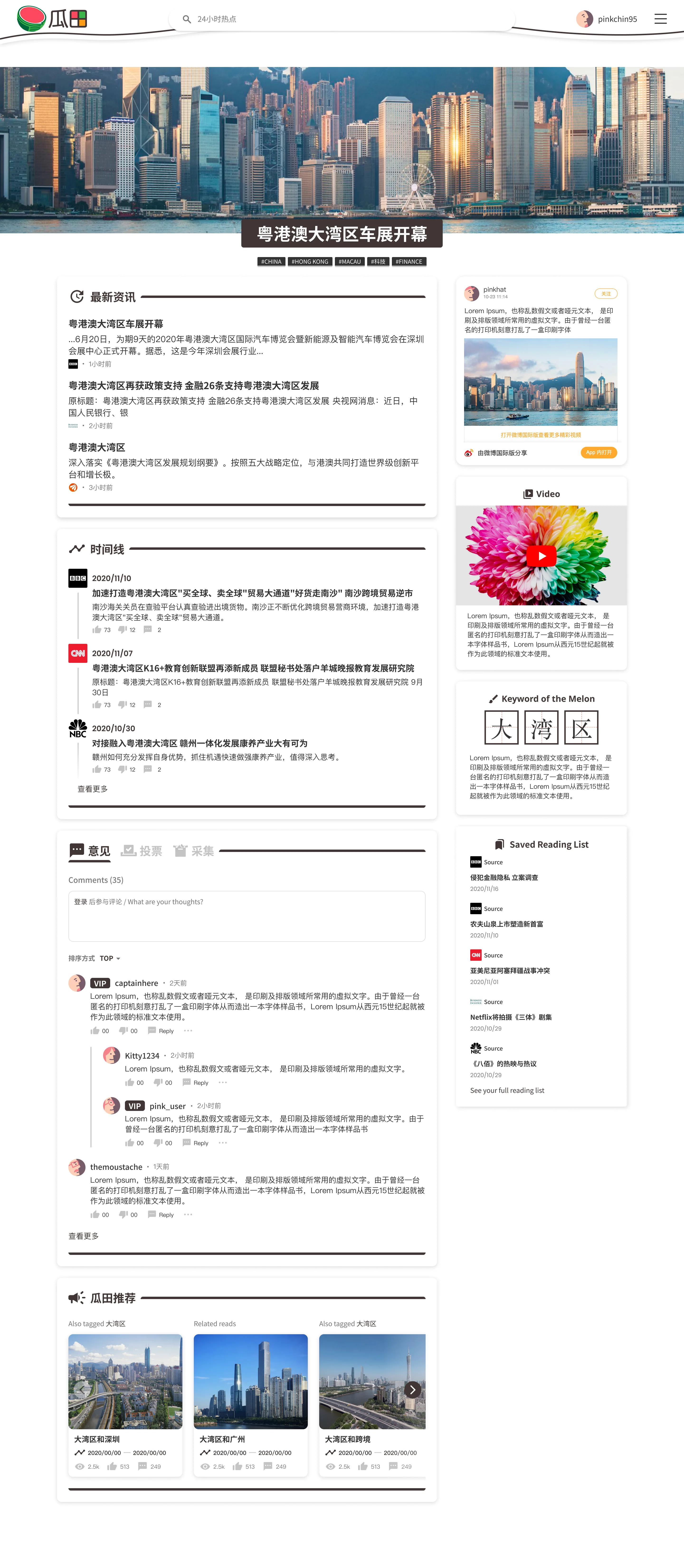
Melon Brown Site Theme