
Neuromatics (Trials)
OVERVIEW
Trials is a comprehensive clinical trial management platform designed to empower medical researchers and clinicians. These trials are the primary mechanism through which researchers evaluate the safety and efficacy of new treatments, medications, diets, and medical devices. Neuromatics engaged Plangora to overhaul this platform, which was actively deployed across medical facilities in the US and Mexico.
TIMELINE
June 2022 - Dec 2022
MY ROLE
Lead UX/UI Designer (via Plangora)
THE TEAM
1 Designer, CEO, and 2 Developers
TOOLS USED
Figma
CONSTRAINTS
Strictly timeboxed to 16 hours/week alongside other agency deliverables.
Strategic UX Audit
I was brought on to lead a comprehensive redesign of the entire application. An initial heuristic evaluation revealed critical usability and compliance bottlenecks:
- Accessibility Failures:
The existing dark mode palette failed standard WCAG contrast guidelines, posing a significant issue for clinical environments. - Ambiguous System Status:
Key indicators (like a standalone blue dot) lacked contextual labels, leaving users guessing about system status. - Inefficient Data Entry:
Form interactions were highly constrained. Long checklist items forced users into horizontal scrolls, and non-editable fields lacked clear disabled states, leading to workflow friction and data-entry errors.
It was clear that the legacy application had been rushed to market. Because doctors were already relying on this platform in their daily workflows, the redesign required a careful, systemic overhaul without disrupting their operations.
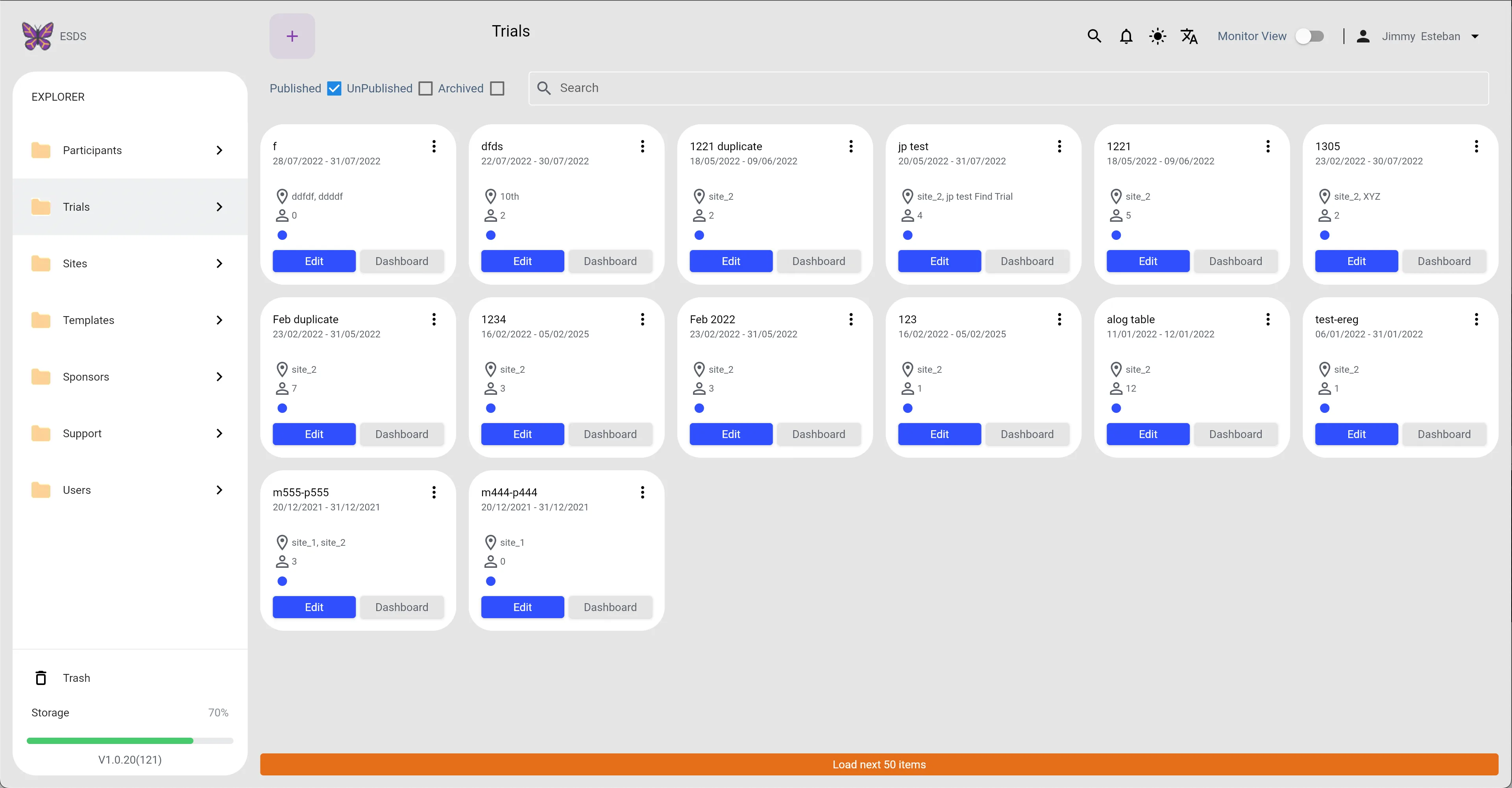
Trials (Light Mode)
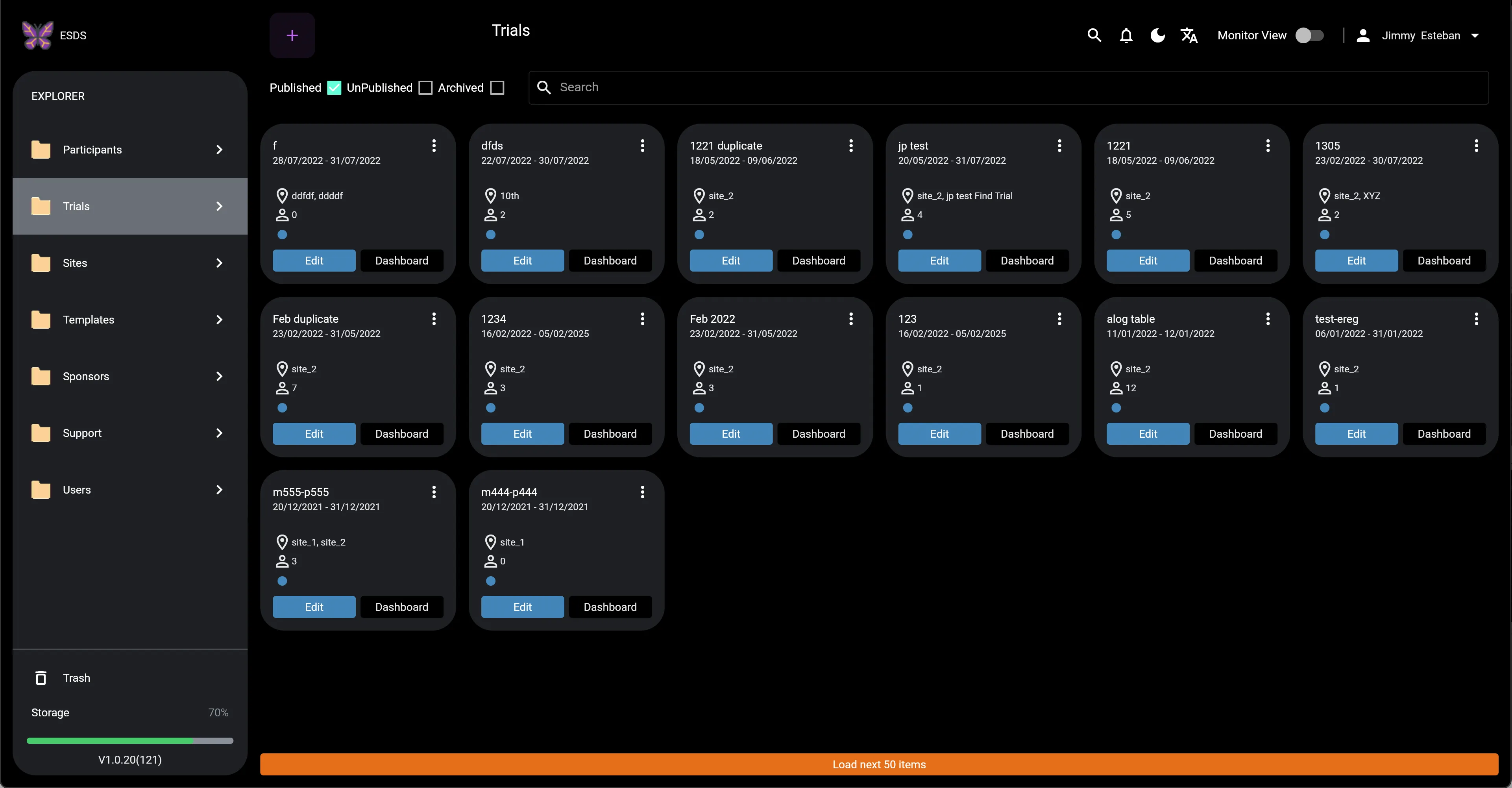
Trials (Dark Mode)
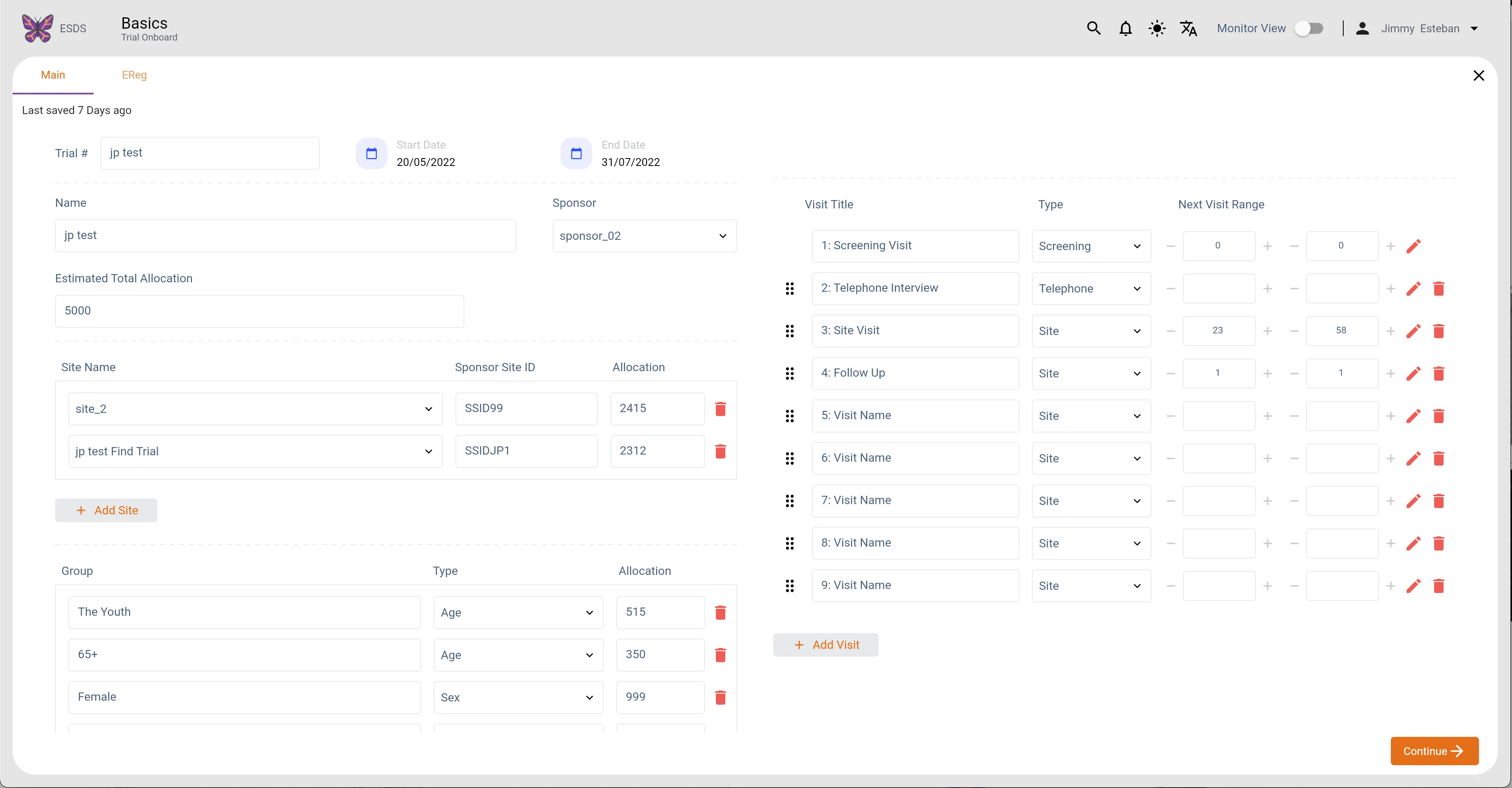
Trials Main (Light Mode)
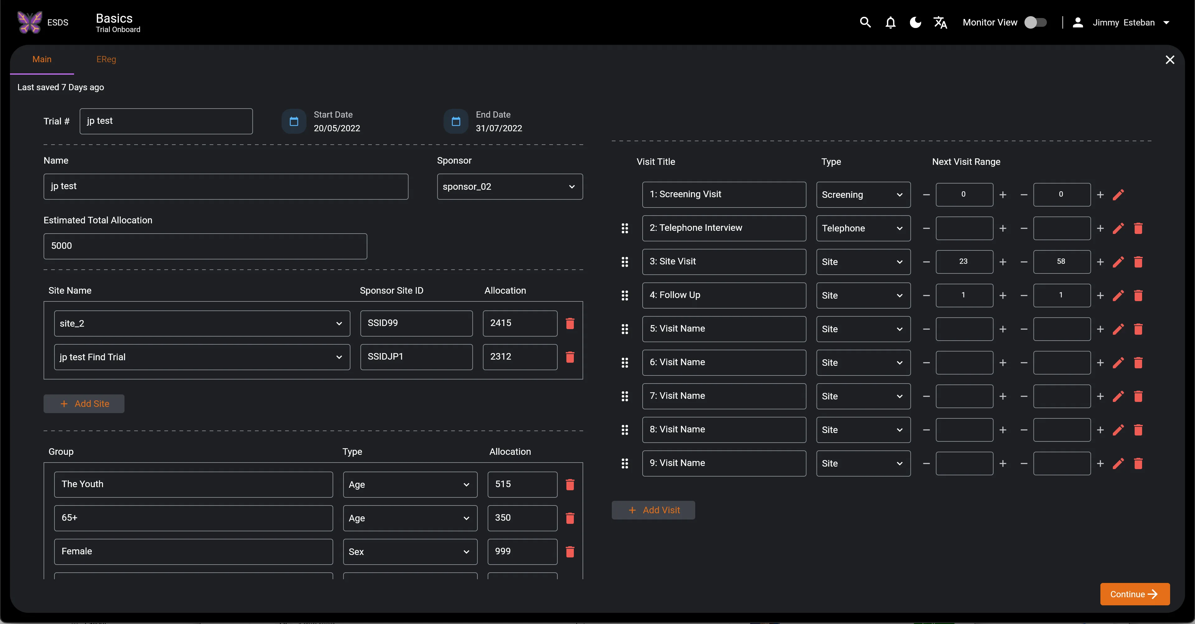
Trials Main (Dark Mode)
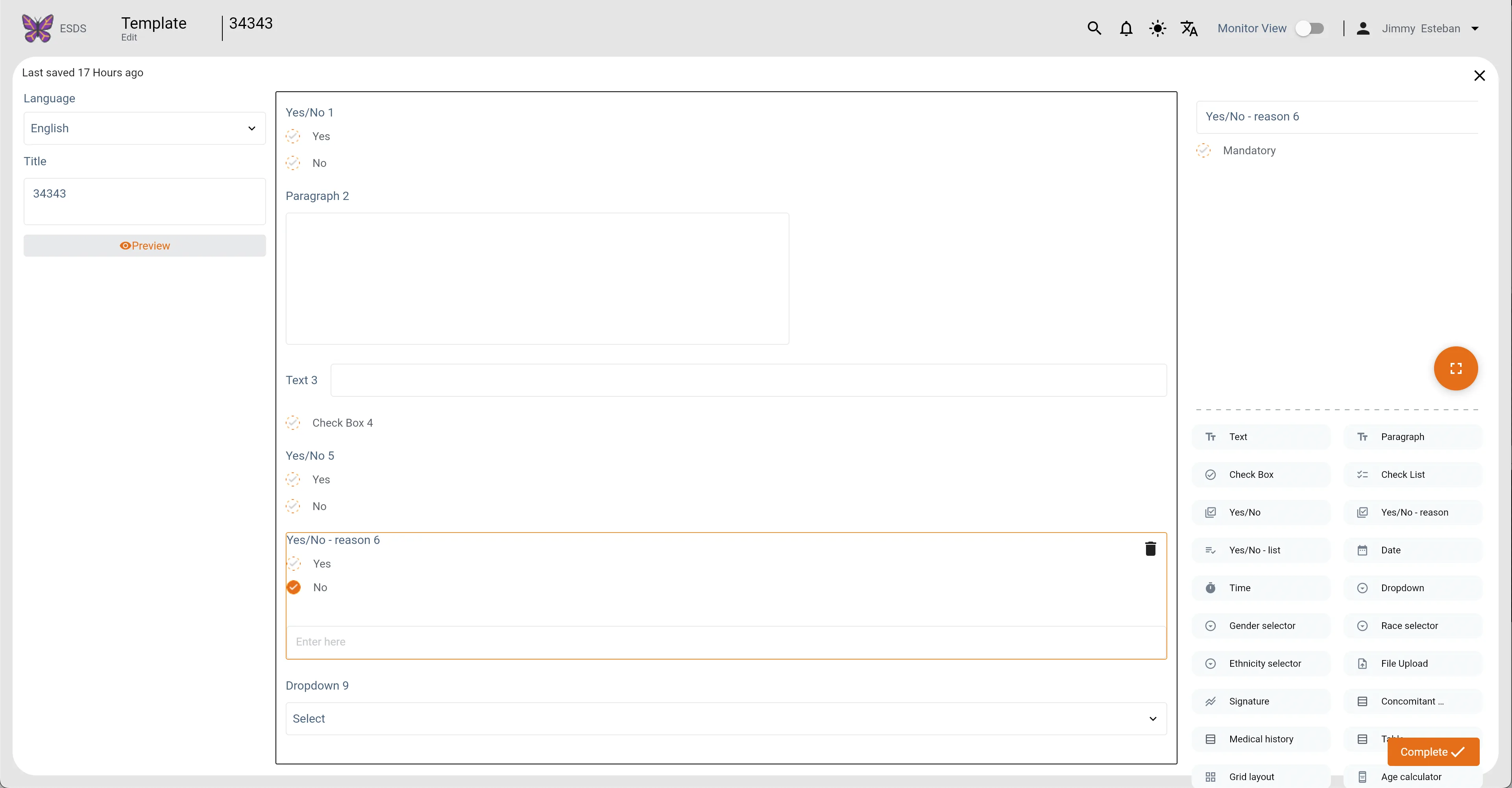
Templates Main (Light Mode)
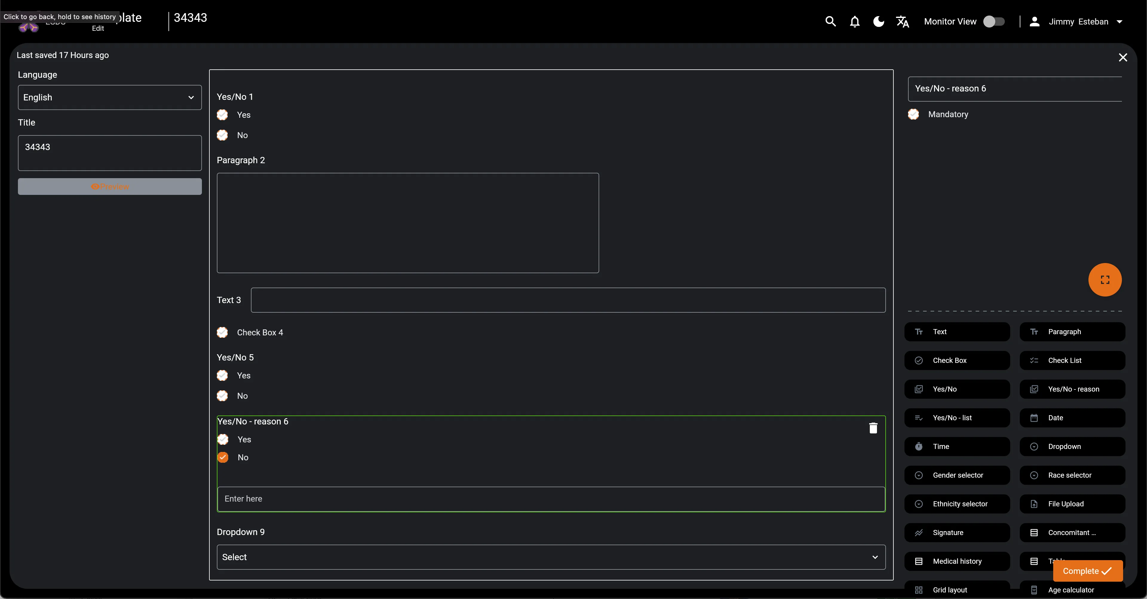
Templates Main (Dark Mode)
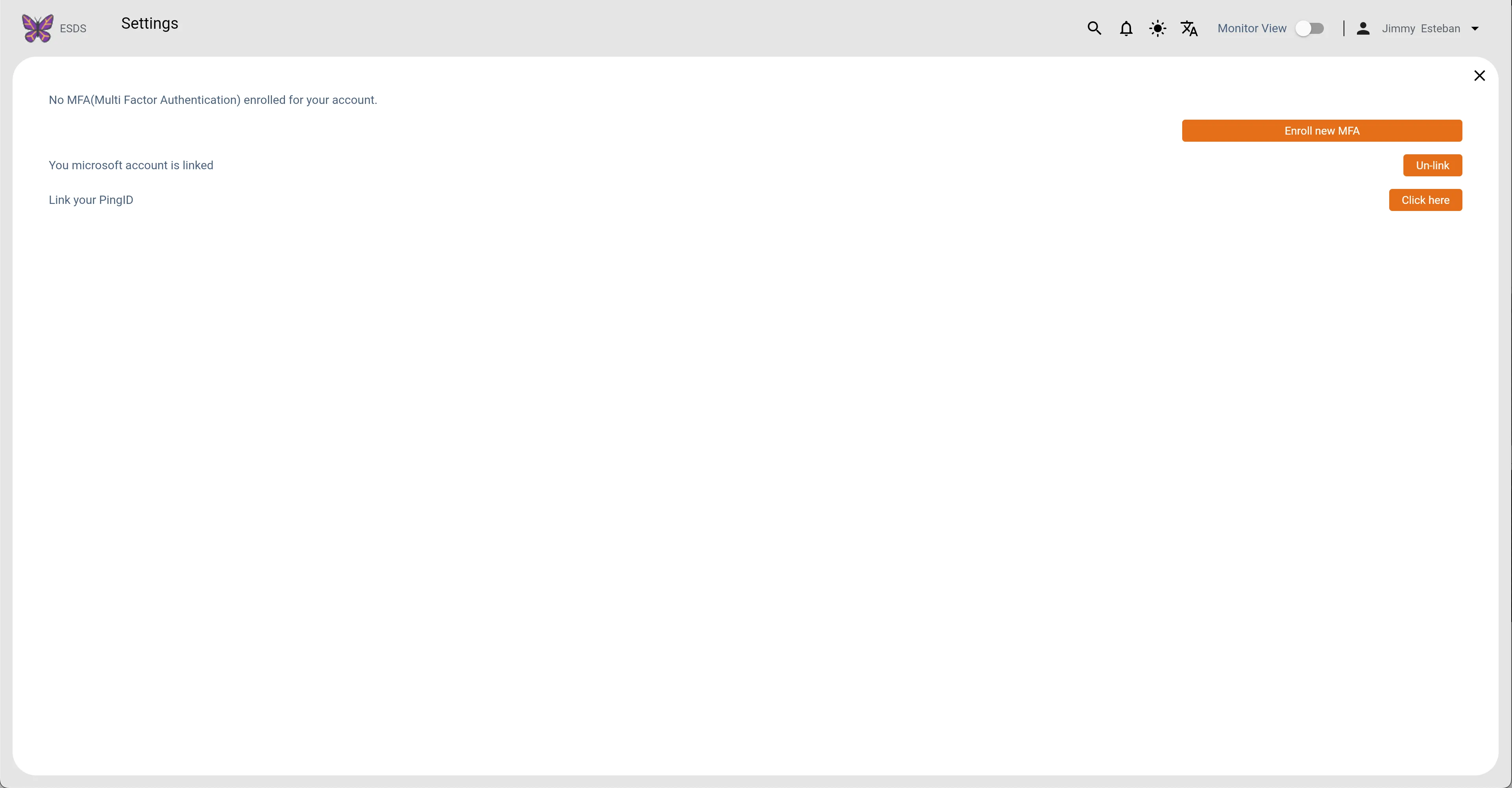
Settings (Light Mode)
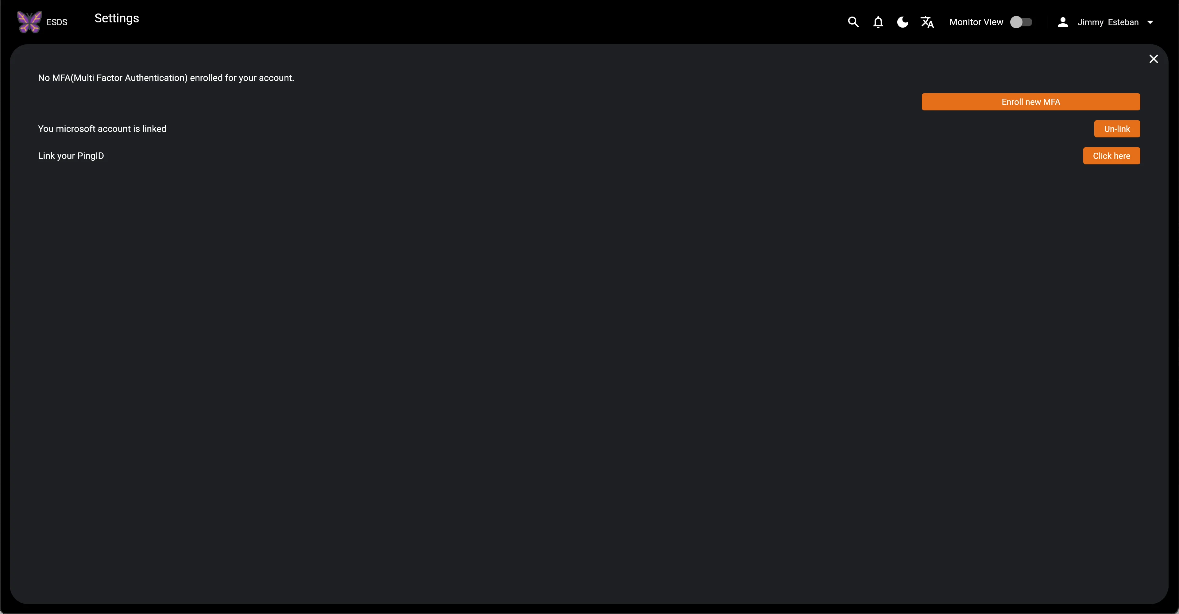
Settings (Dark Mode)
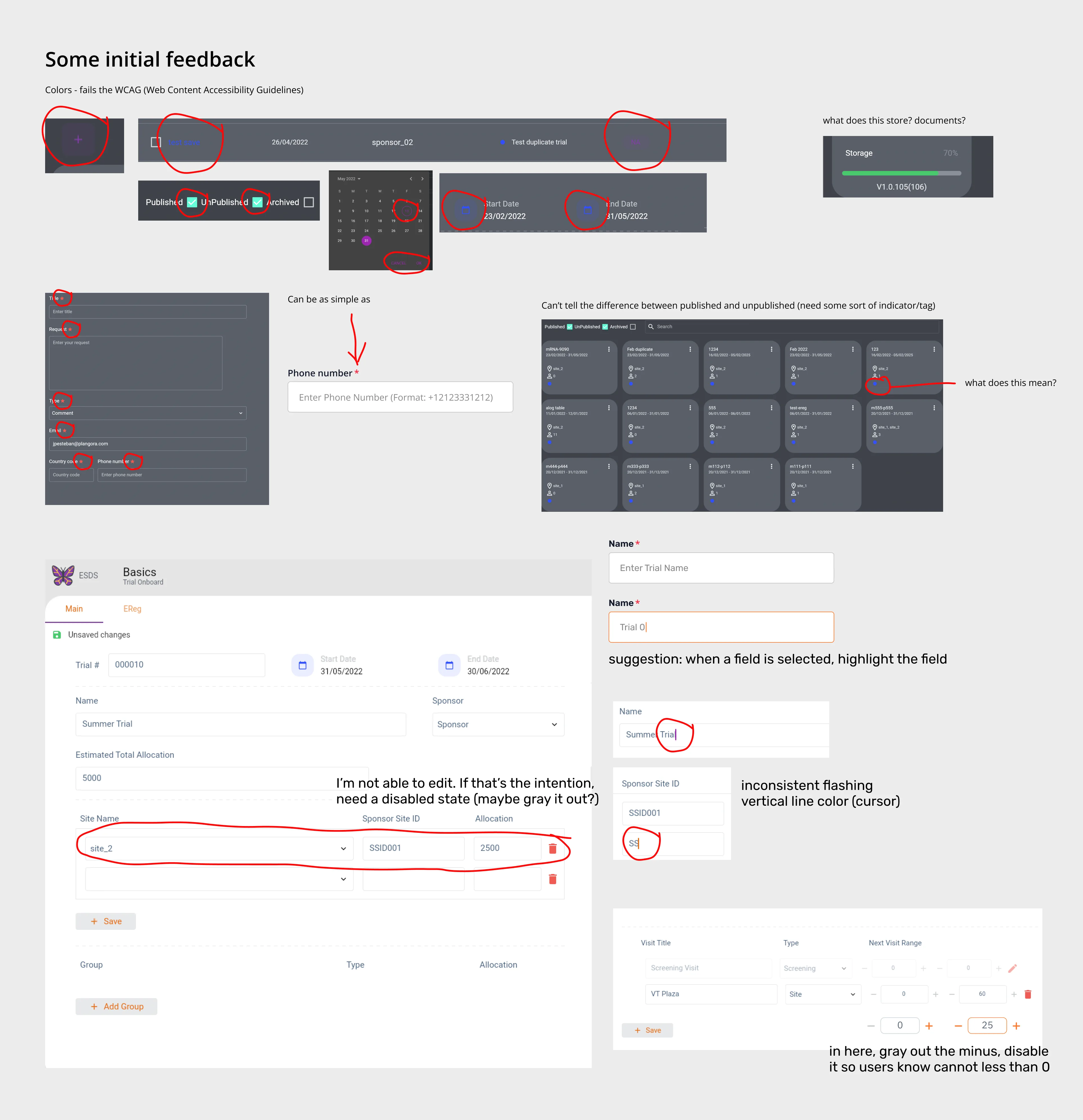
First Glance
Foundational Research & Architecture
Navigating a project with zero legacy documentation meant building the information architecture from the ground up. I initiated foundational user research to map the complex workflows of doctors, clinical administrators, and researchers.
The primary objective was to architect a centralized data hub. By providing healthcare practitioners with an intuitive, efficient system for handling patient records and trial parameters, they could reduce administrative overhead and dedicate more energy to delivering optimal medical outcomes.
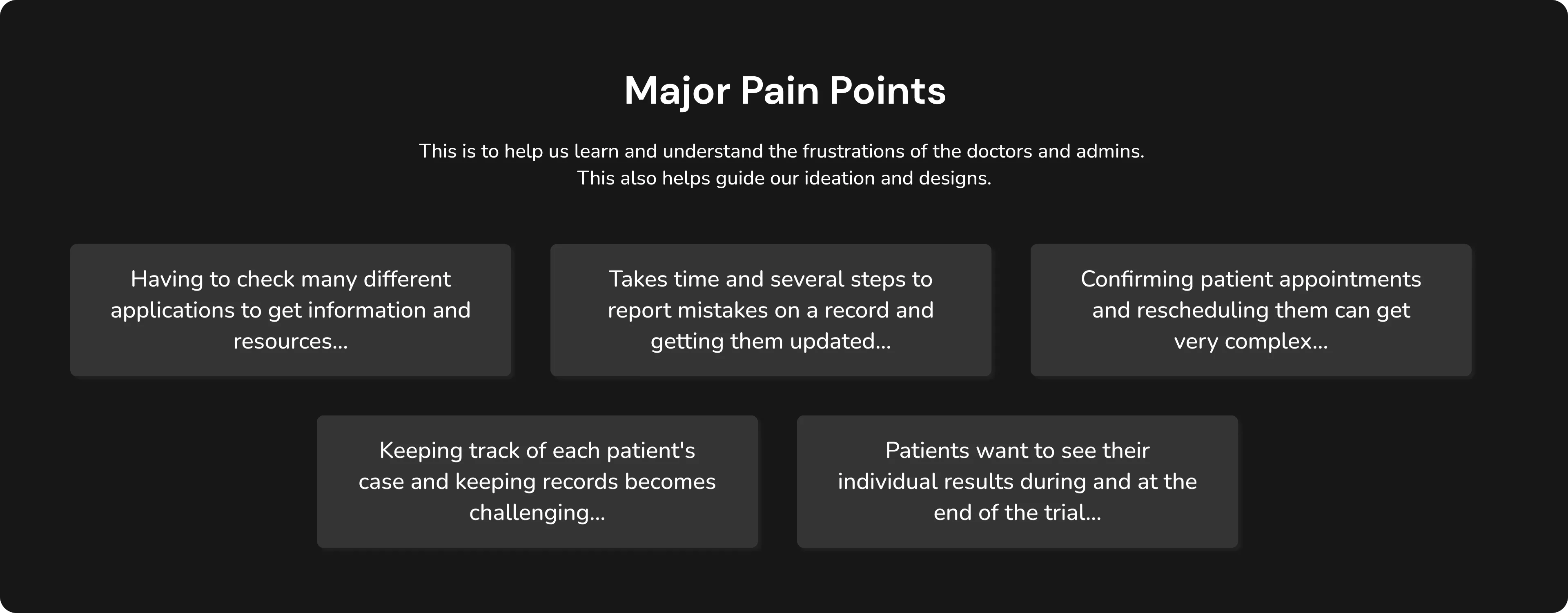
Major Pain Points
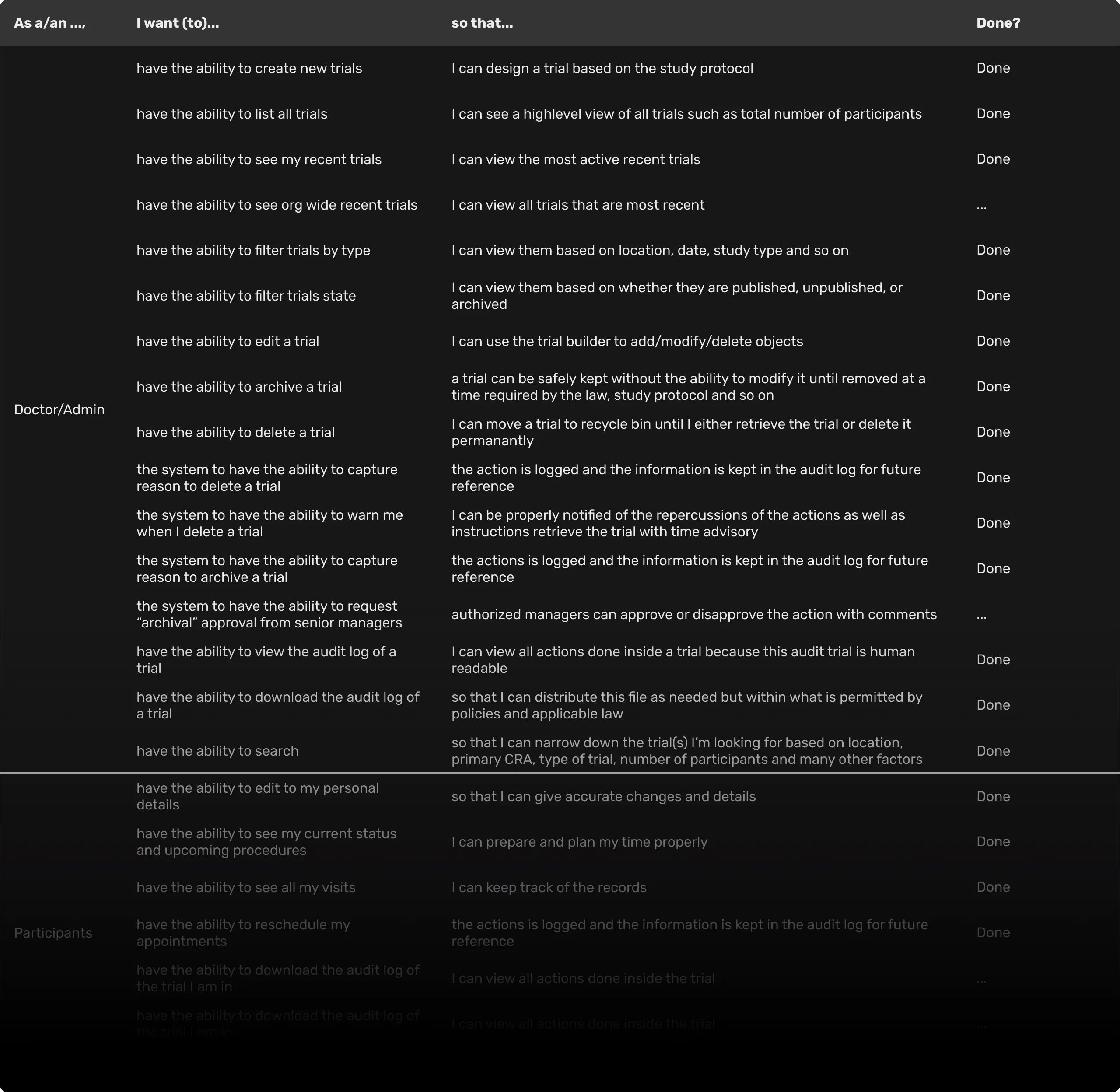
As I Want To Do That...
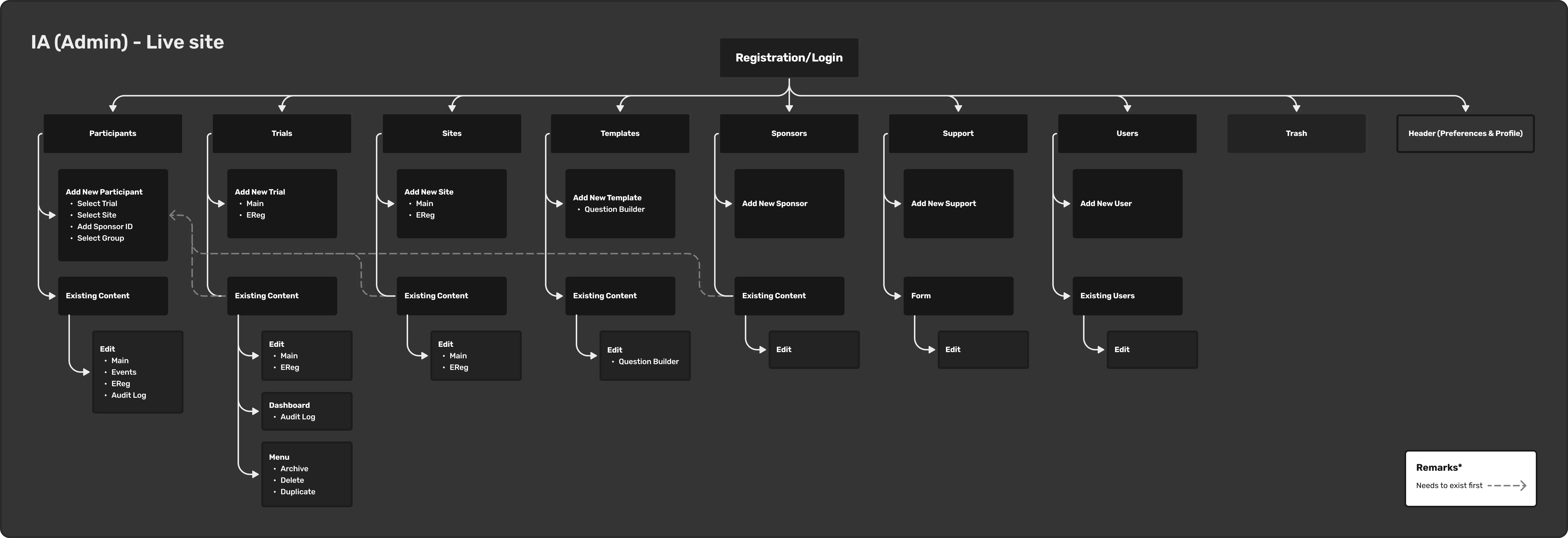
IA Admin
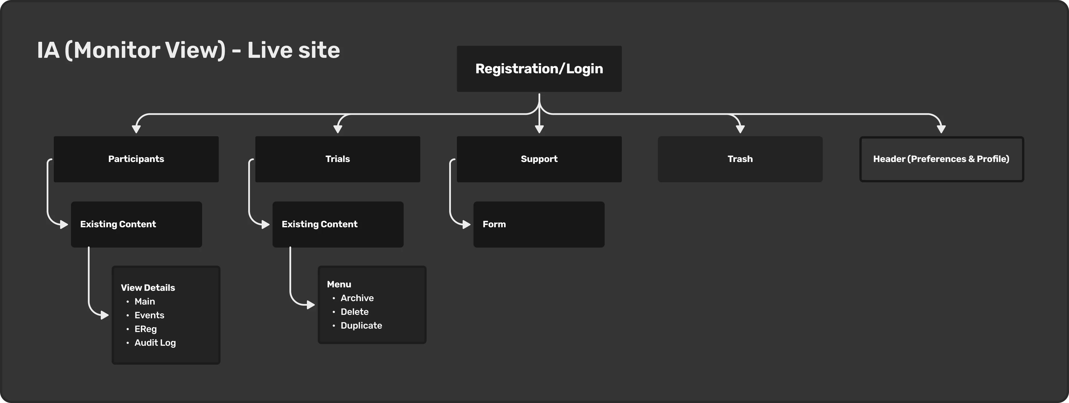
IA MonitorView
The Patient Experience Opportunity
While the immediate business priority was stabilizing the clinical portal, my research highlighted a massive opportunity to close the loop on the patient side.
I began architecting a concept for a companion patient-facing mobile application to drive trial engagement and compliance. The vision for this app was to give participants complete visibility into their longitudinal studies: empowering them to check upcoming visit schedules, track personal health milestones, and seamlessly claim financial compensation or rewards for completing trial phases. Although this scope was pushed to the future roadmap, defining it early ensured our clinical data models could eventually support a seamless patient-facing mobile ecosystem.
Design System
As the sole designer, I created the Design System in Figma, which allows for consistent design and the ability to swiftly swap and adjust elements in the UI such as colors, fonts, icons, and UI components especially having both light and dark themes. This also aids the development process by serving as a guide for the developers working on this project.
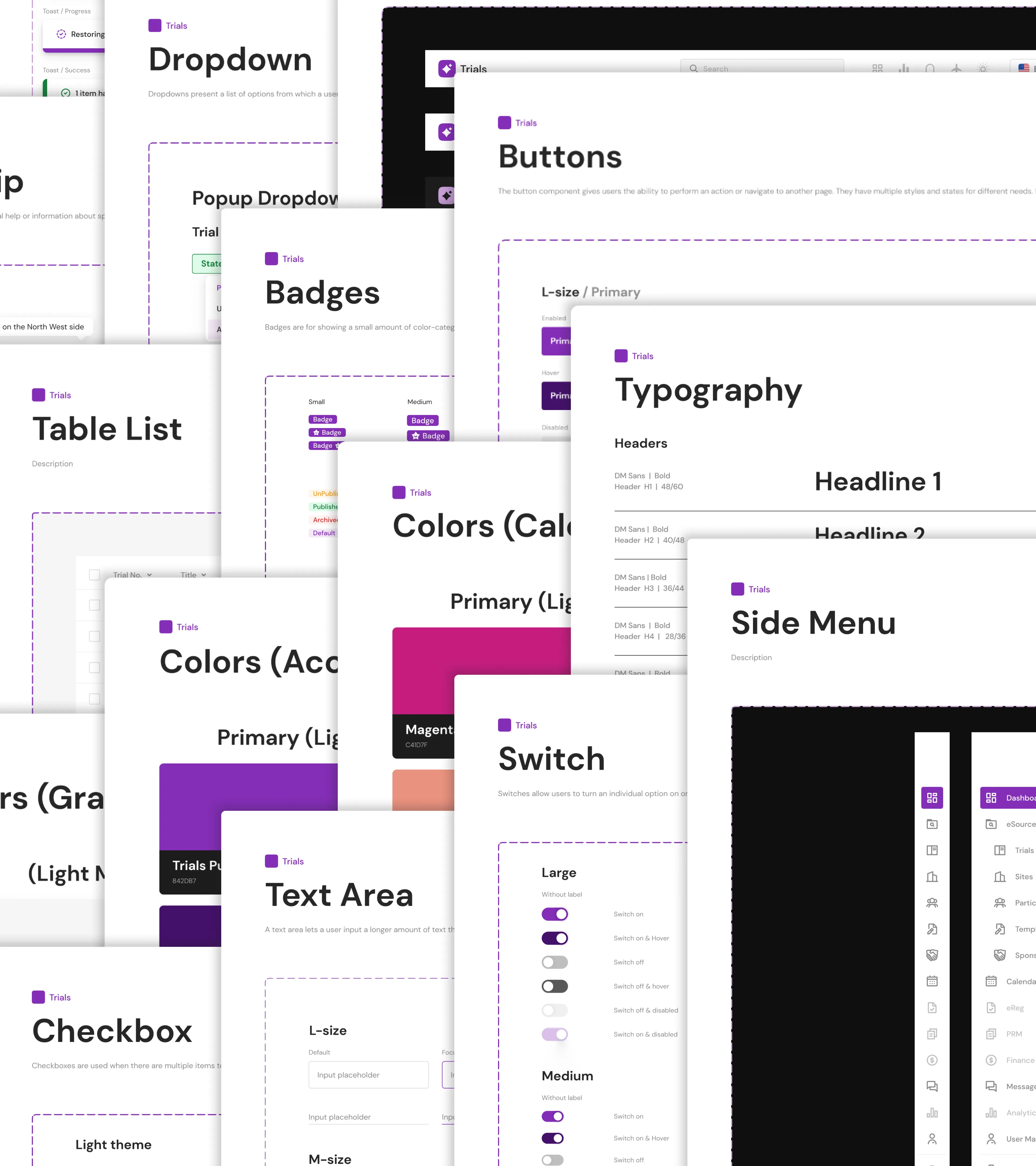
Trials Design System
Prototype
I created a handful of these to aid in further describing some of the desired interactions and to serve as a reference for the developers.
Login
Show/Hide Columns Trials
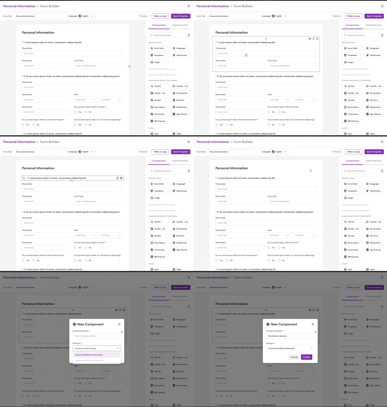
Form Builder: Creating a New Component
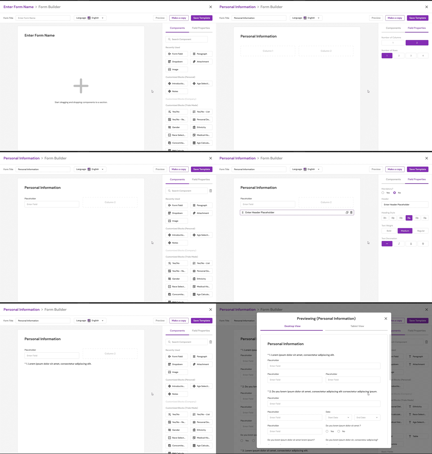
Form Builder: Using a Component
The Redesign
As mentioned in the goal above, colors are failing the accessibility guidelines. In Figma, I heavily relied on the "Stark" plugin to check the contrast ratio. I've also been using the 4-Point Grid System to space things out and to speed up the design and development process. Because the spacing rules have been established, components can always be designed and coded to adhere to these consistent spacings.
Trials Page
There's no telling the cards apart if we check Published, UnPublished, and Archived. As a result, I added a status section to each card. As more trials are created, we will require a filtering feature, which the previous design did not provide. Also, because some users prefer to view the information in a different way, I included an additional viewer mode (list mode or grid mode).
Trials (Light Mode)
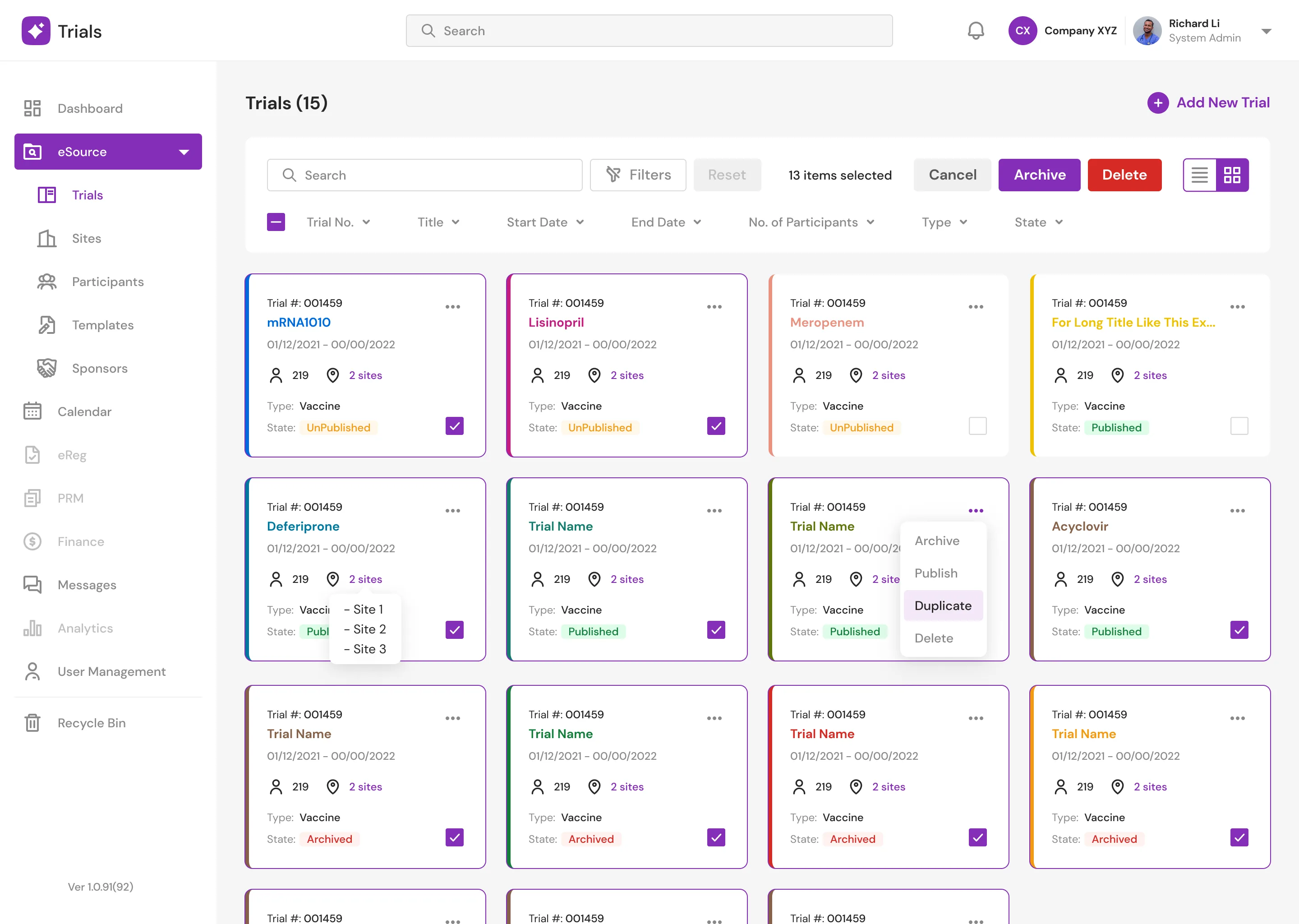
Trials (Light Mode) New
Trials (Dark Mode)
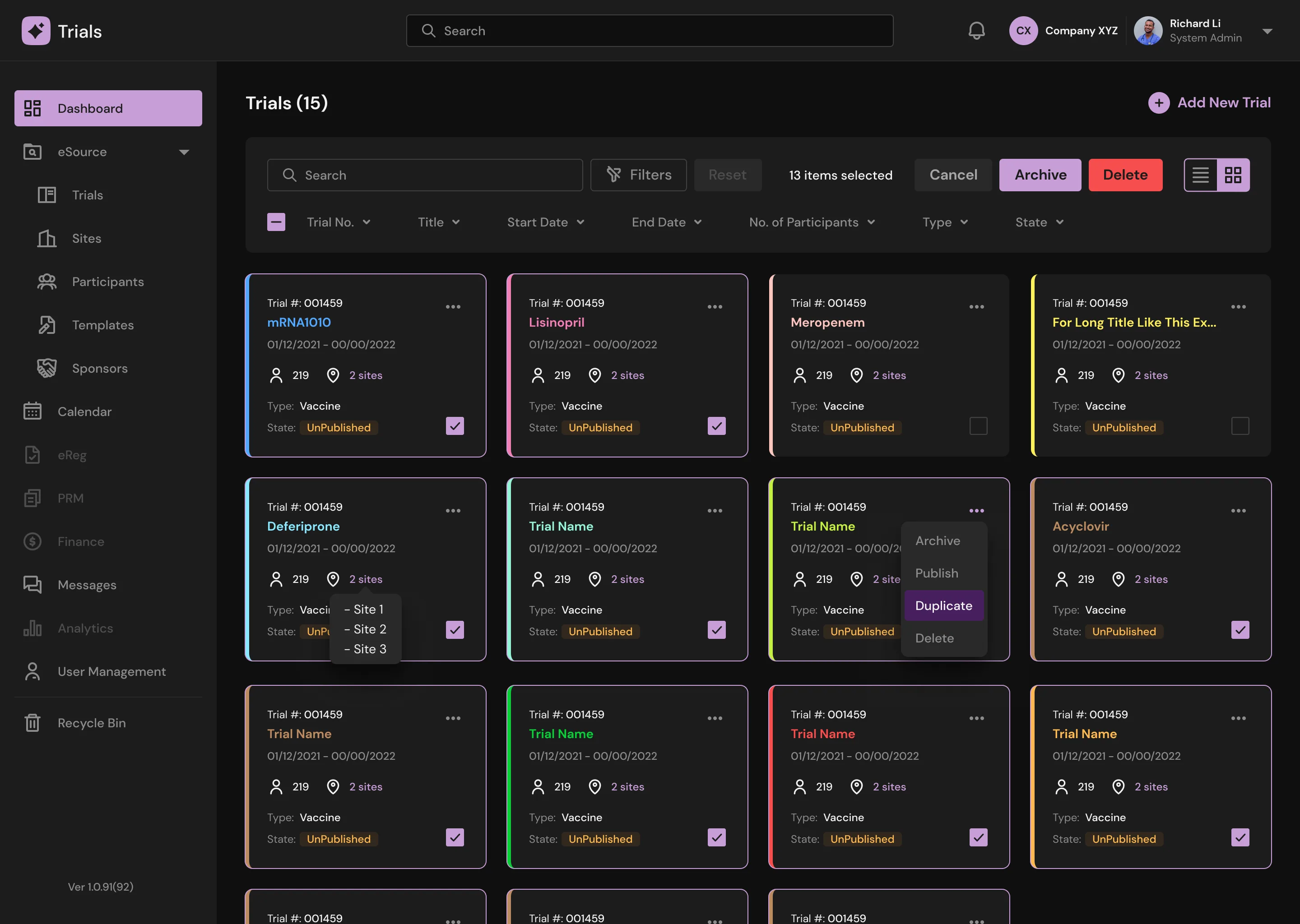
Trials (Dark Mode) New
Trials Main (Light Mode)
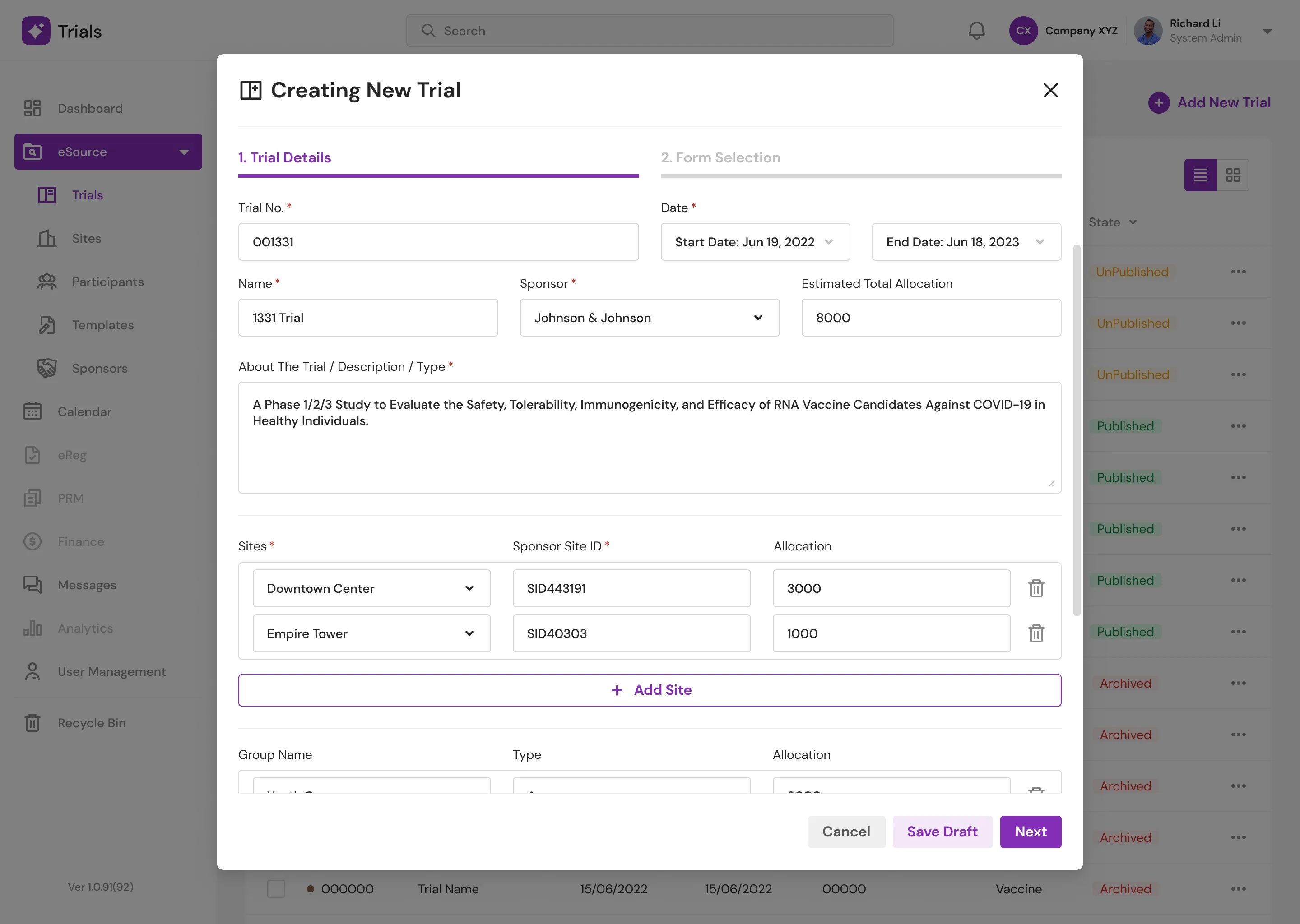
Trials Main (Light Mode) New
Streamlining Clinical Operations
Templates & Form Builder
Templates are custom data-collection forms designed by doctors. To resolve the severe usability issues in the legacy form builder, I engineered modular component blocks. Doctors can now create, save, and share specific component sets across their organization, supported by a robust filtering system and grid-view previews.
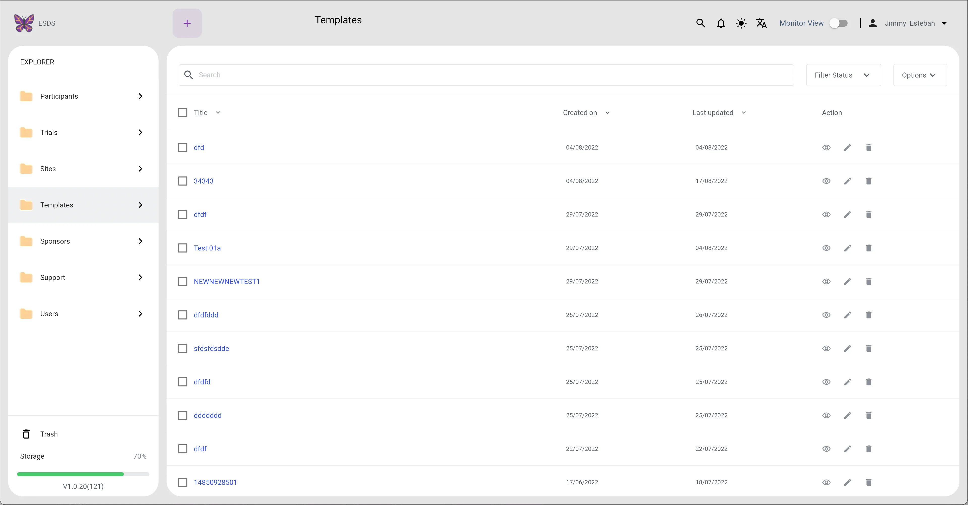
Templates (Light Mode)
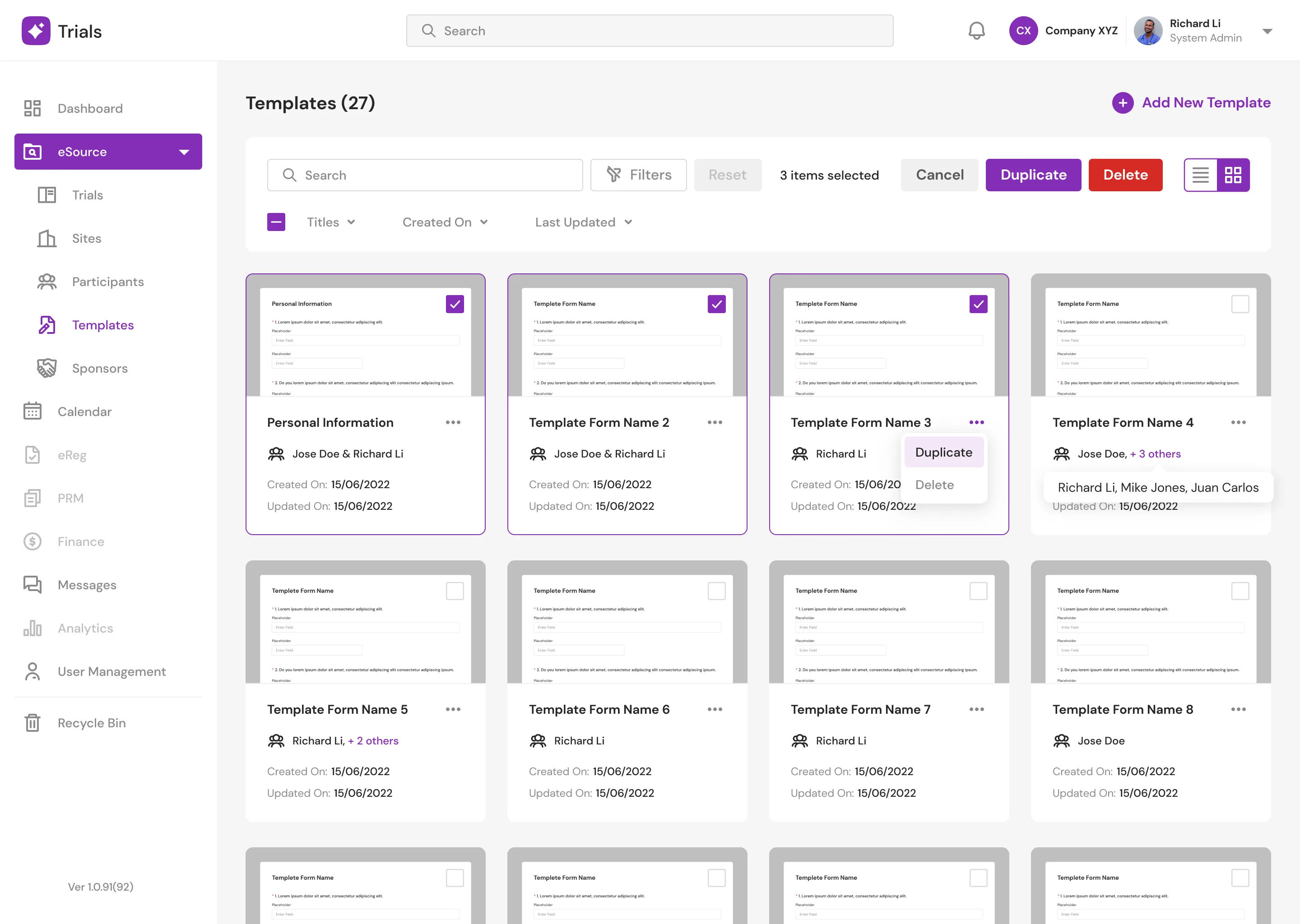
Templates Grid View
Templates Main (Light Mode)
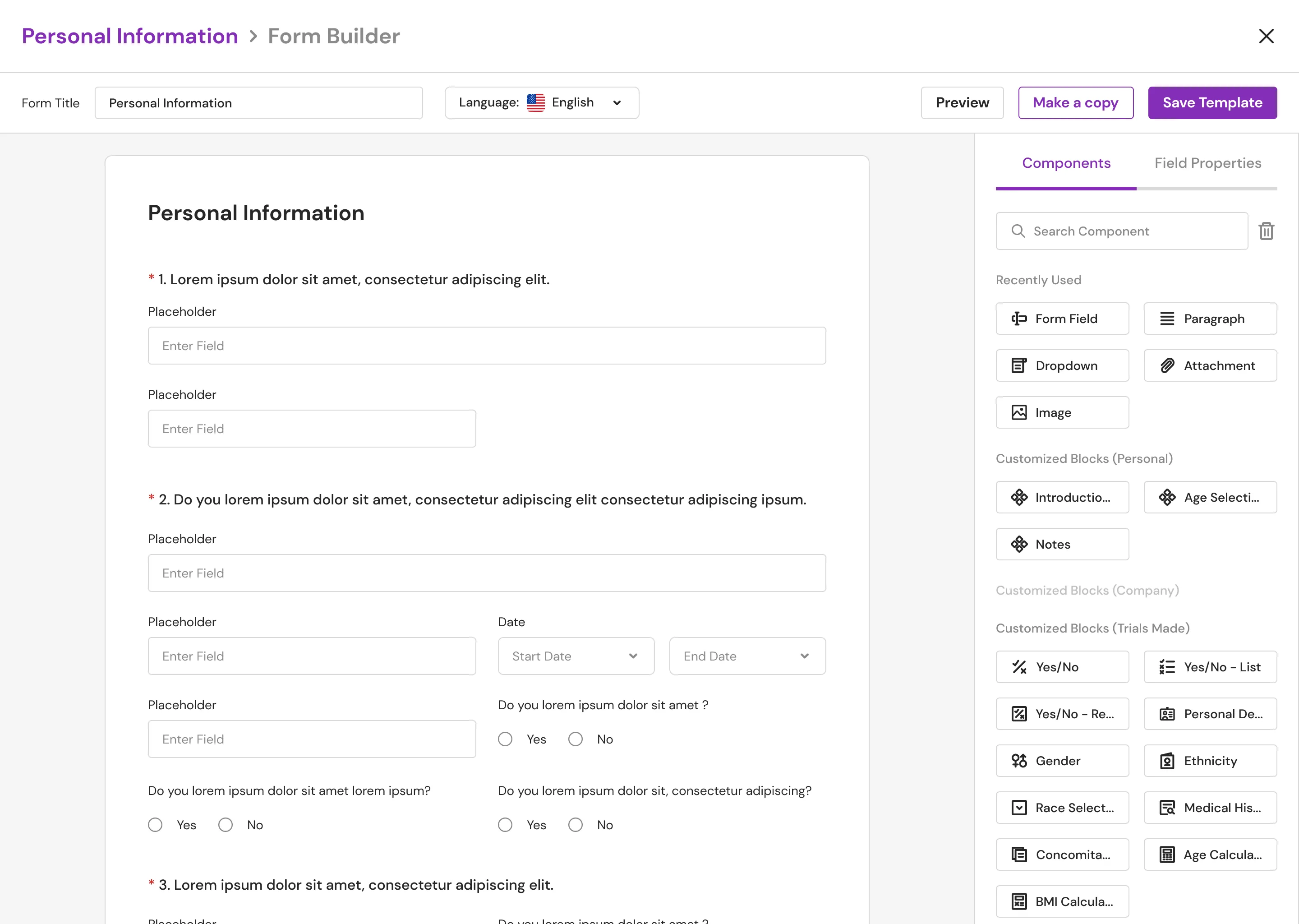
Templates Main (Light Mode) New
Role & User Management
I redesigned the user management flows, allowing primary researchers to seamlessly assign "Monitors" (subordinates) to specific trials. I replaced a disjointed, whitespace-heavy interface with focused modal interactions, utilizing clear visual containers to distinguish between published, unpublished, and archived trial statuses.
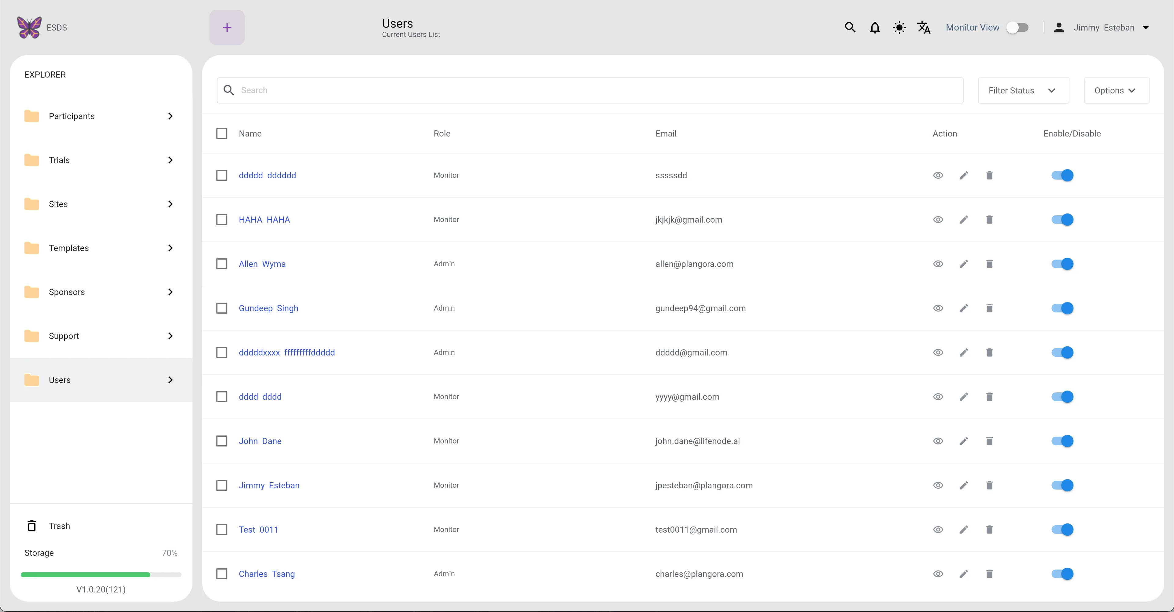
Users (Light Mode)
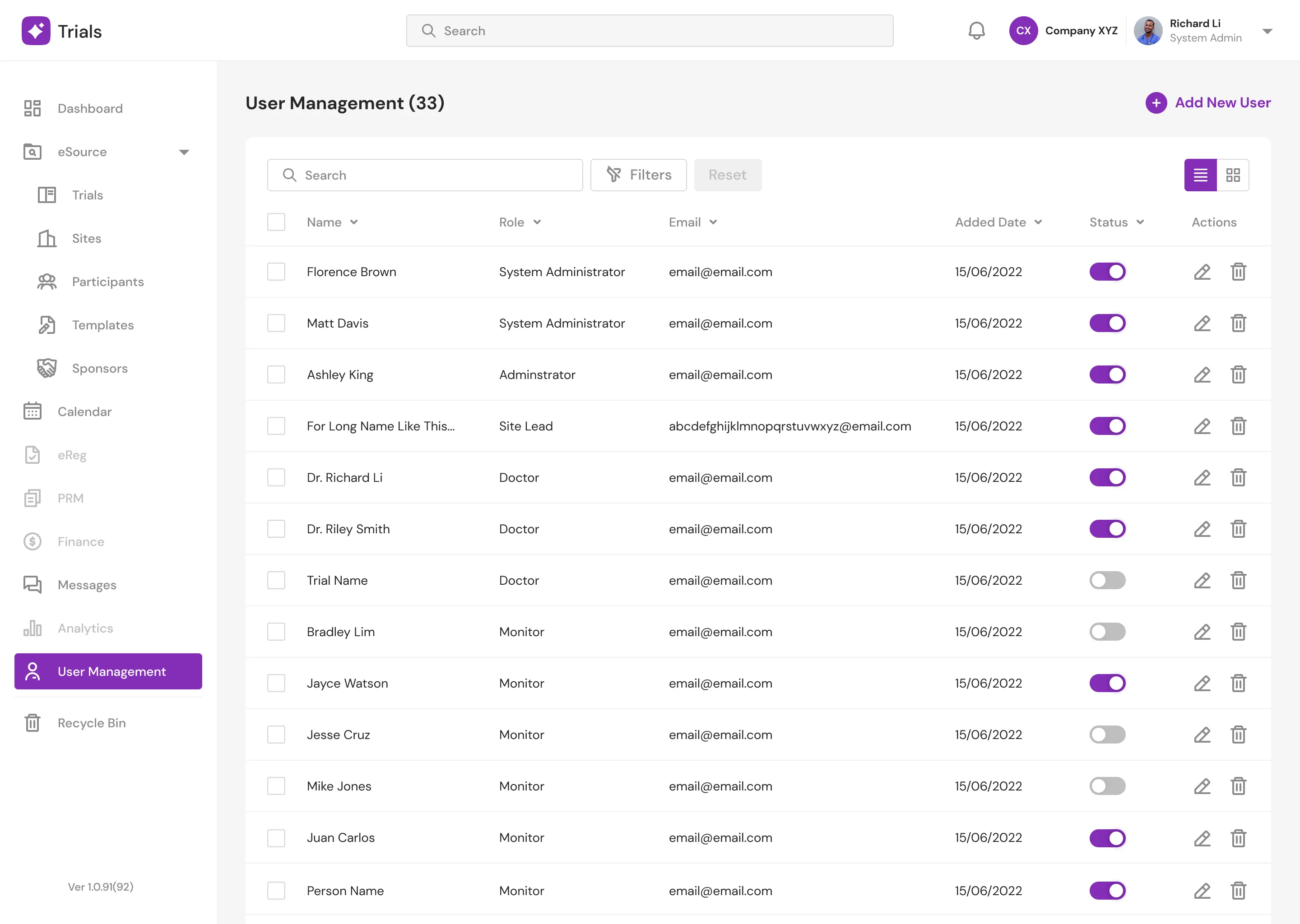
Users (Light Mode) New
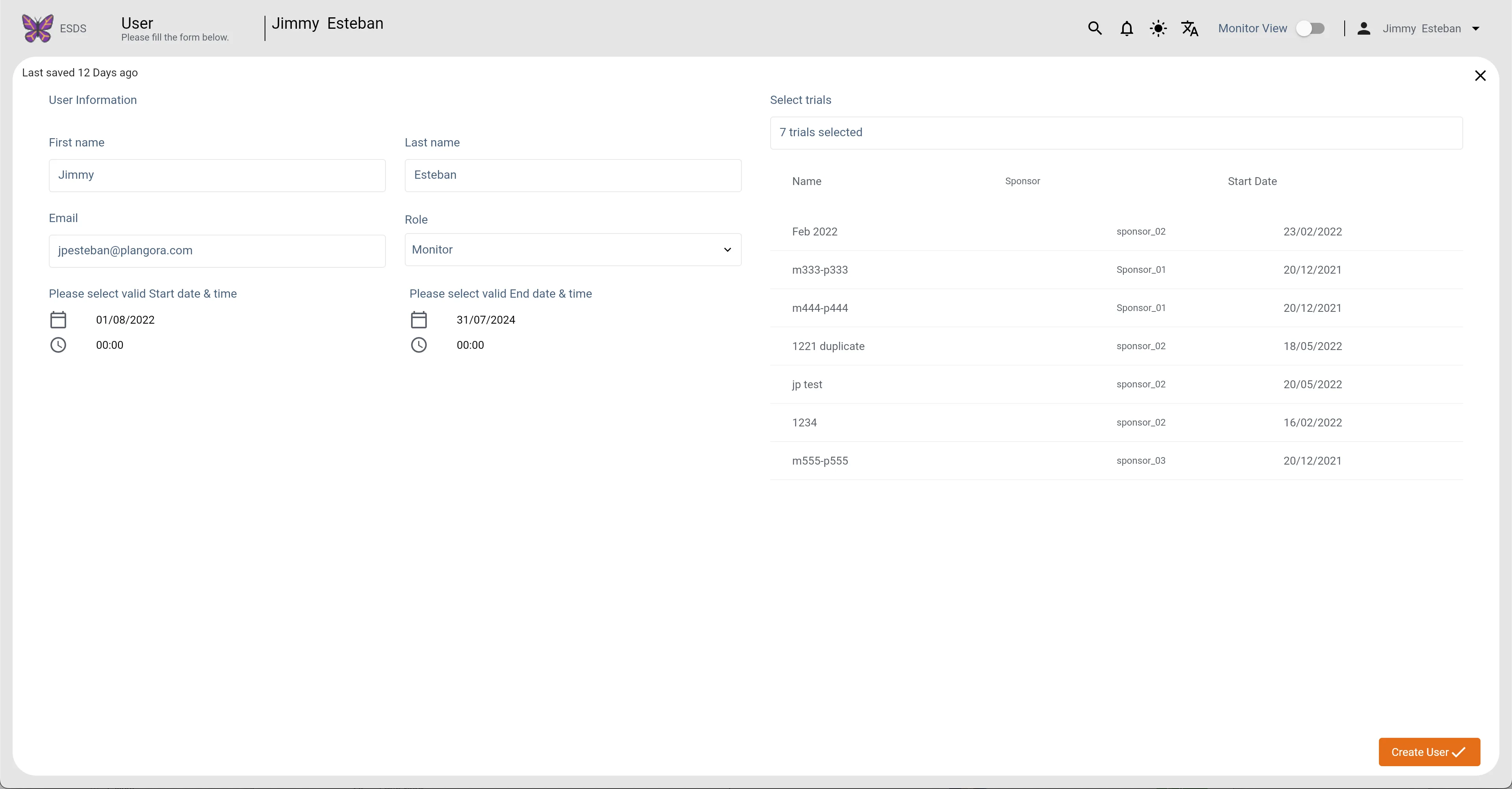
Users Main1 (Light Mode)
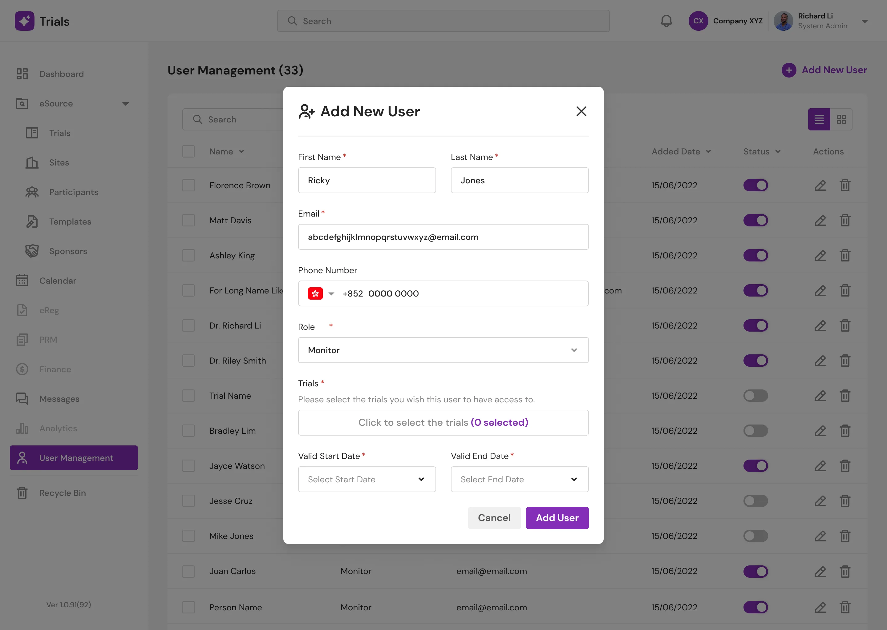
Users Main1 (Light Mode) New
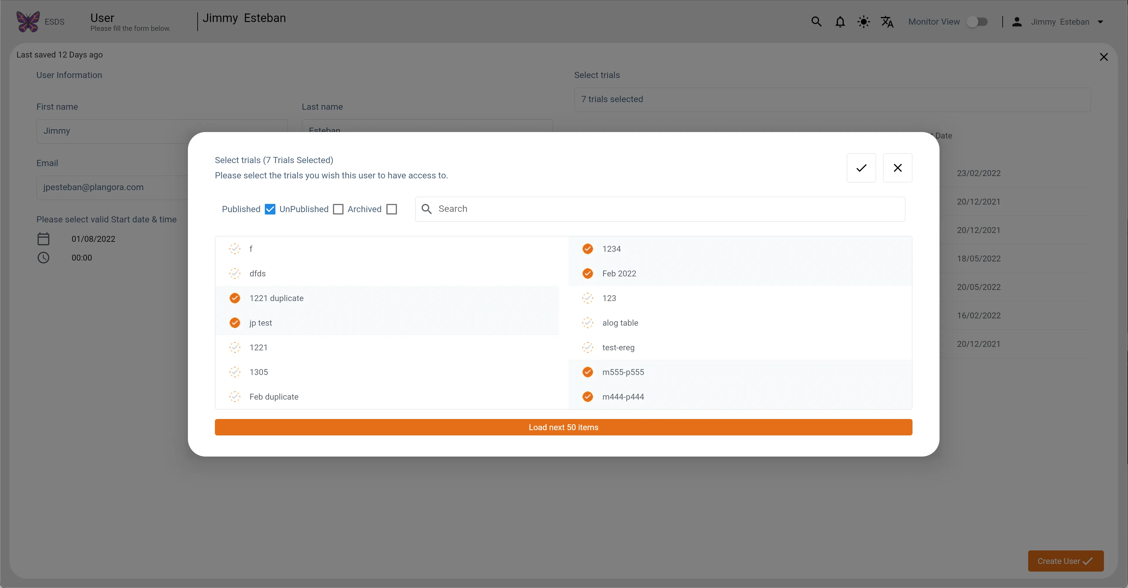
Users Main2 (Light Mode)
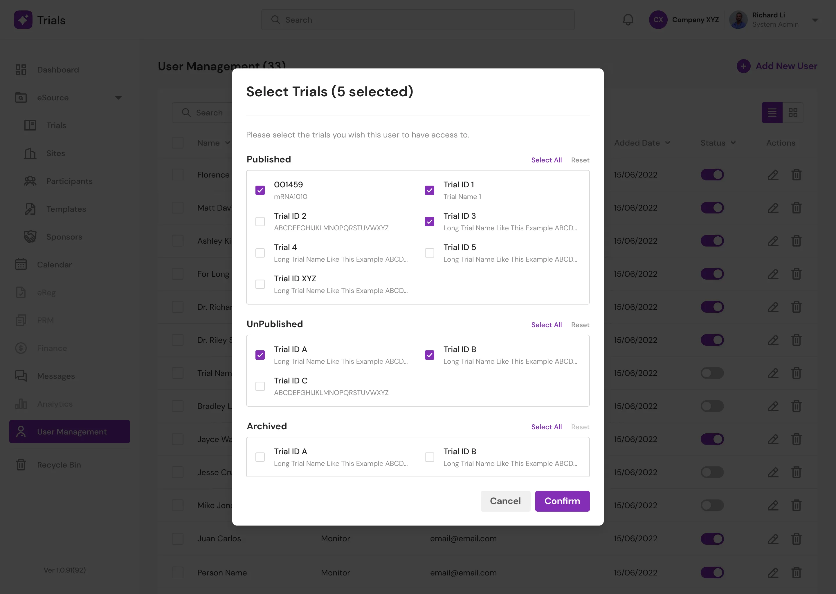
Users Main2 (Light Mode) New
Compliance & Data Integrity
In clinical research, retrospective data analysis is heavily regulated. The legacy design obscured system changes, forcing doctors to submit manual requests to Super Admins just to view audit histories—a massive bottleneck. I eliminated this friction entirely by designing a transparent, human-readable Audit Log natively within the dashboard, ensuring immediate access to critical compliance data.
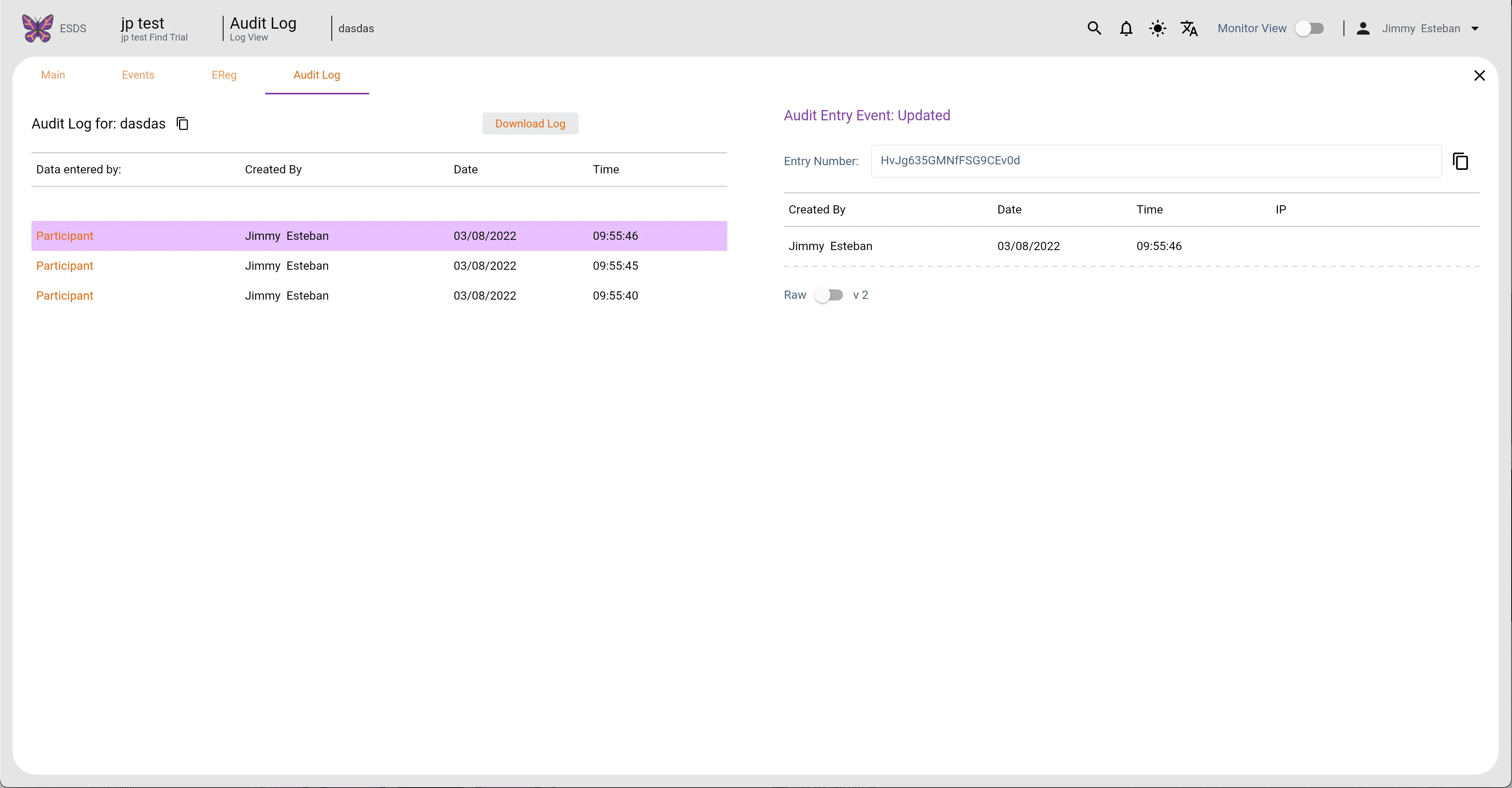
Participants Audit Log (Light Mode)
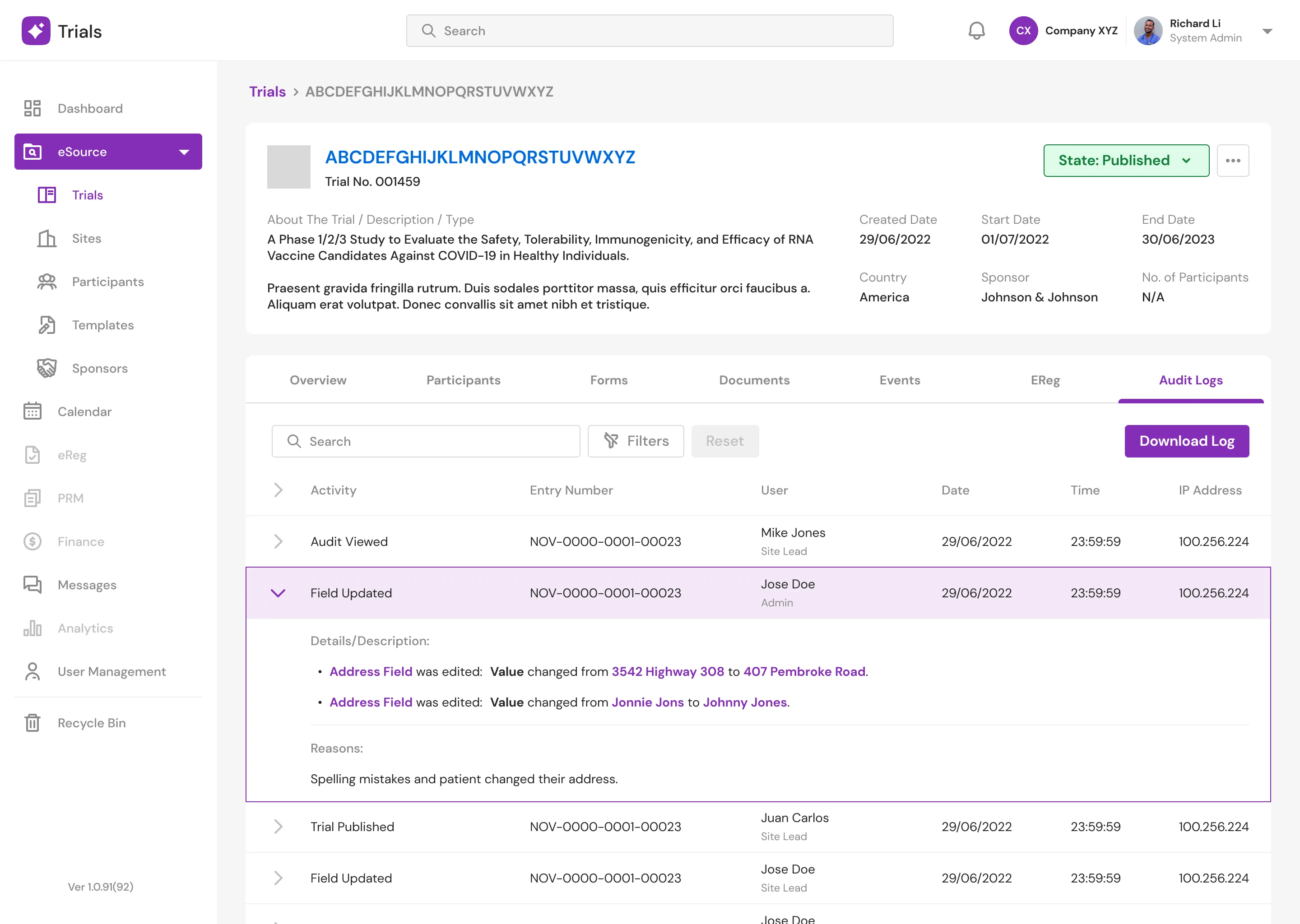
Detailed Page Audit Logs
Centralizing the Workspace
Dashboard & Scheduling
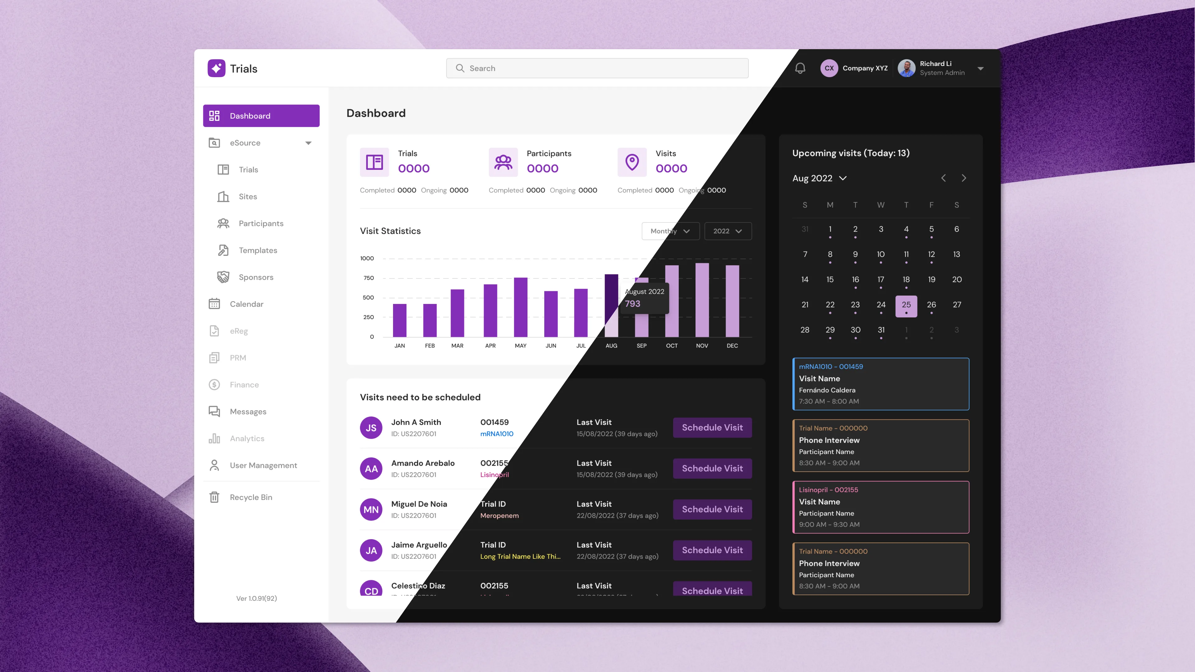
The new Dashboard aggregates critical telemetry at a glance: total active trials, participant enrollment, and pending visits. I integrated a robust Calendar system that flags upcoming appointments and allows clinicians to drill down into specific procedural details or reschedule instantly without leaving the primary view.
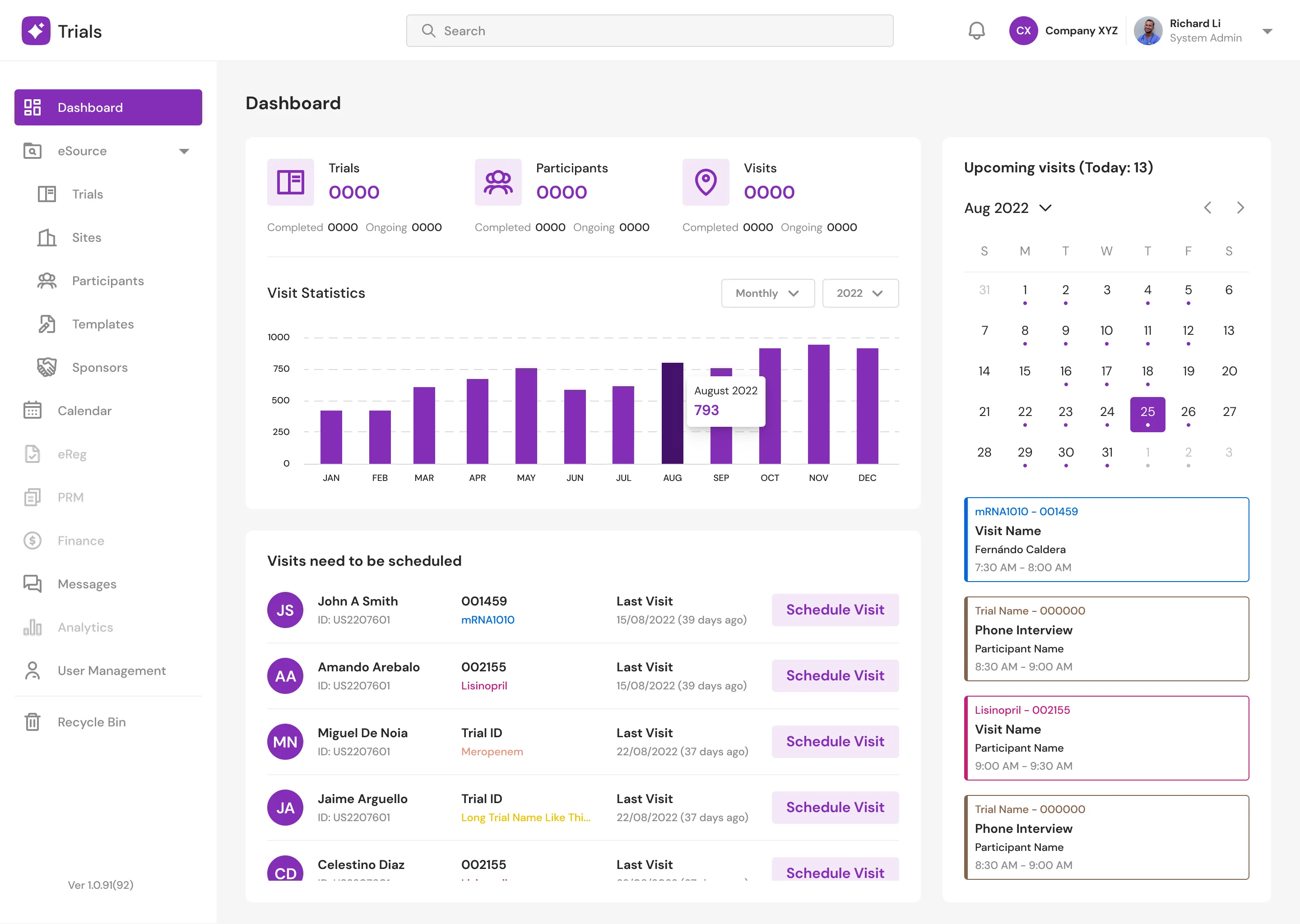
Dashboard (Light Mode)
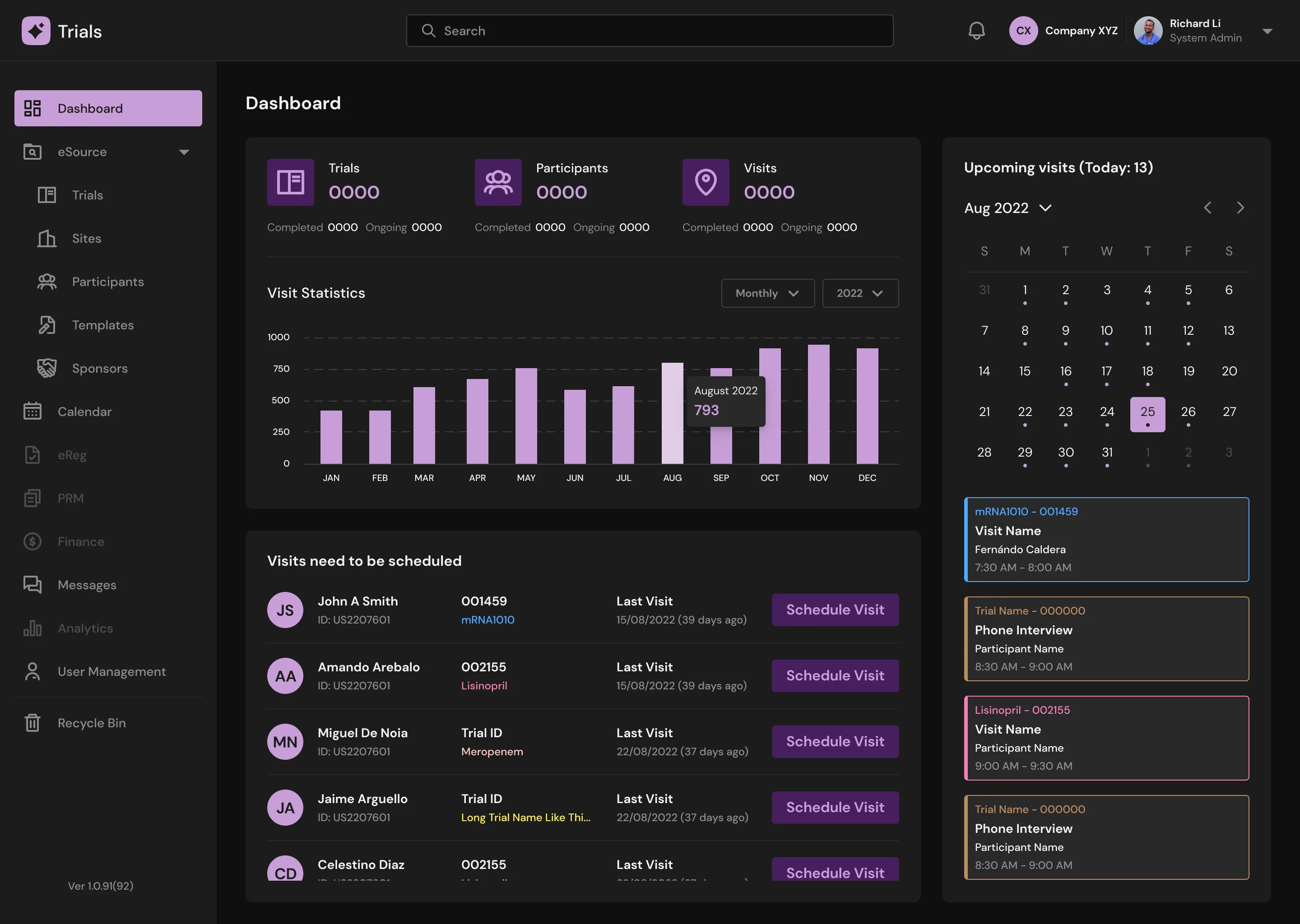
Dashboard (Dark Mode)
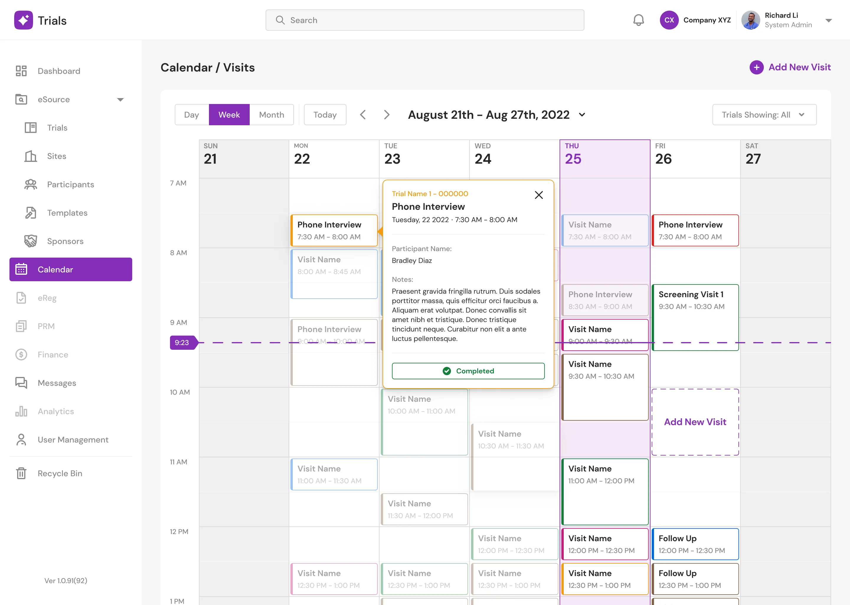
Calendar (Light Mode)
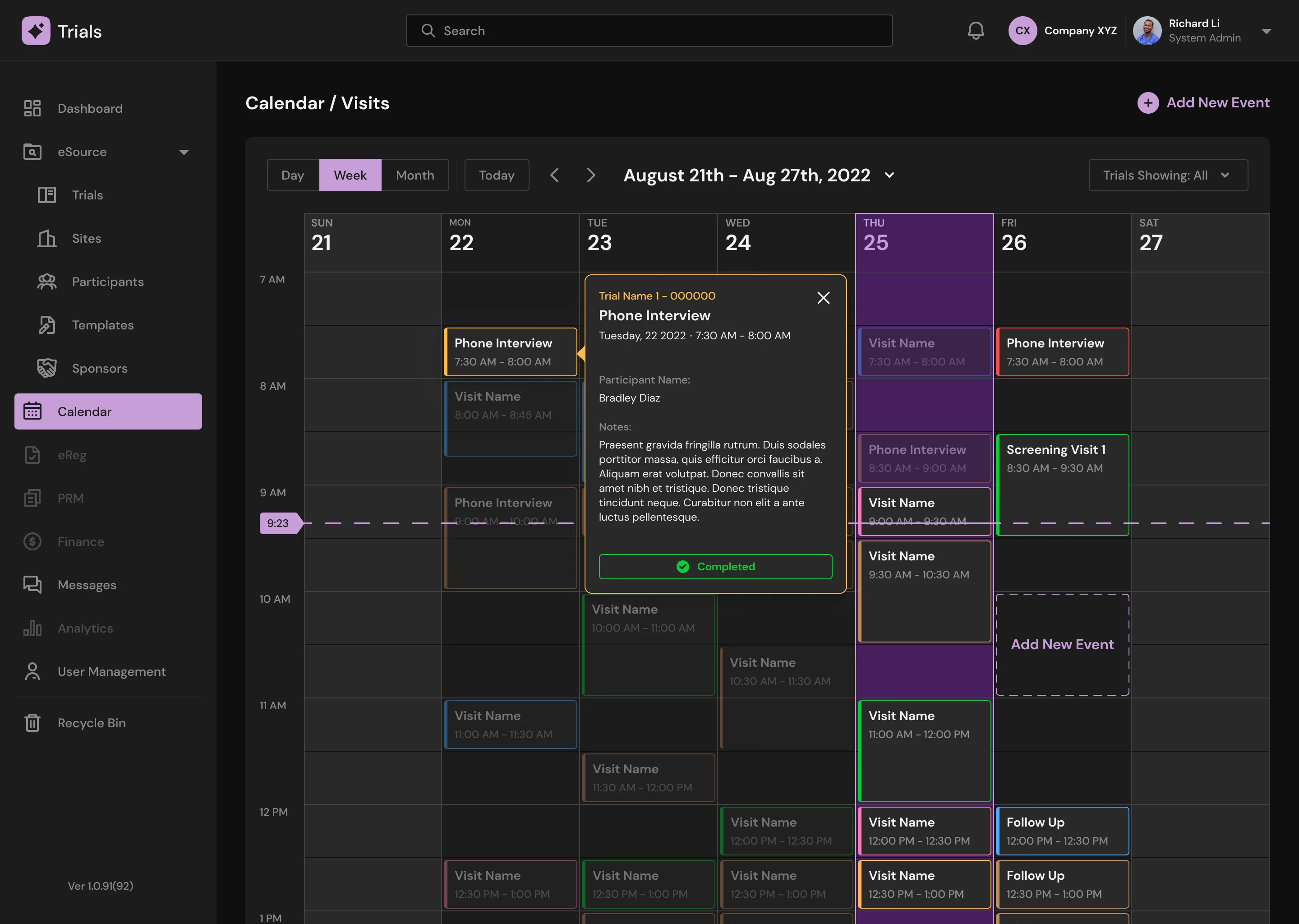
Calendar (Dark Mode)
Secure Communication
To facilitate complex trial coordination, I designed an integrated Messenger hub. This allows doctors to communicate securely with peers and participants via text, audio, and video, featuring rapid-access modals to review participant overviews without losing conversation context.
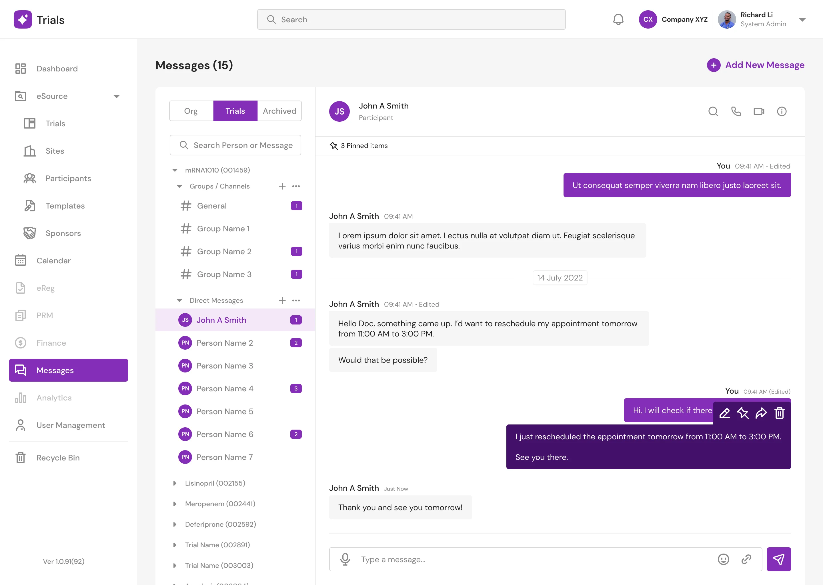
Message (Light Mode)
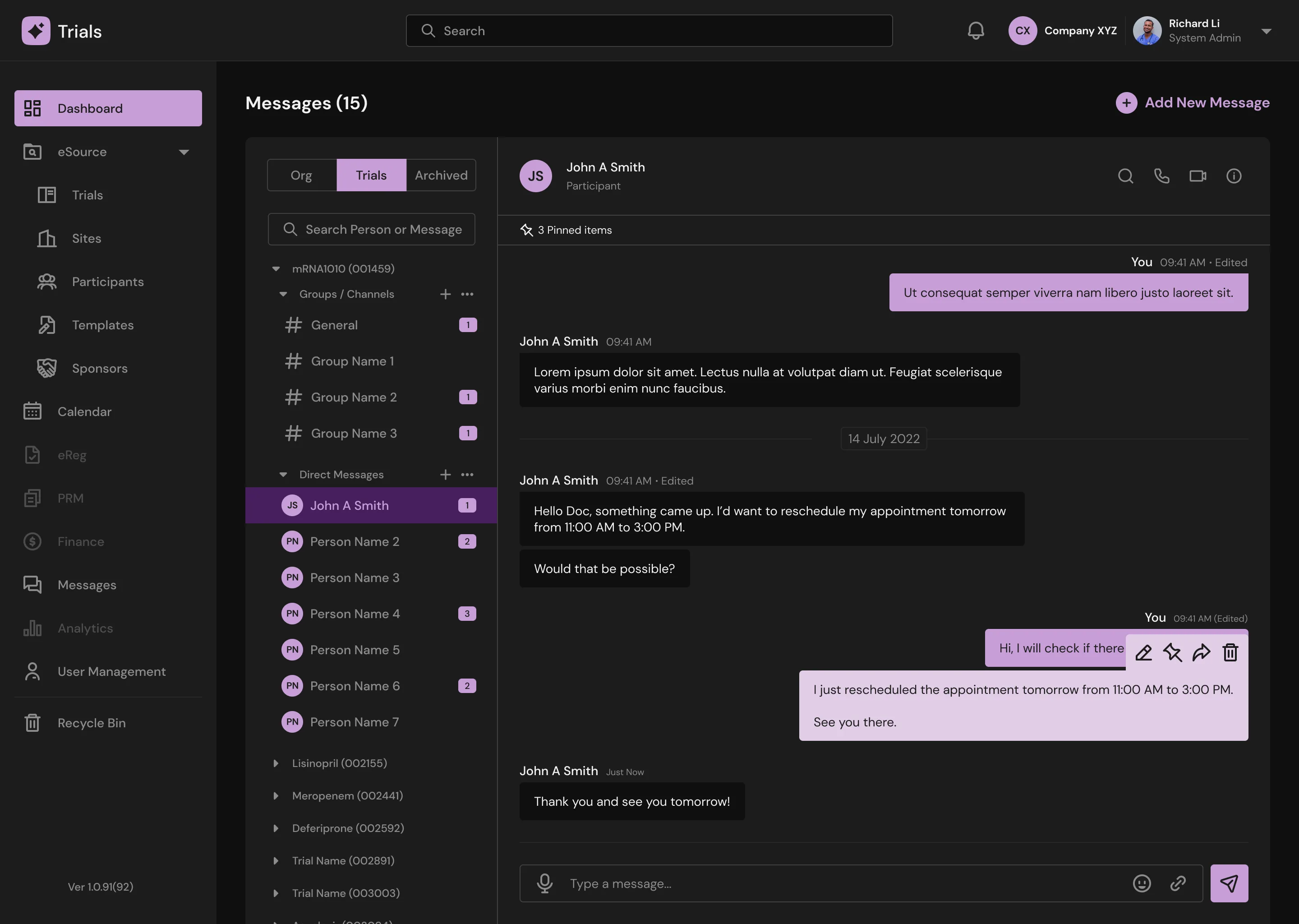
Message (Dark Mode)
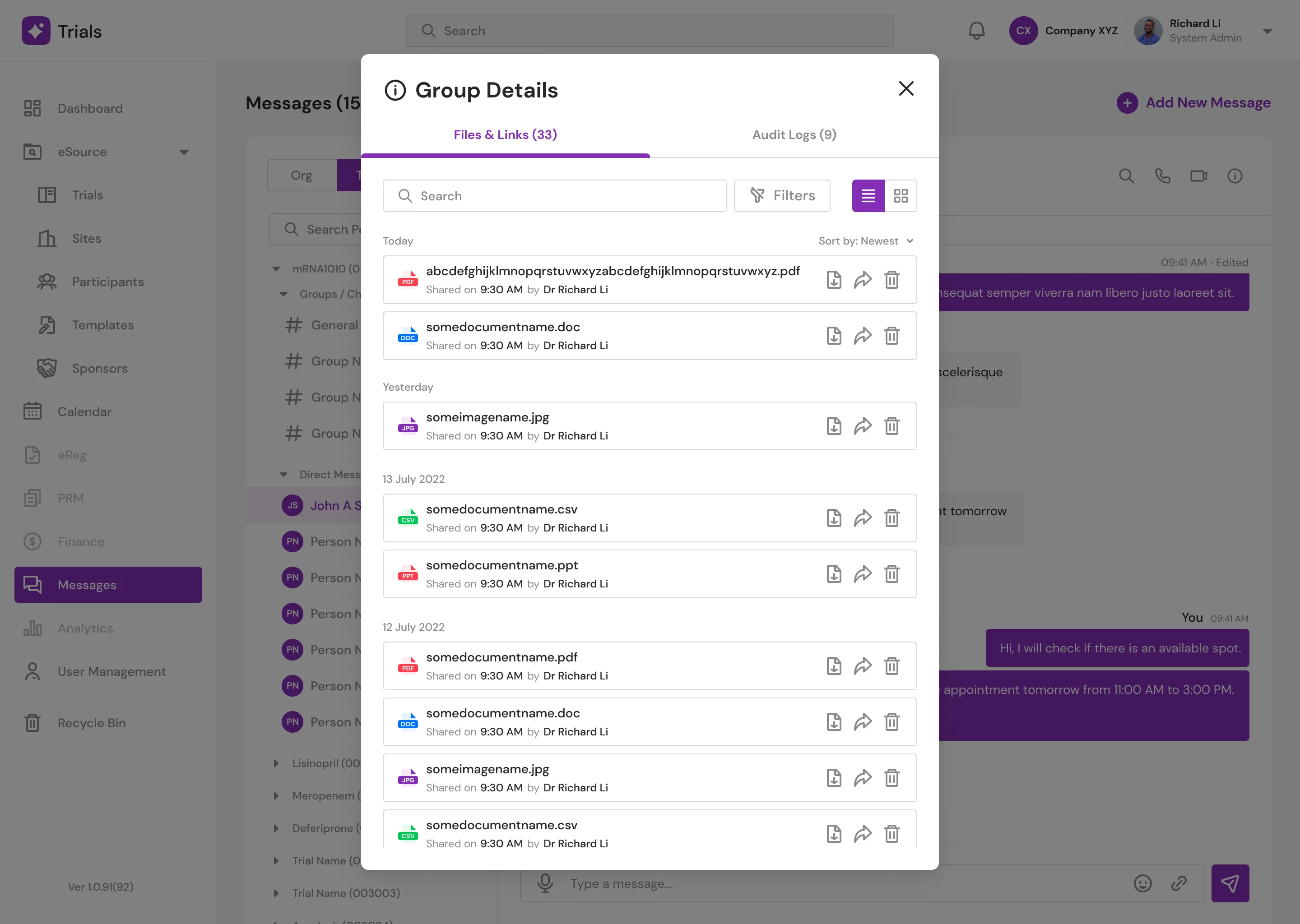
Message: Group Details (Light Mode)
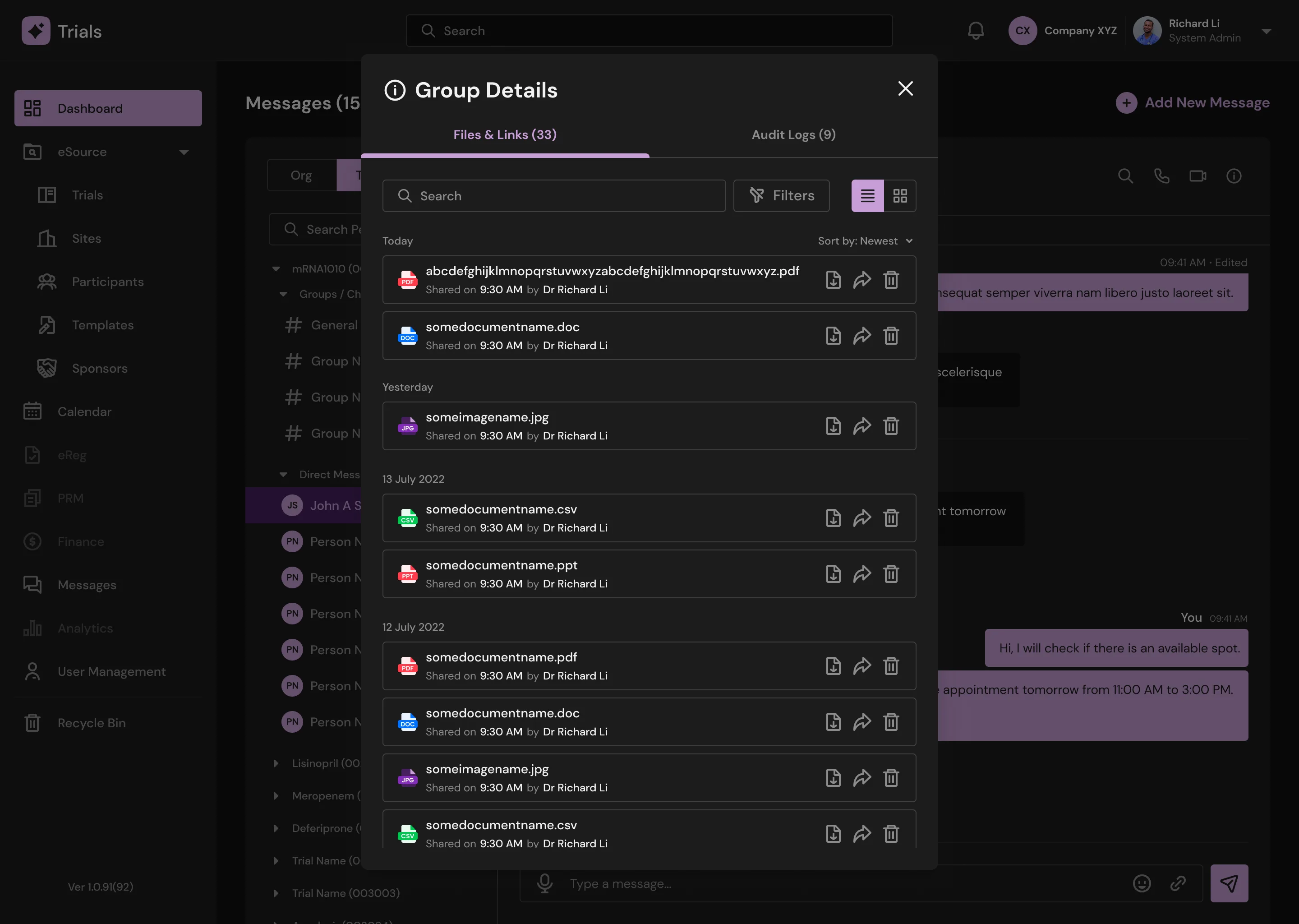
Message: Group Details (Dark Mode)
New Screens
Support / Tickets
Reflection & Design Leadership
While shipping a compliant, accessible UI was a major milestone, the most significant takeaway from this project was the importance of cross-functional leadership and engineering advocacy.
Operating as the solo designer working alongside junior developers required high-touch collaboration. Because my allocation for this client was strictly capped at two days a week, ruthless prioritization was essential. Rather than simply throwing Figma files over the wall, I established a highly efficient designer-developer workflow, explaining the "why" behind interaction states and accessibility standards. By the end of the project, the engineering team deeply understood the product vision and the cadence of our handoffs, proving that a strong UX system—and a strict timebox—ultimately drives clearer communication.
Client Impact
The redesigned platform was met with immediate positive reception from both the clinical end-users and the executive team. The success of this timeboxed engagement established a strong foundation of trust, leading the Neuromatics CEO to actively seek my continued UX expertise even after my tenure with the agency concluded.