
EdTech Product Initiatives (NDA)
Under NDA. In compliance with project confidentiality, proprietary branding, specific details, and raw metrics have been obscured. This case study highlights the methodologies, user flows, and design systems used during the project. Reach out to discuss further details privately.
Key Points That Define Our Success
2023/08 - 2026/08
UI/UX Designer
Projects/Features Completed
Successfully completed roadmap items aligning with internal team, user, and business needs.
All About the Users
Over 100 users took part in research and usability studies to validate concepts, including students, teachers, parents, student groups, and company interns brought in as test participants.
Engagement
Per Amplitude analytics tracked by our PM, average student time on the platform increased from about 7 minutes to 11 minutes through lots of innovative and engaging ideas.
Accessibility Fixes
Since joining, addressed color contrast, missing alt text and aria-labels, keyboard navigation and focus states, touch target sizing, form input labeling, and semantic HTML across the platform.
Quick Wins
Teachers reported spending noticeably less time writing grading summaries by hand once they could start from a generated draft instead of writing from scratch.
Teachers kept returning to the AI-recommended content section repeatedly rather than searching from scratch, several called out saved lesson-prep time as the main benefit.
Average student session time increased from about 7 to 11 minutes after the gamification features shipped, tracked via Amplitude analytics.
Design Handoff, Built for Clarity
Working with roughly 8 engineers across initiatives
As the only designer on this team, engineering never had a second designer to fall back on for clarification, so the Figma files themselves had to carry that weight. I kept every frame documented with states (default, hover, focus, error, empty) and consistent naming, so engineers could pick up a design and build it without needing to ask what a component should do in an edge case. Most of the time they didn't have questions, and when they did, I was glad to walk through it, but keeping the files clear from the start meant that was the exception, not the norm.
Selected Works
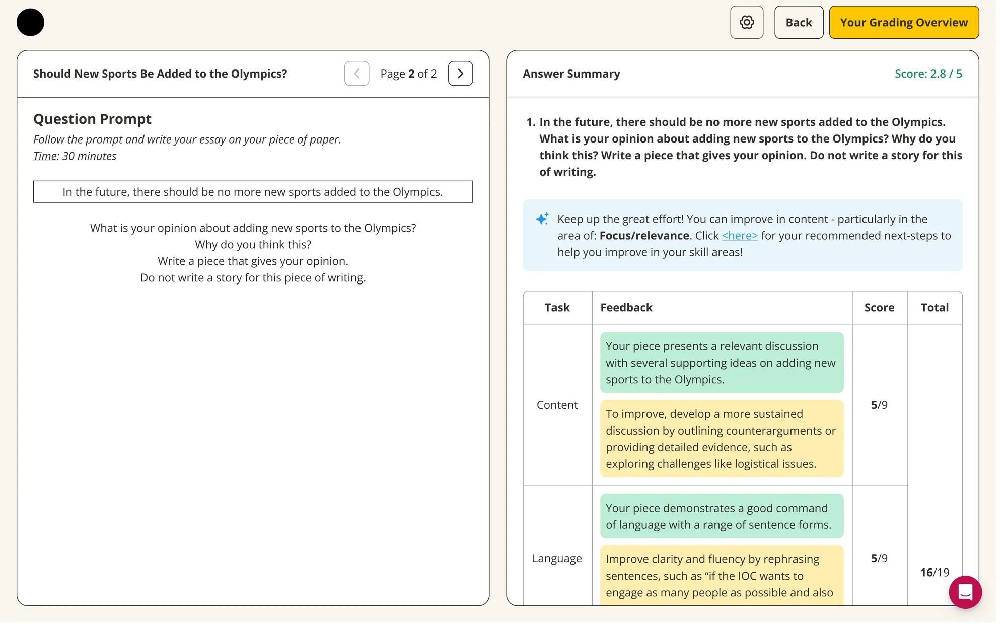
AI Grading Summaries for Students & Teachers
ShippedProblem: Teacher feedback pointed to too much time being spent manually reviewing and summarizing student answers.
Goal: Use AI to generate quick, accurate summaries of student performance for teachers.
- Teachers reported spending noticeably less time writing summaries by hand, since they could start from a generated draft instead.
- Editing wasn't available at launch, and nothing was factually broken without it, but we added it as a follow-up so teachers could personalize a summary when they wanted to. The engineer owned the AI generation itself; the PM shaped the underlying language, and I designed how teachers actually read and edited it. The pedagogy team also reviews a sample of summaries periodically to keep quality in check.
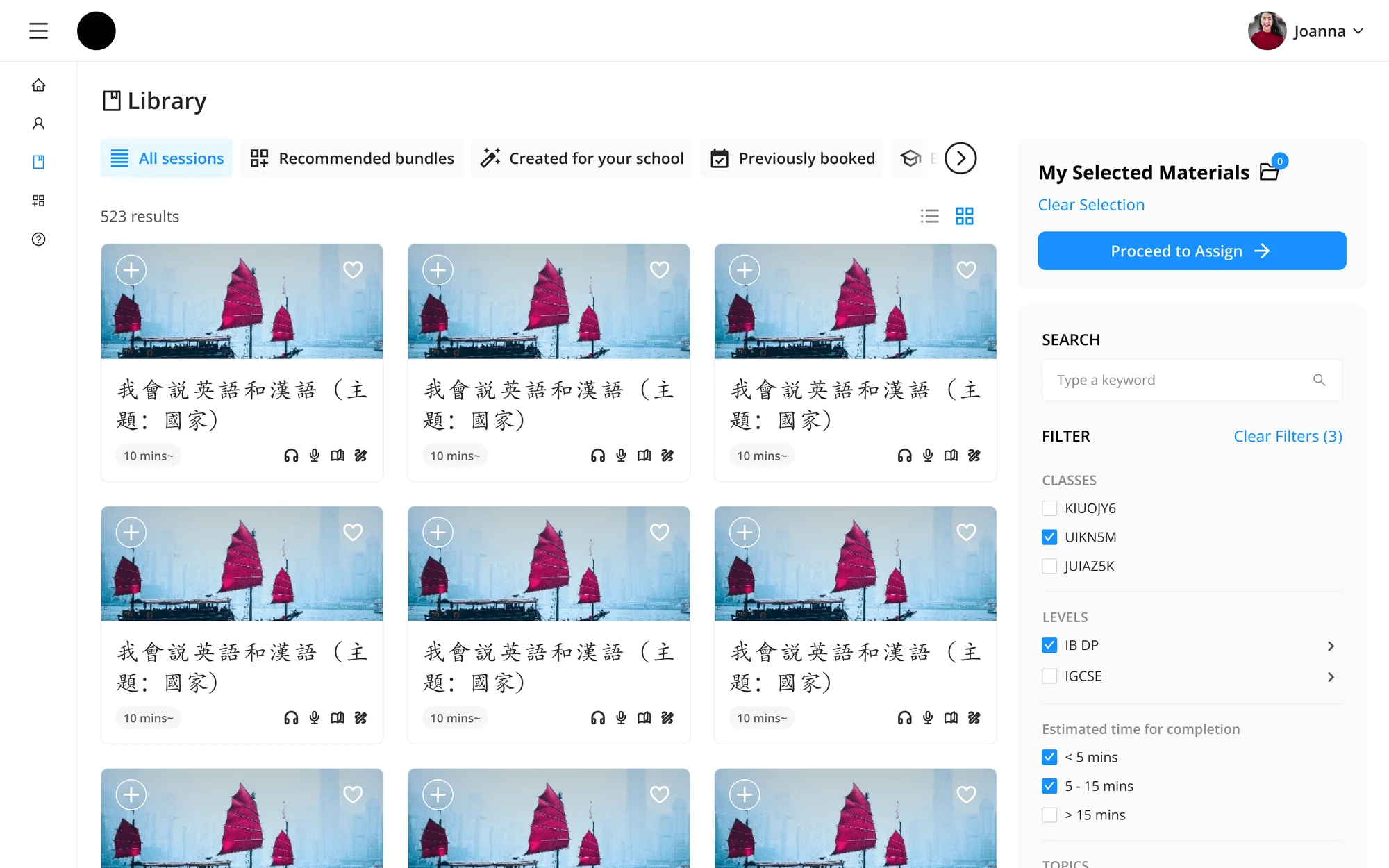
AI-Powered Library for Teachers
ShippedProblem: Teachers reported difficulty finding relevant content quickly within a growing content library.
Goal: Use AI to recommend content aligned with what a teacher is currently teaching.
Result: Early usage showed teachers returning to the recommended content section repeatedly rather than searching from scratch. Several teachers specifically called out saving time on lesson prep as the main benefit.
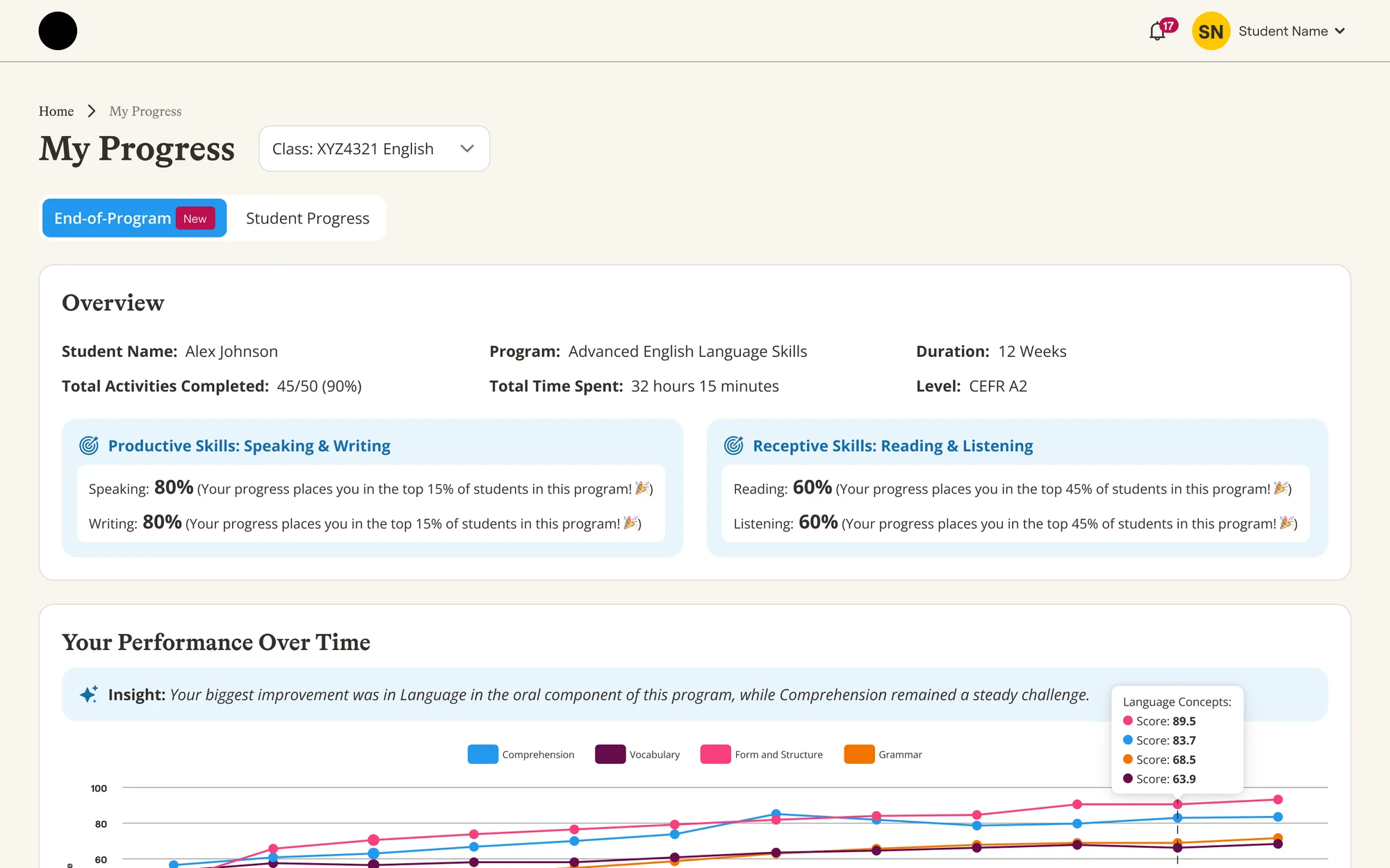
AI Next Steps for Students
ShippedProblem: A recurring student question was simply: what should I work on next?
Goal: Recommend next steps tailored to each student's specific weaknesses and recent performance, not just generic content.
- Both students and teachers noticed improvement, since students finally knew what to work on based on their actual weaknesses instead of guessing.
- The founders originally wanted every strength and weakness explained in full paragraphs. The PM and I pushed back: that much text buried the one thing a student actually needed to see. We broke it down into short, scannable sections instead, with an option to expand into the fuller explanation only if a student wanted it.
Gamification Across the Student Experience
ShippedProblem: Learning felt like a chore for many students, with little day-to-day incentive to return to the platform outside of assigned work.
Goal: Introduce game-like mechanics, points, streak bonuses, class leaderboards, and a personalized recap, to make regular use of the platform feel rewarding instead of obligatory.
- Per Amplitude analytics tracked by our PM, average student time on the platform increased from about 7 minutes to 11 minutes per session after these features shipped.
- As originally designed, the leaderboard only ever showed the top students, which in practice meant the same few names every week and no real shot at recognition for anyone else. For a competitive group of students, that leaves most of the class with nothing to play for. Instead of a single ranking, we shipped several ways to win, Most Improved, Most Consistent, The Early Bird, and The Game Master, so a student who was never going to top the class outright could still earn something real and public. The class-level board was also scored per student rather than by class total, so a bigger class couldn't win on headcount alone.
Game Shop & Mini-Games
Other Projects/Features
Multi-platform design system
Extended the shared design system to stay consistent across web and mobile, so components didn't drift as new surfaces were added.
Instructor portal upgrades
Rolled out usability and workflow improvements to the instructor-facing portal based on ongoing feedback.
Admin and Teacher exercise creation
Built tools for admins and teachers to create and manage exercises directly in the platform, instead of relying on outside documents.
Reports for different users
Built tailored reporting views per user type, surfacing the metrics most relevant to students, teachers, and admins respectively.
Reflection
This engagement ran long enough to cover nearly every part of the product: design system, student and instructor portals, gamification, admin tooling, and reporting. The last stretch was focused on AI-assisted guidance: helping students and teachers know what to do next instead of leaving them to figure it out from raw content and scores alone.